Overview
Reading the faces of entertainment
The iconic Olympia Theatre is a destination for all kinds of people – music fans, theatre lovers, those interested in the theatre’s legacy, and those eager for the newest talent. Not to mention, there are several types of users approaching 3Olympia’s digital presence: those expecting to admire the iconic theatre, those with logistical questions, and those ready to buy a ticket. An audience as large and diverse as 3Olympia’s needed a website robust and flexible enough to engage this wide variety of traffic.
View the site
3olympia.ie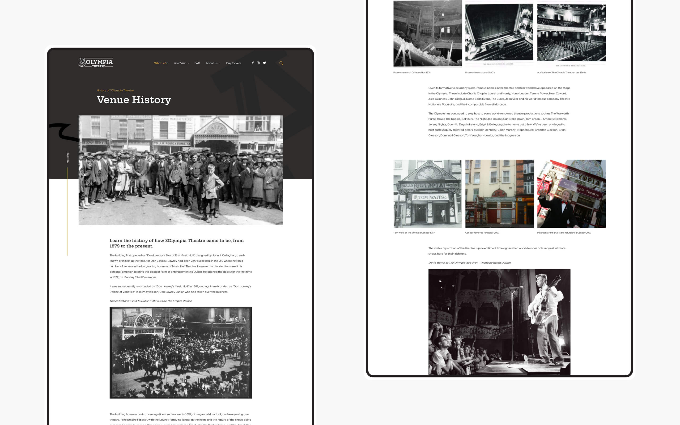
Representing the venue
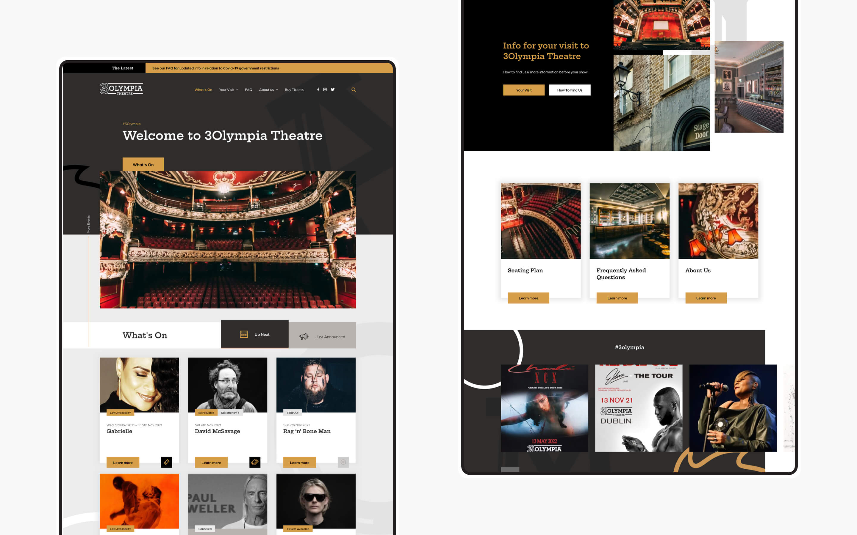
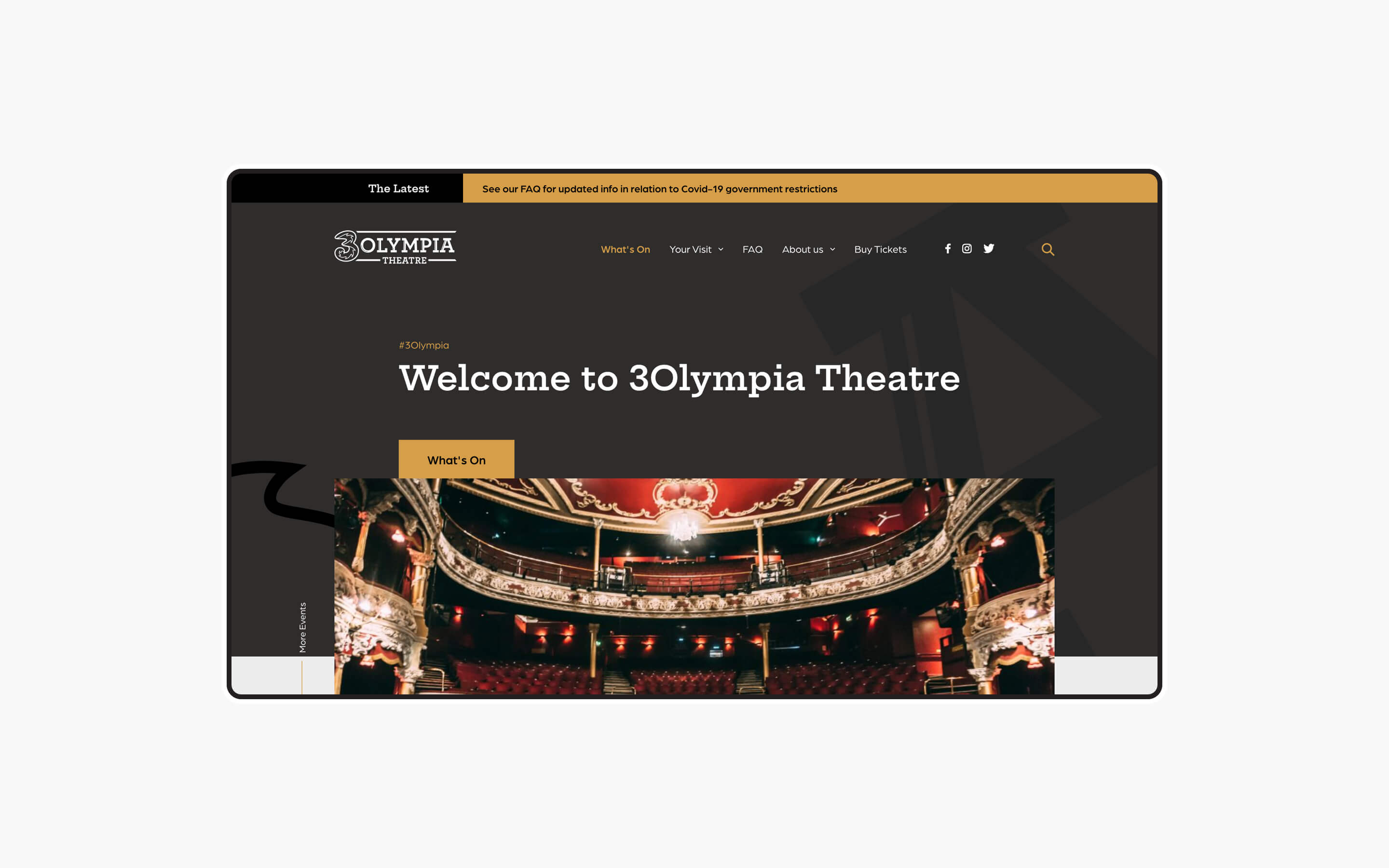
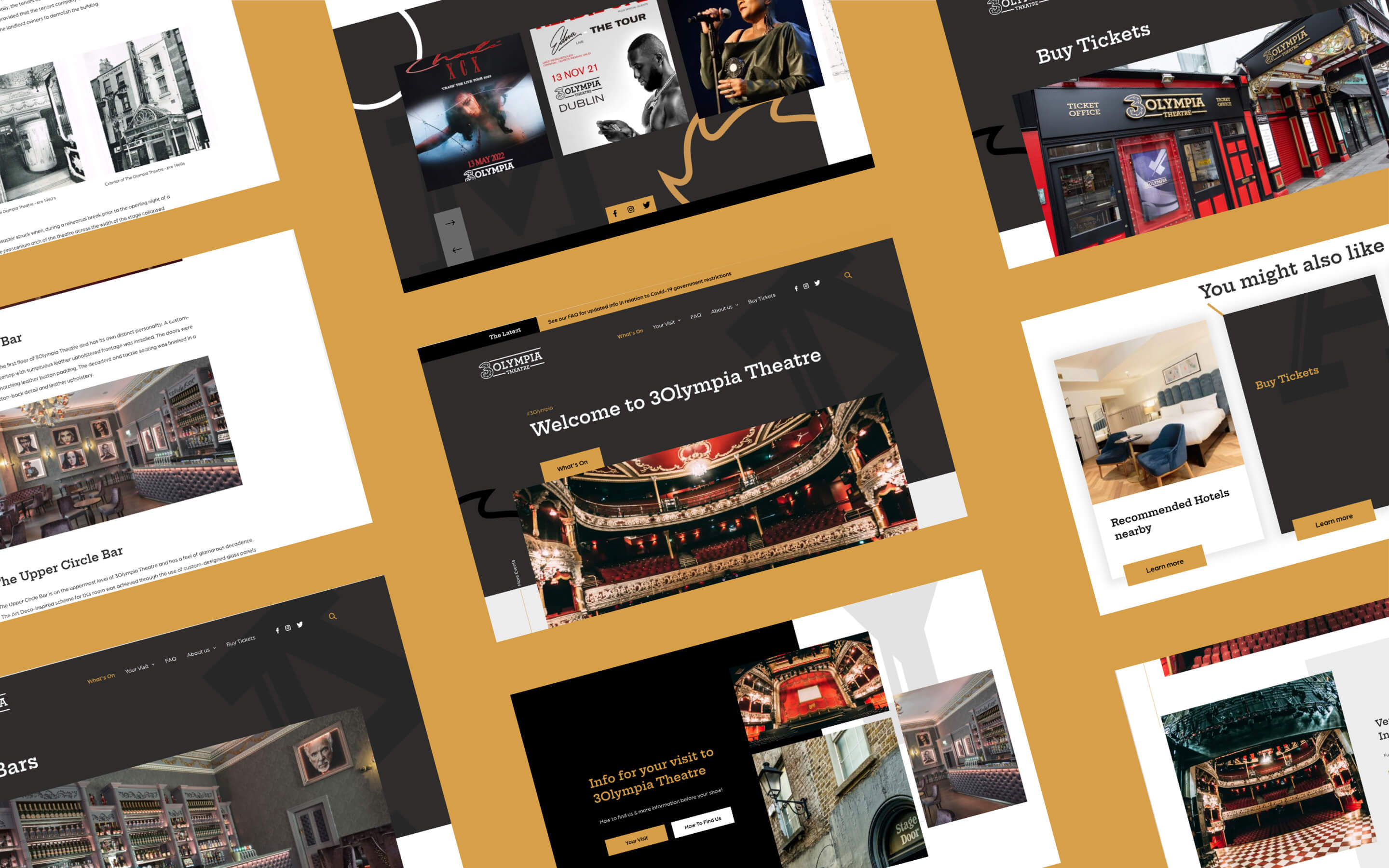
One of Ireland’s most iconic venues, 3Olympia has attracted audiences and world class talent to Dublin for the last 140 years. The 3Olympia's diverse audience and wide array of acts is what makes the venue so unique. The challenge was to craft a site that appeals to the different ‘faces’ of the theatre without losing the nostalgia and personality of the venue itself. Using 3Olympia’s rich promotional assets and imagery, we designed to not only highlight upcoming events but also to incorporate the iconic building and unique history into the site in a visual way, weaving in the building, story, and legacy of theatre.
Digitally ushering the crowd
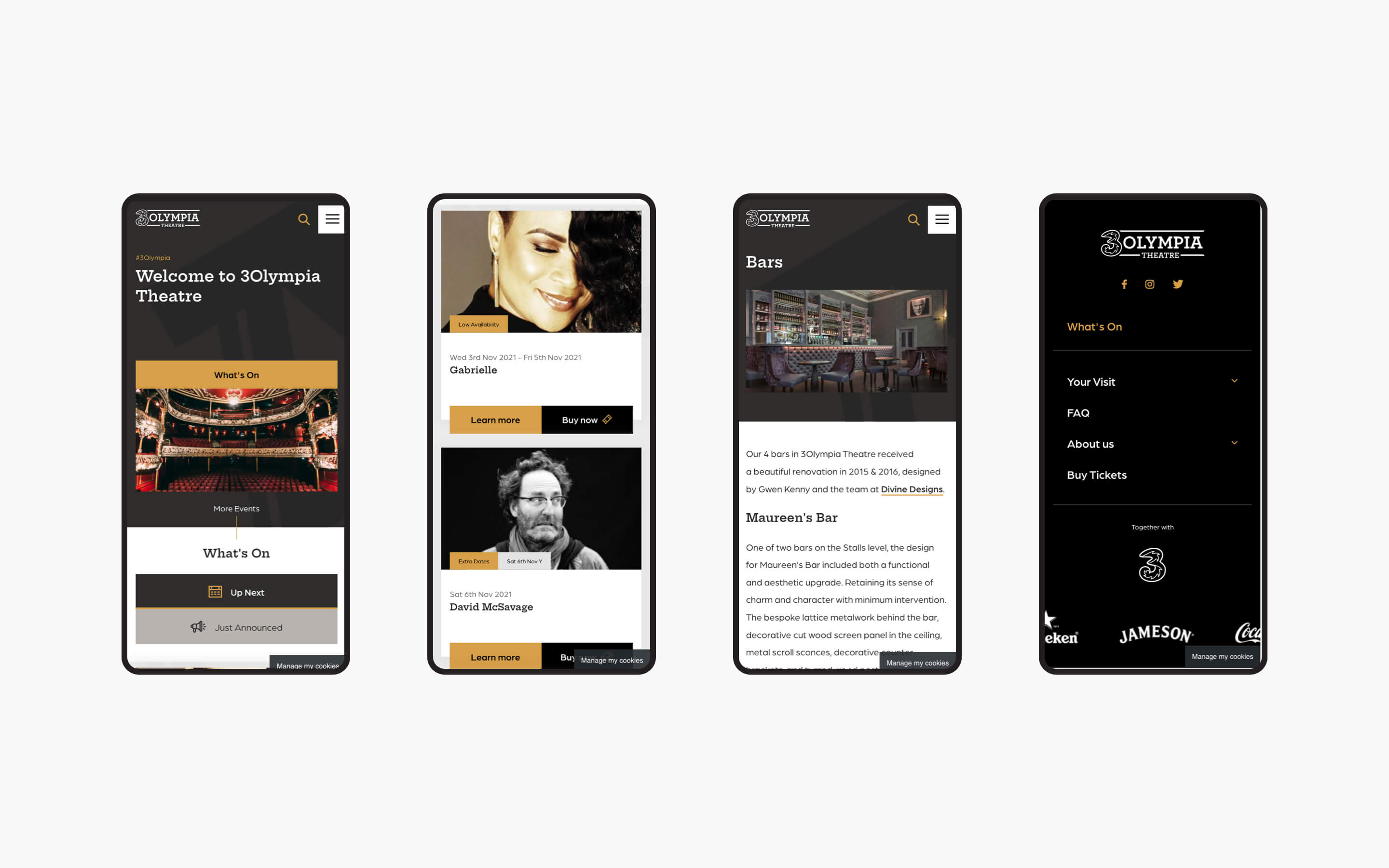
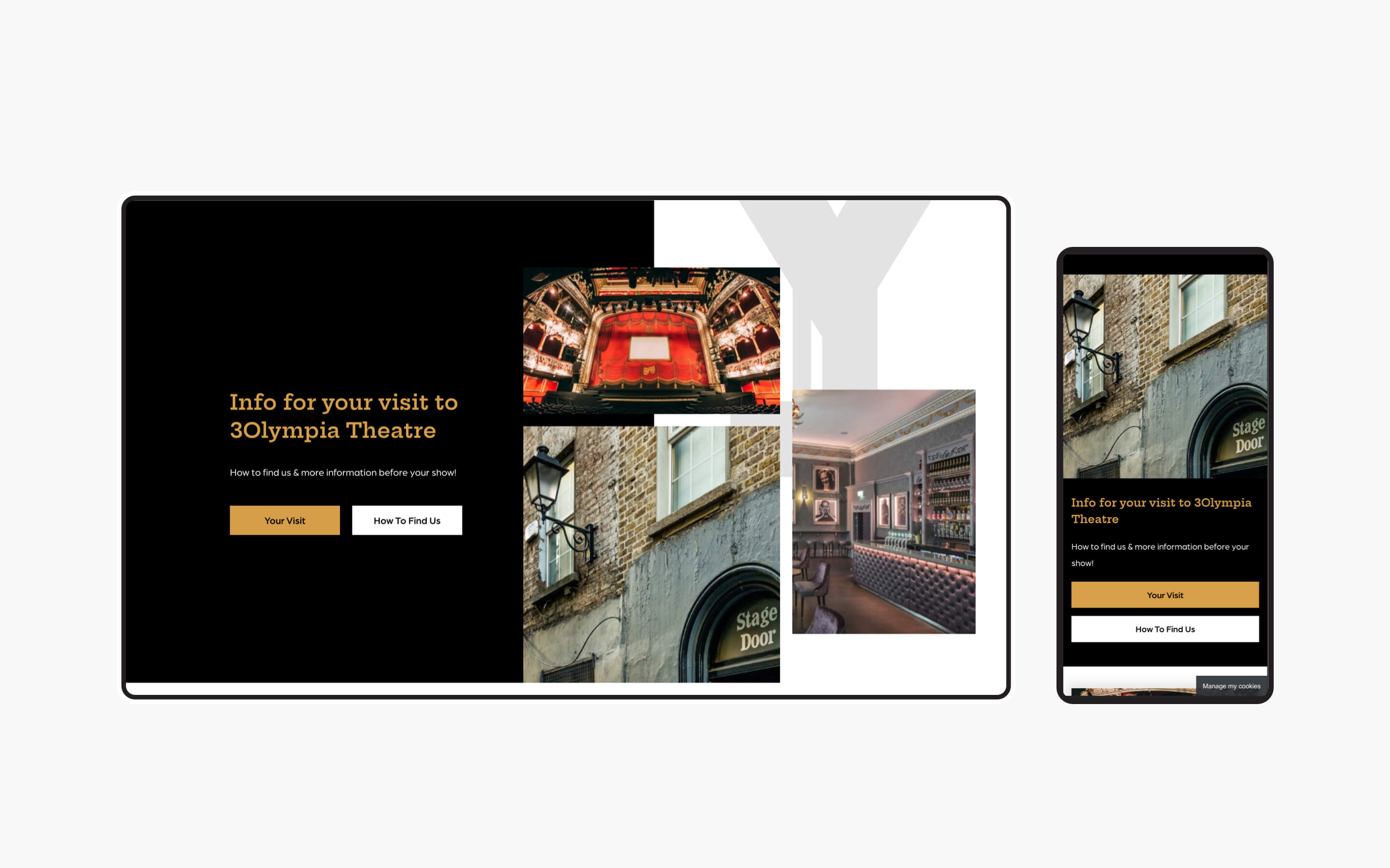
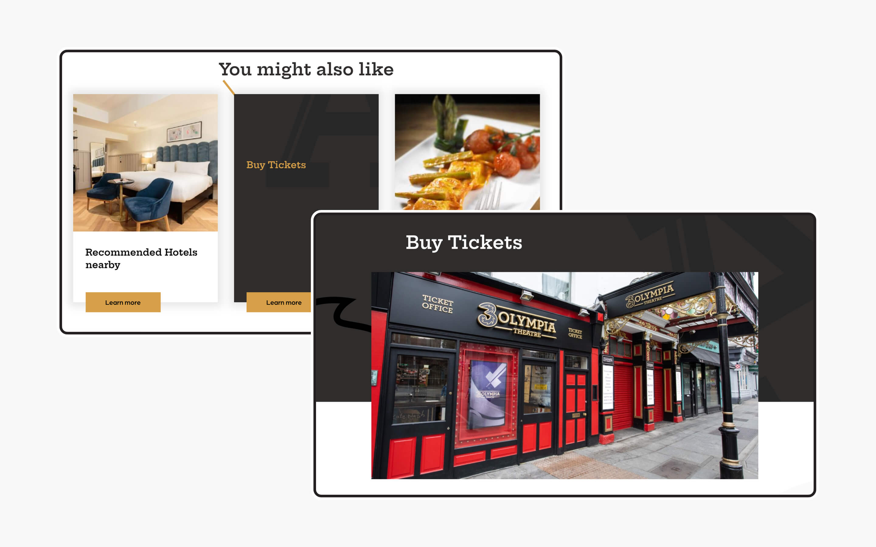
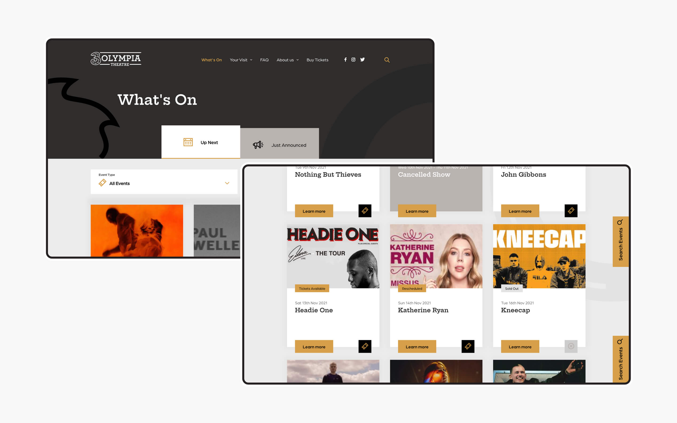
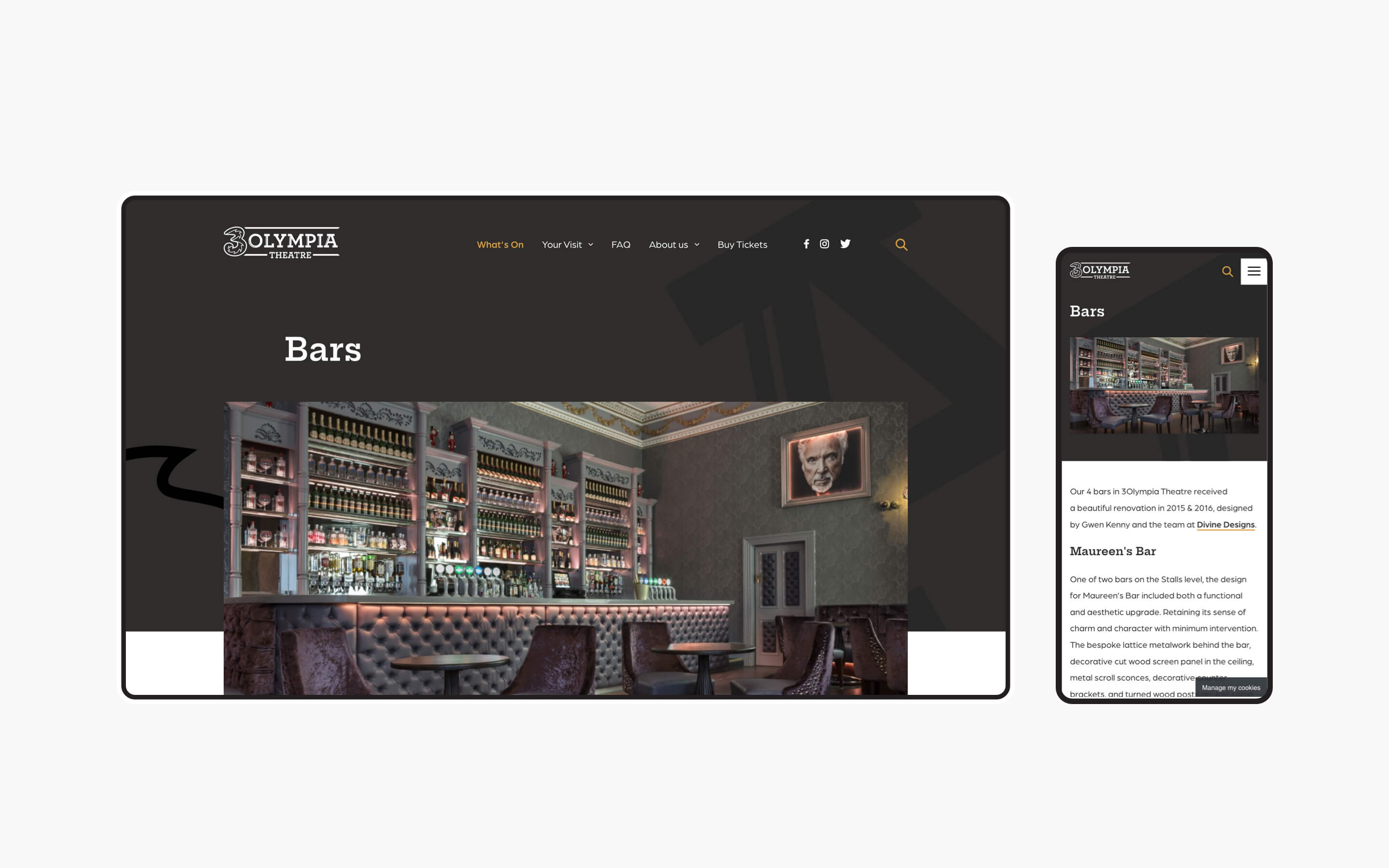
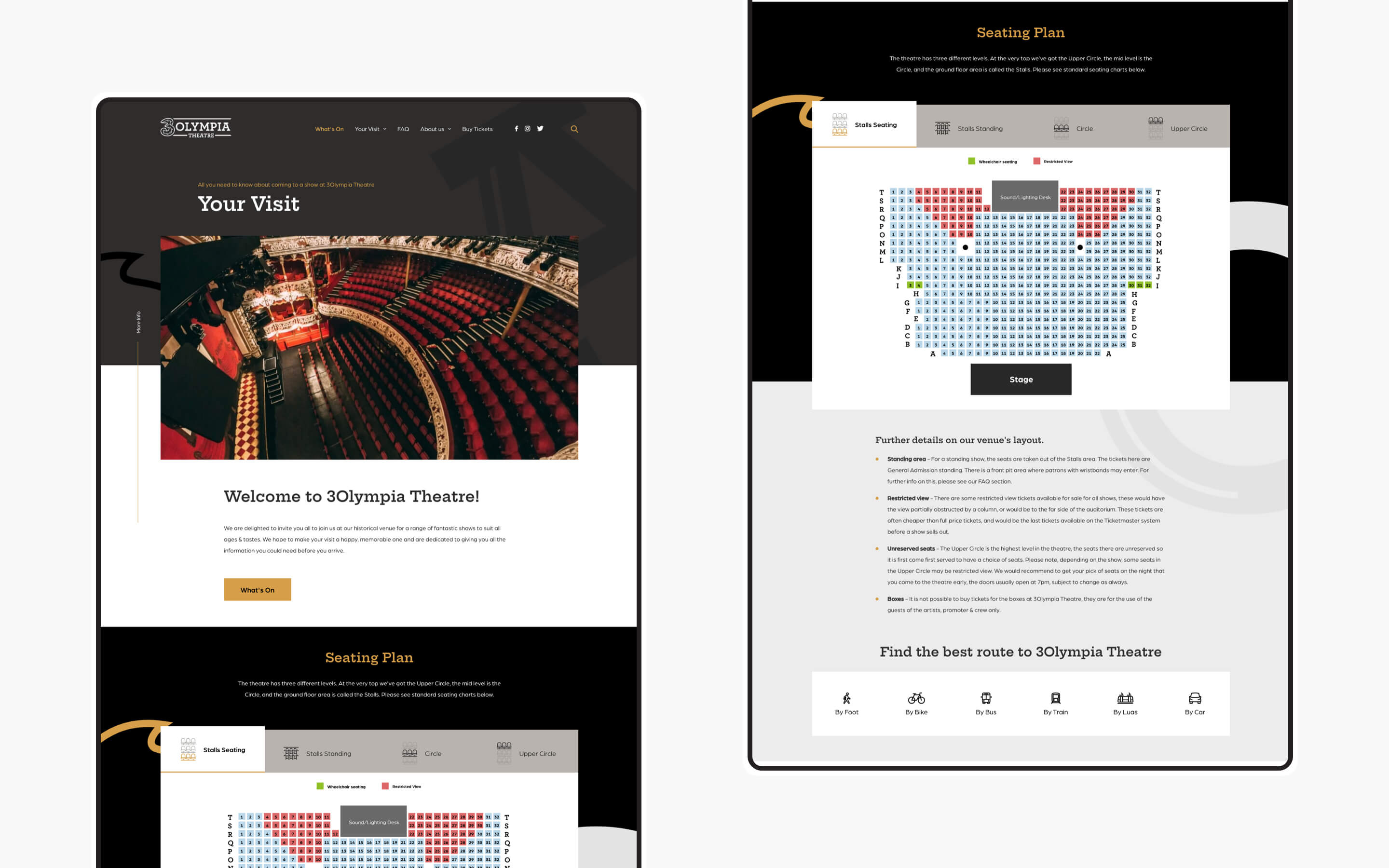
The new site was designed to act as both a sales tool and information hub that directs users to relevant content in as few clicks as possible. For instance, we designed clear CTAs that younger and older audience members alike could navigate. Such CTA’s were designed to guide users to admire, learn or purchase depending on their goal. Now, users who wish to learn about the significance of the venue are able to easily navigate toward areas of the site like the ‘Venue History’ page. Site visitors who seek information regarding calendars, showtimes, directions, or general queries are directed to helpful areas of the website such as the FAQ section and interactive venue map. Finally, users now have an easier journey from entering the site to purchasing tickets on Ticketmaster. The new site brings the audience exactly where they need to go – with plenty of time before the show begins.
Rebranding for a Three Ireland sponsorship
While crafting a site that illustrates the roots of the the venue, Kooba were also conscious of incorporating the recent Three sponsorship and rebrand into the design process. Specifically, a new typographic system was introduced to enhance the brand and create a user friendly, consistent visual language throughout the website. This new type system connects the audience’s attention to the right content, helping to simplify the user journey. Consistency in the branding served two purposes at once: refreshing the branding to reflect the sponsorship, and streamlining the lead generation process.
What we did
- UI / UX design and development
- Information architecture
- Content strategy and development
- CMS integration
- SEO analysis and implementation
The result
Informative, strategic & high-performing
Kooba's redesign of the 3Olympia website has been a complete success. 3Olympia members have expressed the ease at which they can access key FAQs, see upcoming shows, and purchase tickets. The 3Olympia operations team has seen a decrease in phone calls and emails regarding general inquiries since the site launch. The significant visual changes on the site have successfully presented information to various customer profiles, reducing operational costs and improving the attendee experience. 3Olympia’s online presence also underwent a massive brand change alongside their partnership with Three Ireland. Not only is the site informative and effective, but it is also high performing. Compared to the previous year, the site has seen an increase in sessions, users, page views, and pages per session. These metrics are a good indication that the new CTA and search systems are encouraging higher engagement and enabling more purchases.


