Overview
Reflecting Boyne Valley as a progressive market leader
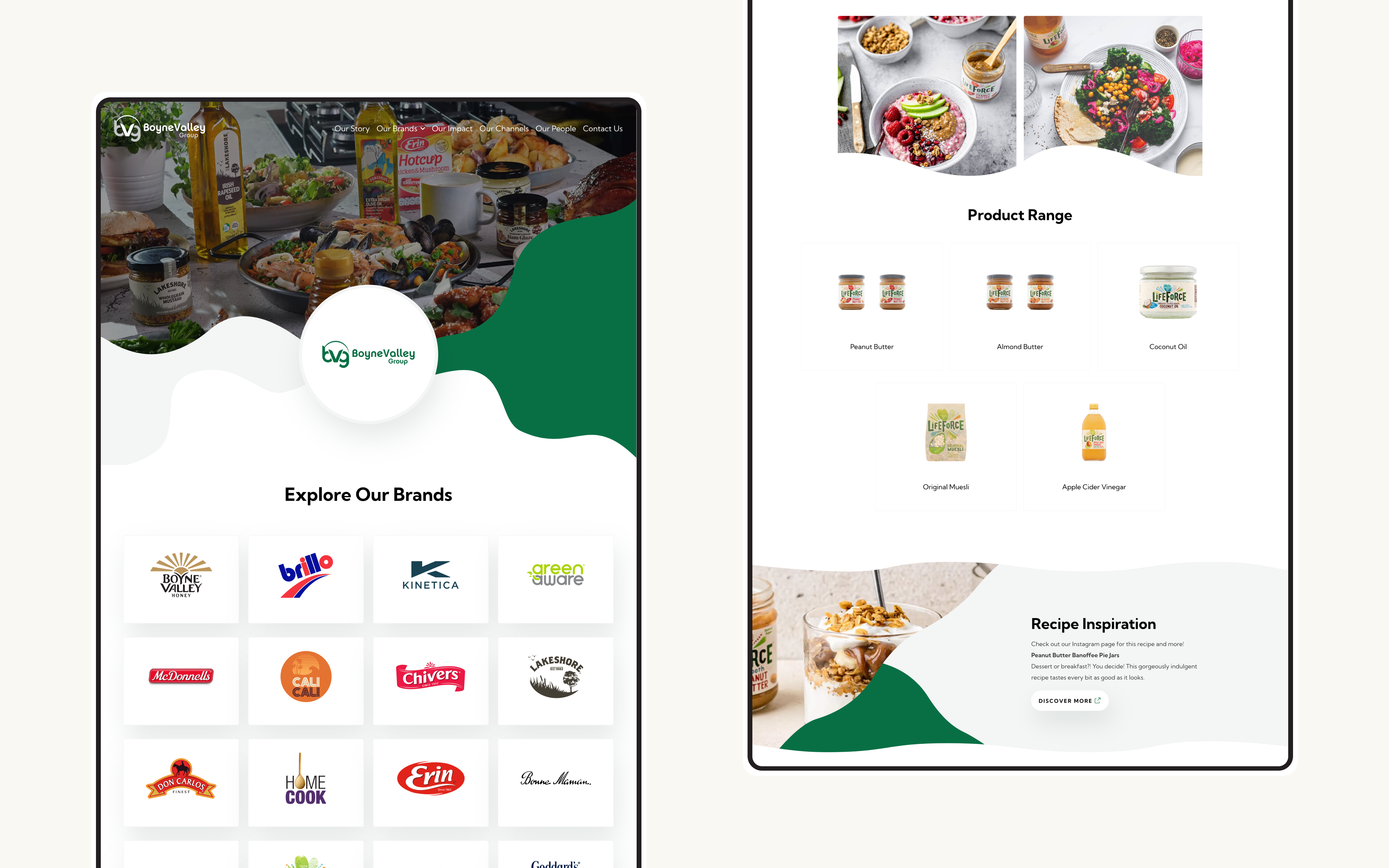
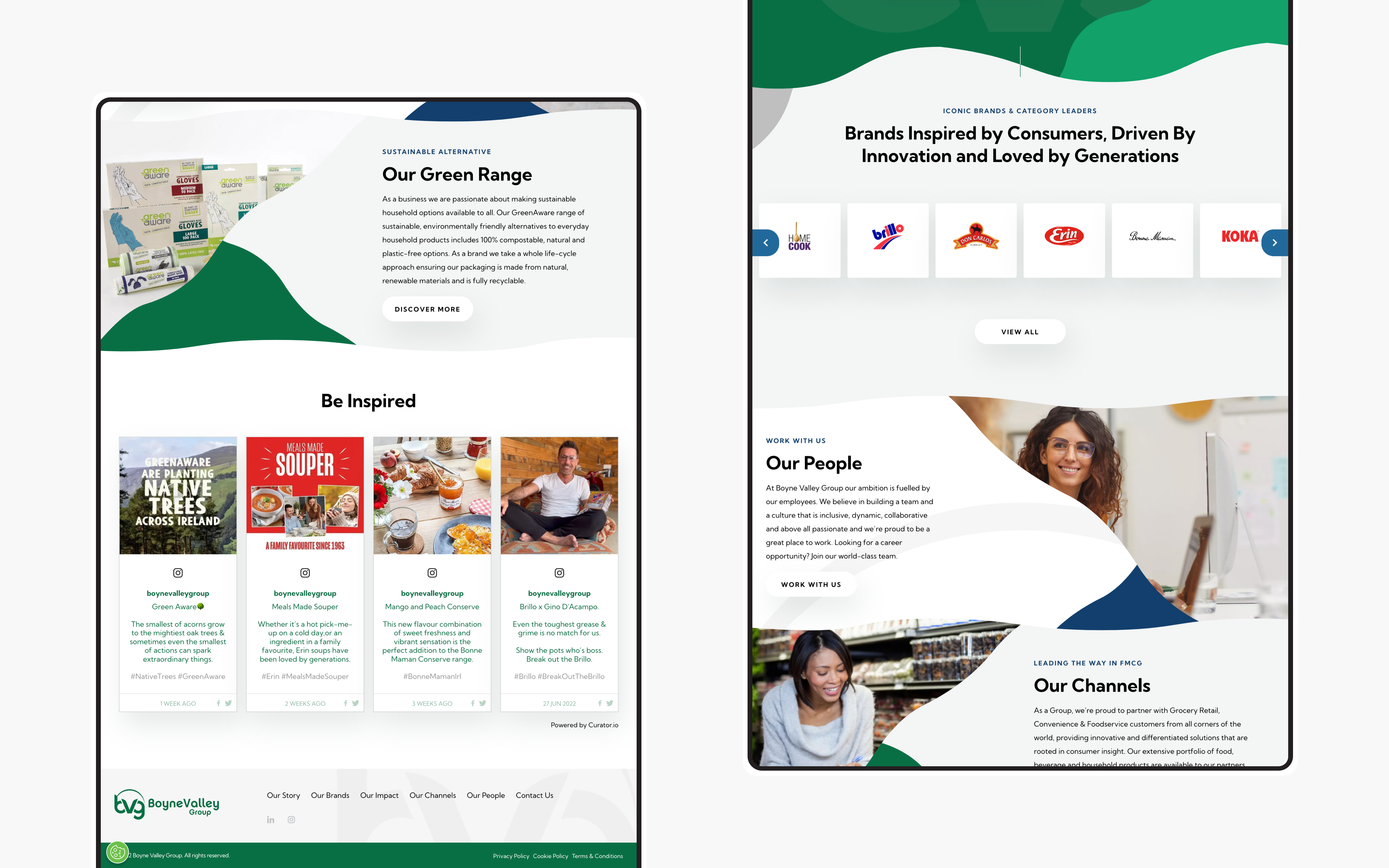
Boyne Valley Group is an extensive organisation that houses several international and well-known brands; their portfolio includes names such as McDonnells, Koka, Lifeforce and more. When Boyne Valley approached Kooba, the main aim of the project was to update their site completely so that the group itself was accurately reflected. We wanted to focus on bringing together and presenting their twenty marketing-leading brands coherently and consistently on a digital platform.
View the site
boynevalley.com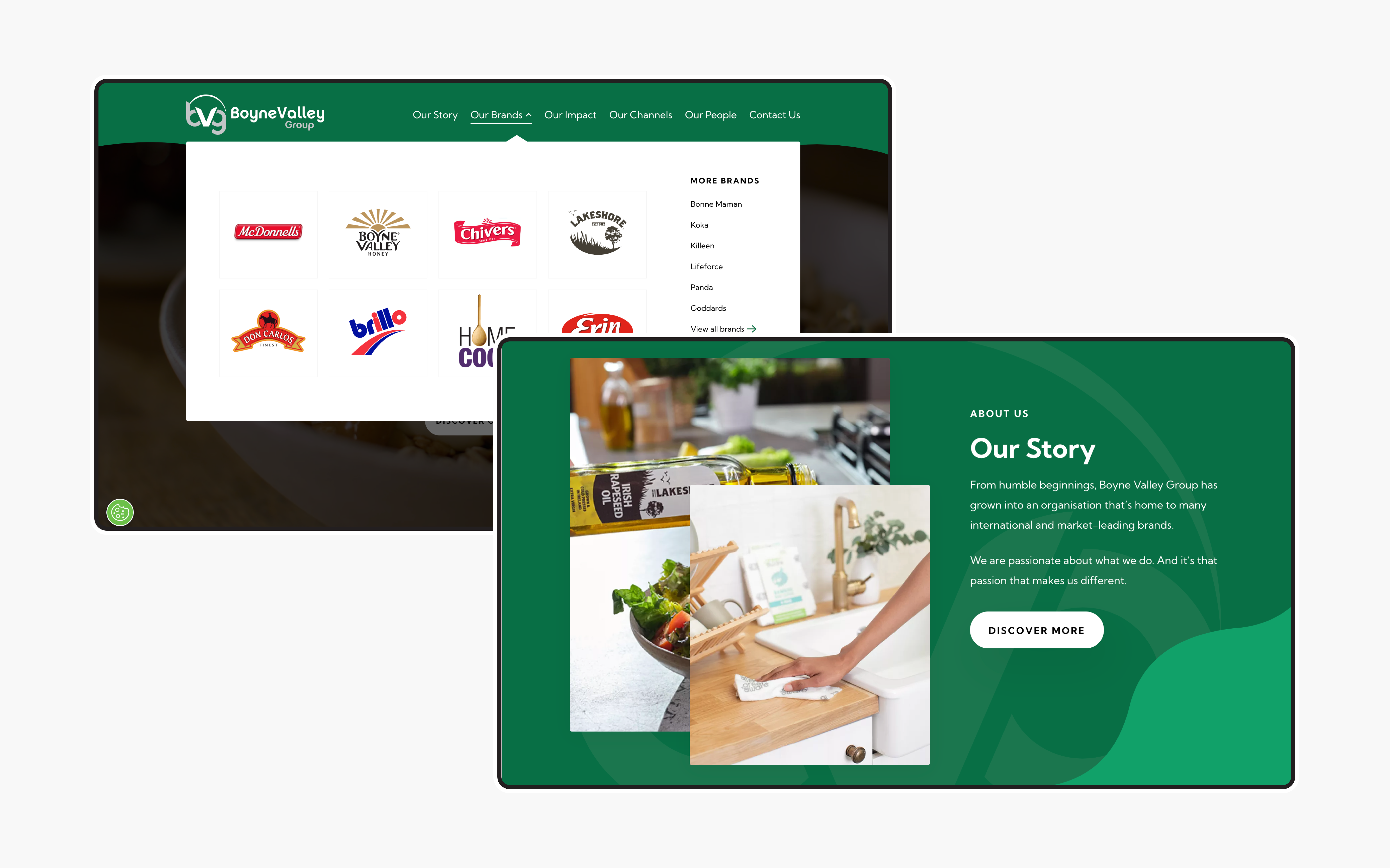
Upholding a valued reputation
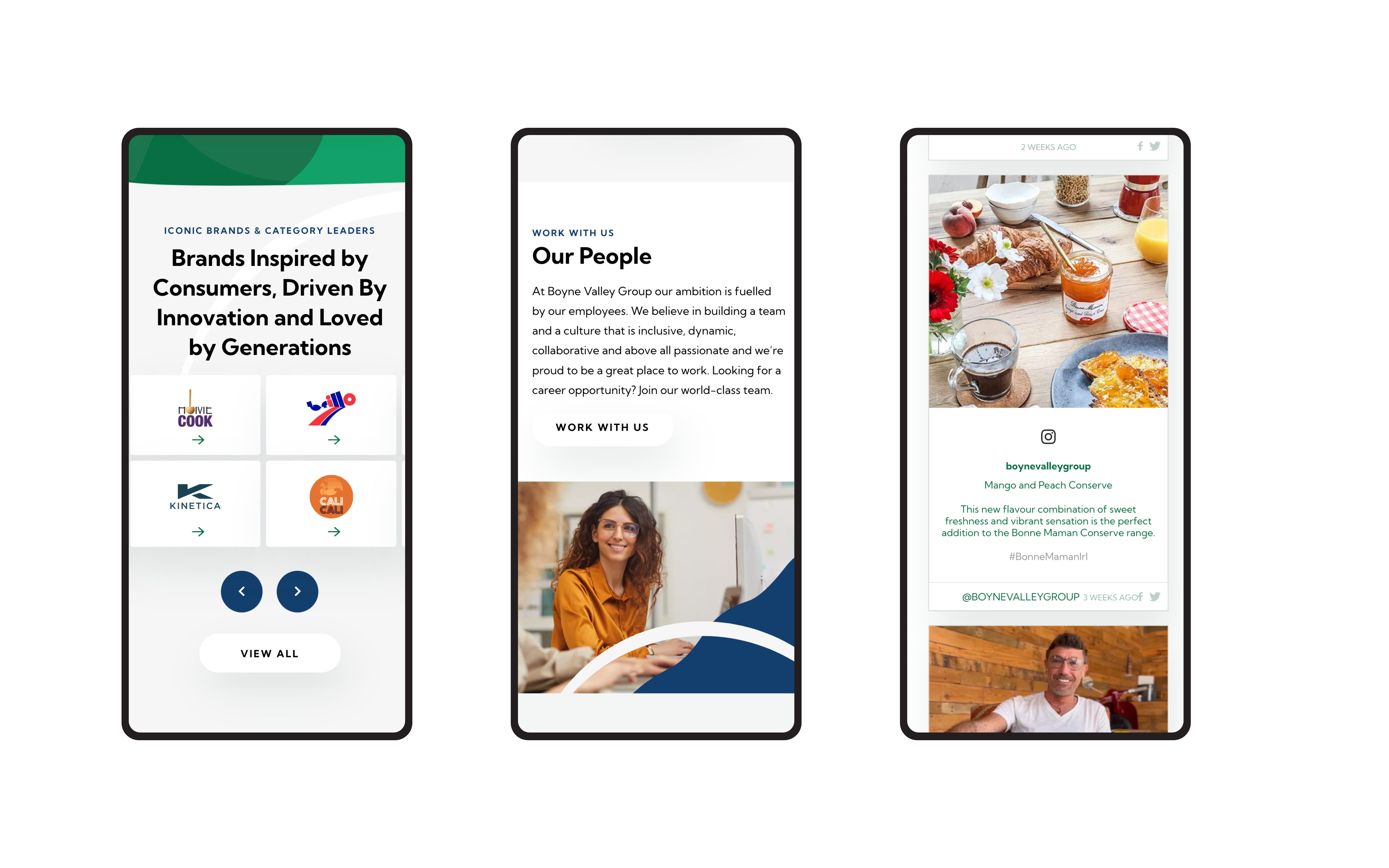
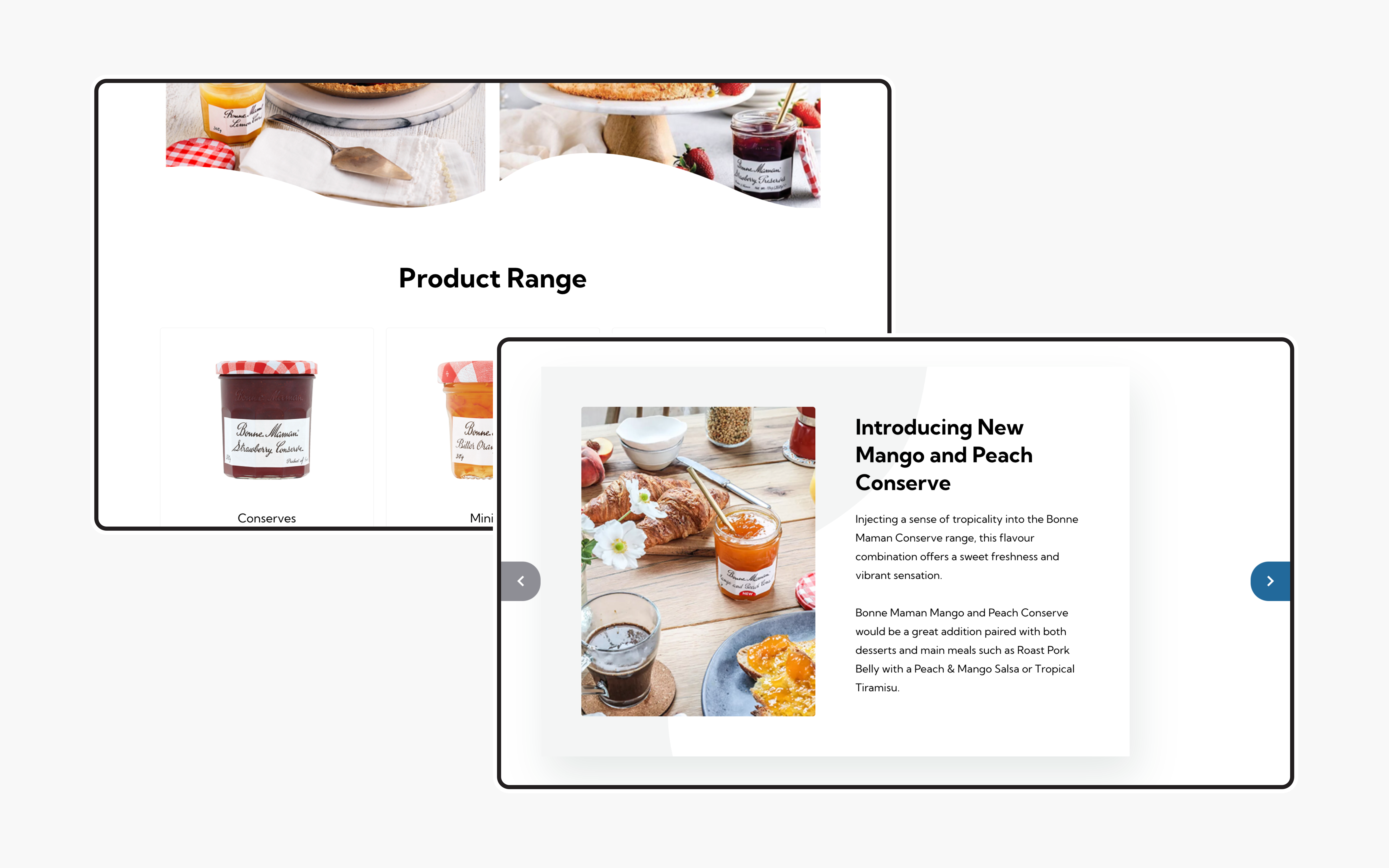
A central priority for Boyne Valley Group was to focus on potential new business partners. The new site portrays Boyne Valley Group as a trusted partner, a reliable foundation for grocery, convenience, foodservice, and international businesses. Given the reputation of Boyne Valley Group as a foundation in the industry, the site needed to reflect this dependability. We also ensured that the pages had been created with the brands in mind as to ensure they are displayed and represented effectively. For example, the logo of the brand is front and center when the user lands on an individual detail page. From then on, the graphical shapes, colour and imagery have been specifically designed with that brand in mind.
A new spin on brand recognition
The food industry itself is extremely brand oriented and rooted in interaction, the site had to reflect these characteristics. The food selection and consumption experience for the industry and the consumer are both deeply rooted in identifying with brands; this means the site had to highlight the brands in such a way where site visitors would resonate with their favourite brands in a similar way. Additionally, food is an extremely immersive experience from shopping to cooking to sharing a meal. We understood that the Boyne Valley Group site had to reflect that same sense of interaction and immersion by building an engaging online experience.
Molding the user journey
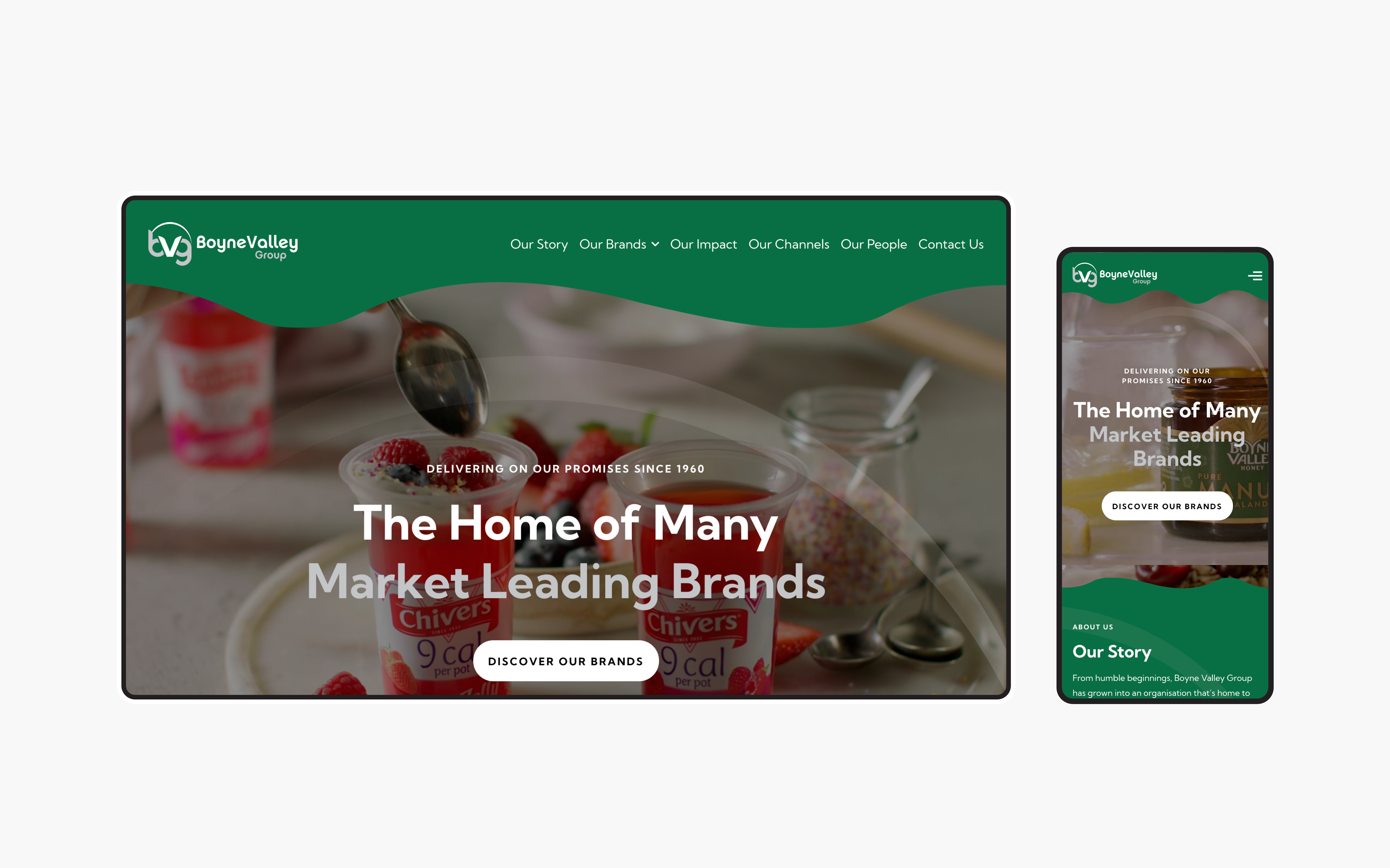
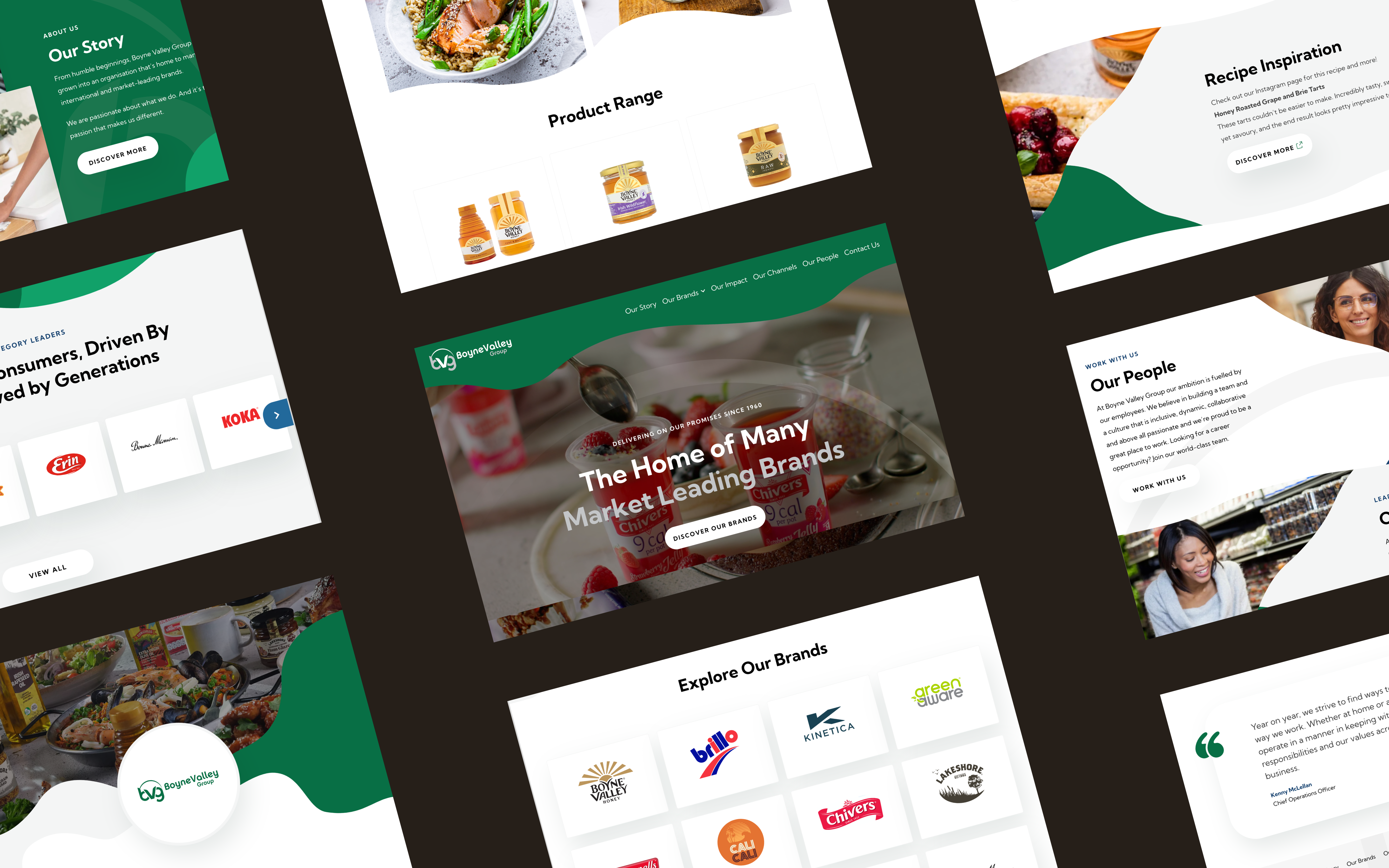
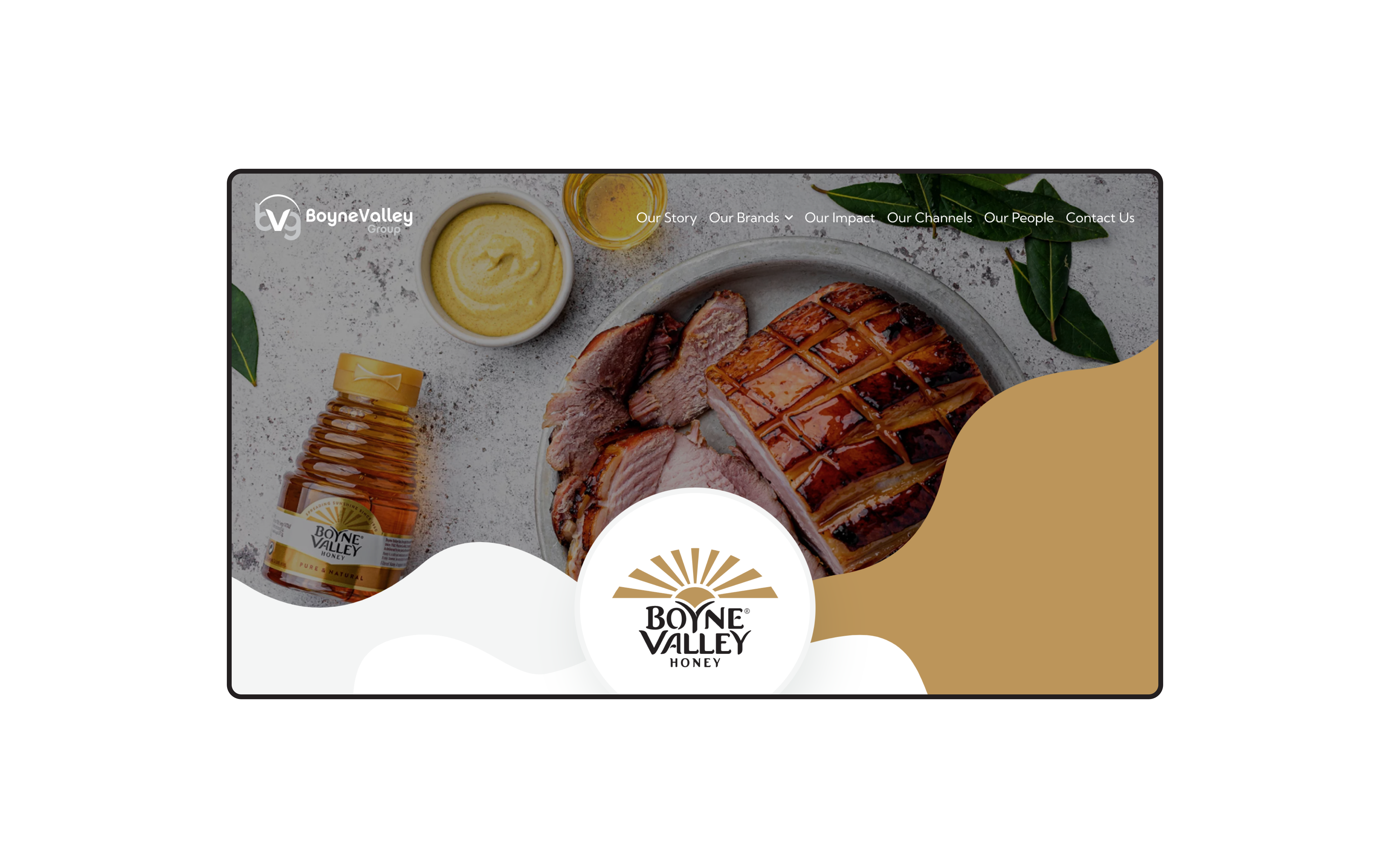
Along with these key organisational, we also focused on immensely improving the overall user’s experience while interacting with the website, to ensure that the journey was as seamless as possible. From a design point of view, the website provides a fully immersive and engaging experience to the user. For example, the homepage banner experiments with the combination of the graphical shapes relating to the brand graphics and video. In doing so, the banner catches the eye of the user on their first visit and provides a memorable first impression. Other elements that promote a more interactive and engaging user experience include the individual hover states such as call-to-action buttons but also the experimental shape play with the brand graphics combined with imagery relating to individual modules on the site.
What we did
- UI / UX design and development
- Information architecture
- Content strategy and development
- CMS integration
- SEO analysis and implementation
The result
A digital reflection of a forward-thinking, innovative, entrepreneurial and a market led group
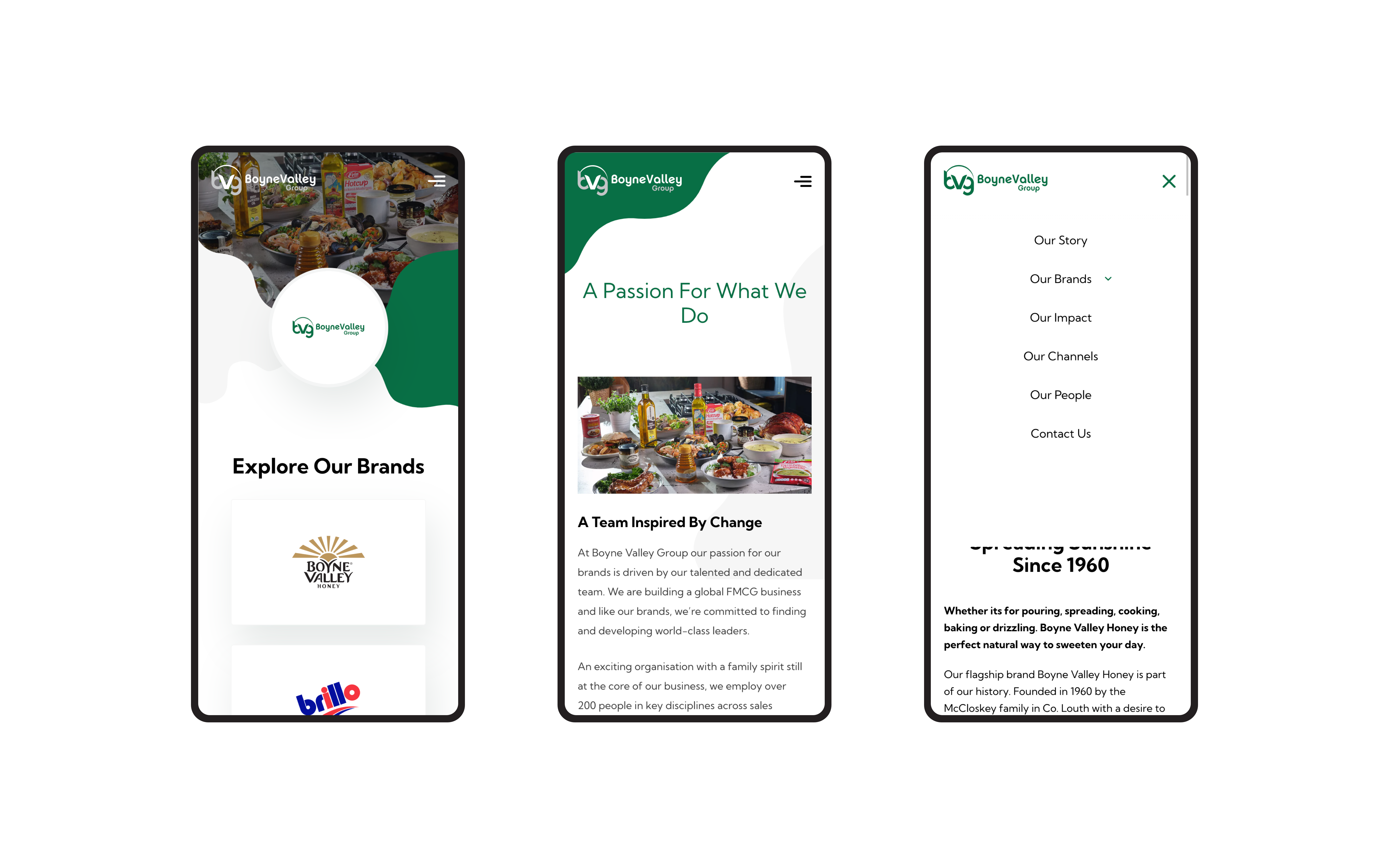
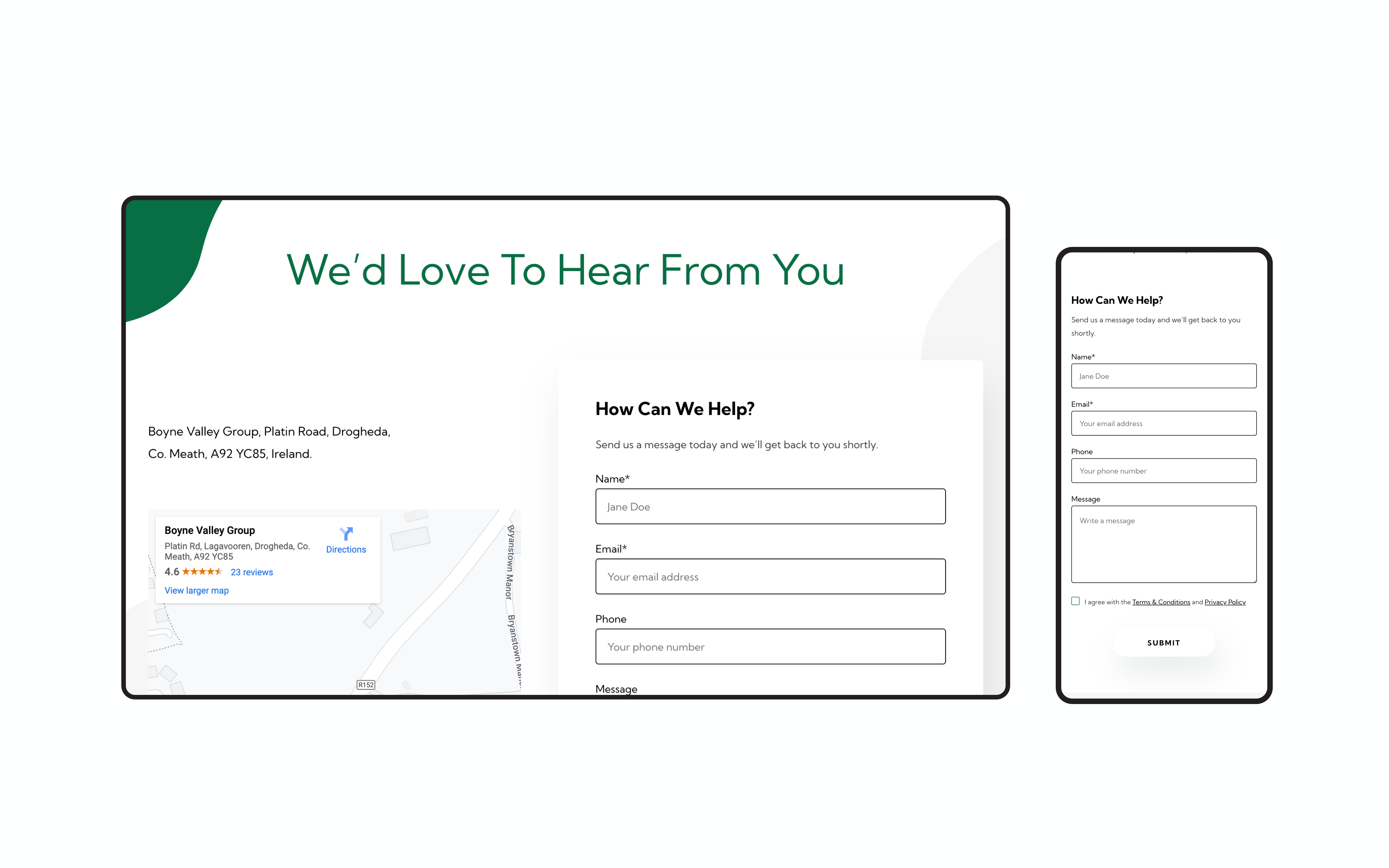
Since going live, the site has seen significant results. For one, overall performance ratings have increased relating to Google pagespeed insights. We are delighted to see pagespeed increase despite the influx and diversity of content types on the new site. The different content types are not only supported from a visual standpoint, but also from a functional, internal standpoint within the CMS. The content responsiveness has been heavily improved upon, and the website is now fully compatible on all devices. The site also offers improved user experience and interactivity compared to the old site, specifically with the addition of a consistent and clear call-to-action system complete with hover states


