Overview
The transformation of Cash & Carry Kitchens
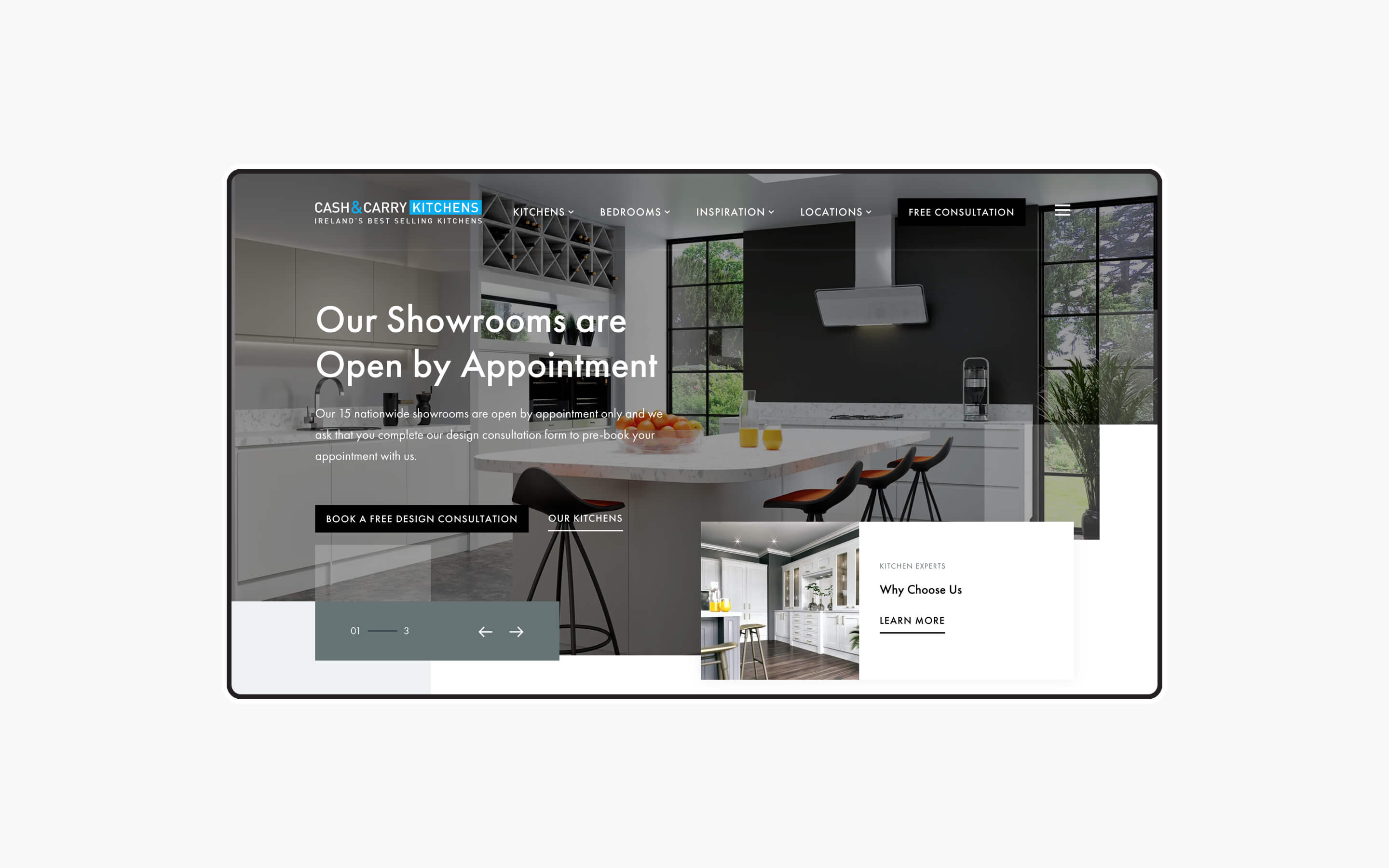
Cash & Carry Kitchens was founded in Cork over 40 years ago with a simple idea: to make beautiful kitchens and bedrooms affordable for families in Ireland. Kooba took their online presence to the next level with a complete digital transformation, with a focus on better informing and converting Cash & Carry's audience.
View the site
cashandcarrykitchens.ieGoal completions
Goal conversation rate
Our strategy
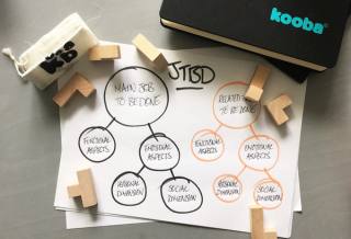
Kooba began our redesign by collaborating with stakeholders at Cash & Carry Kitchens to identify the KPIs of the project. Ultimately, two central aims were agreed upon. Firstly, the website was tasked with driving more high-quality leads. Secondly, the site's interactive online experience needed reflects the status and position of Cash & Carry Kitchens within the market.
Kooba wanted the site to resonate with Cash & Carry’s target audience and showcase their stunning work for potential customers, all while funneling users to the right information from the moment they landed on the site. We also wanted to ensure the site told a story to the user reflecting Cash & Carry’s established brand presence, company heritage, and 40+ years of experience in their core business as kitchen experts.
Driving conversions
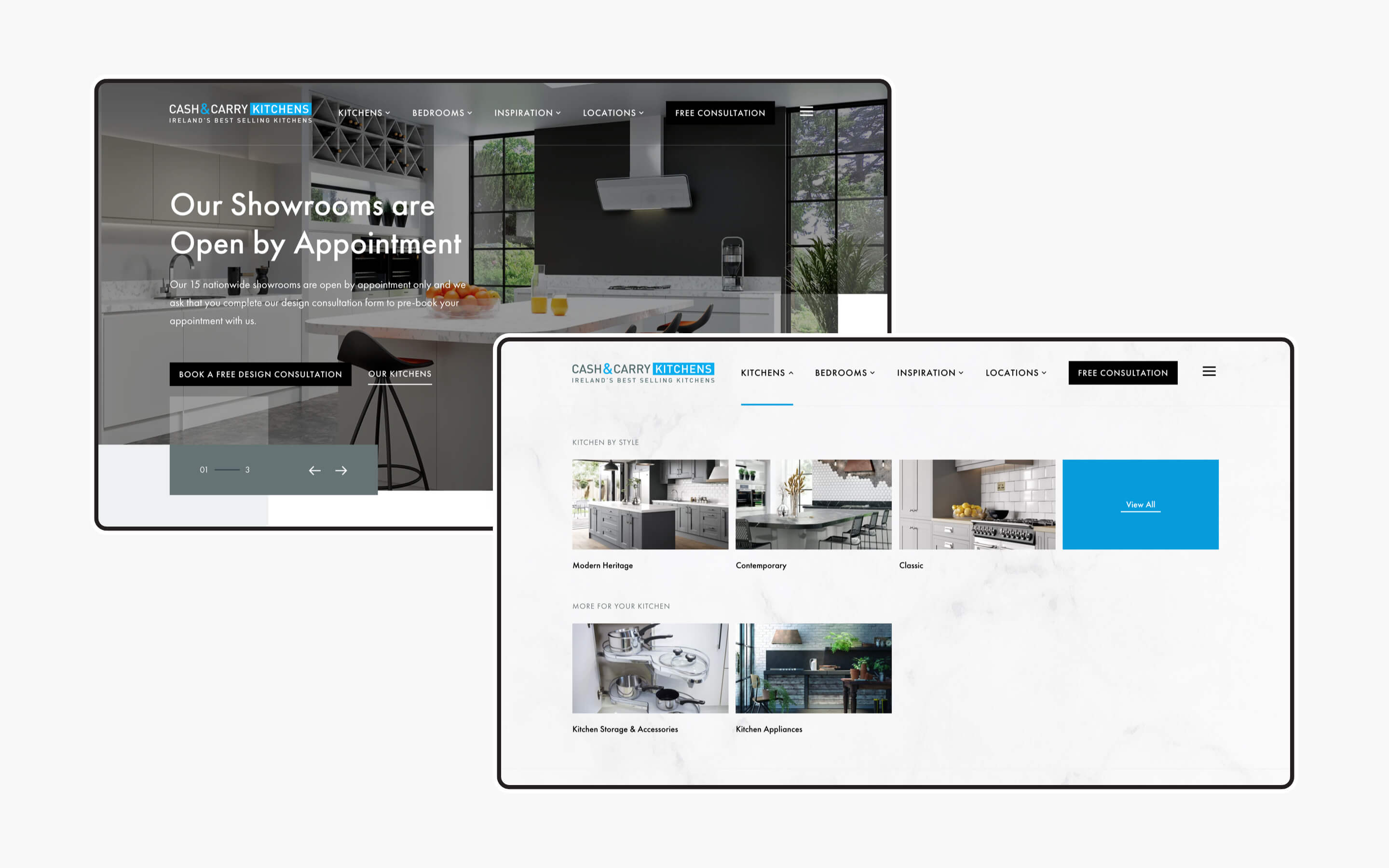
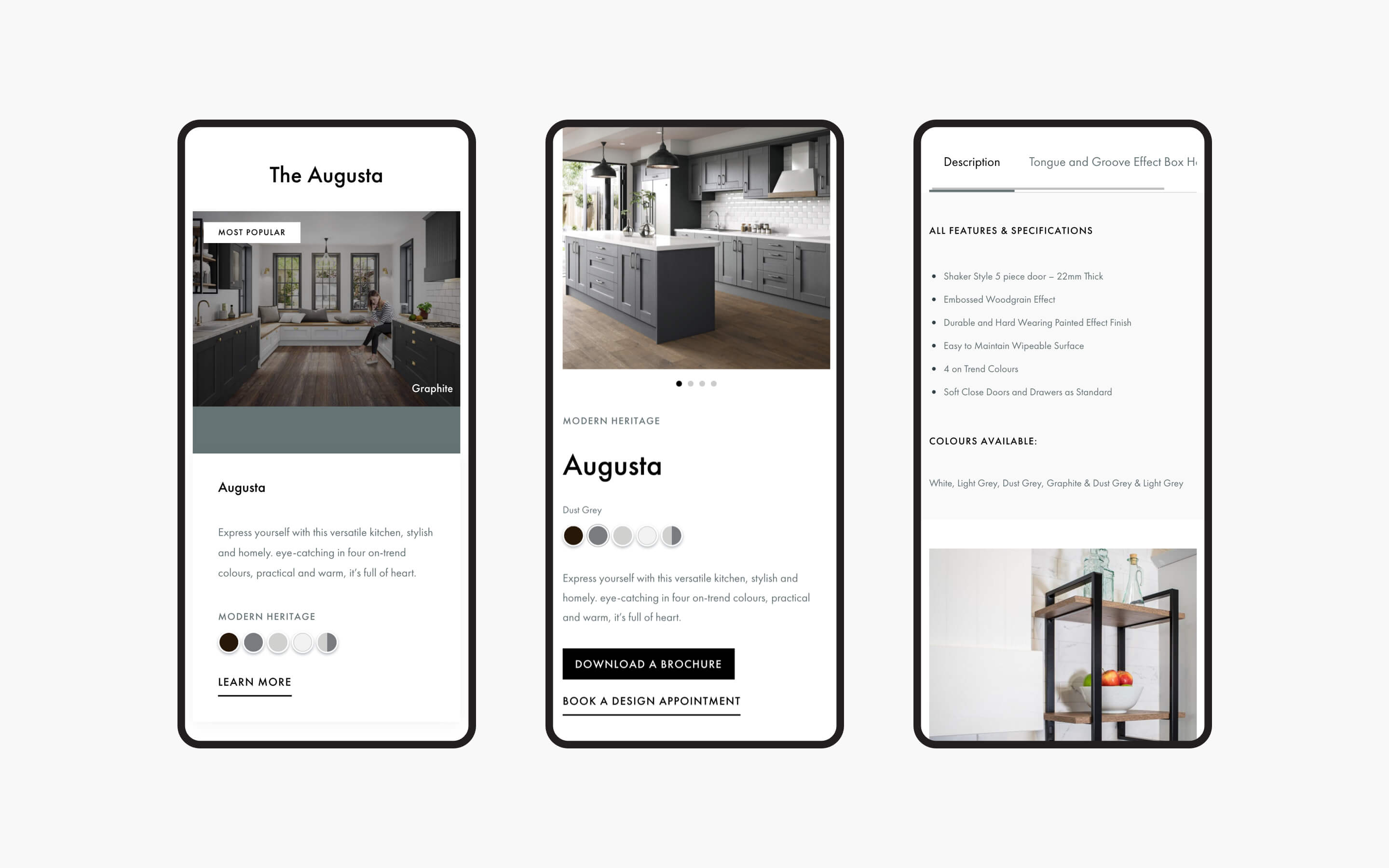
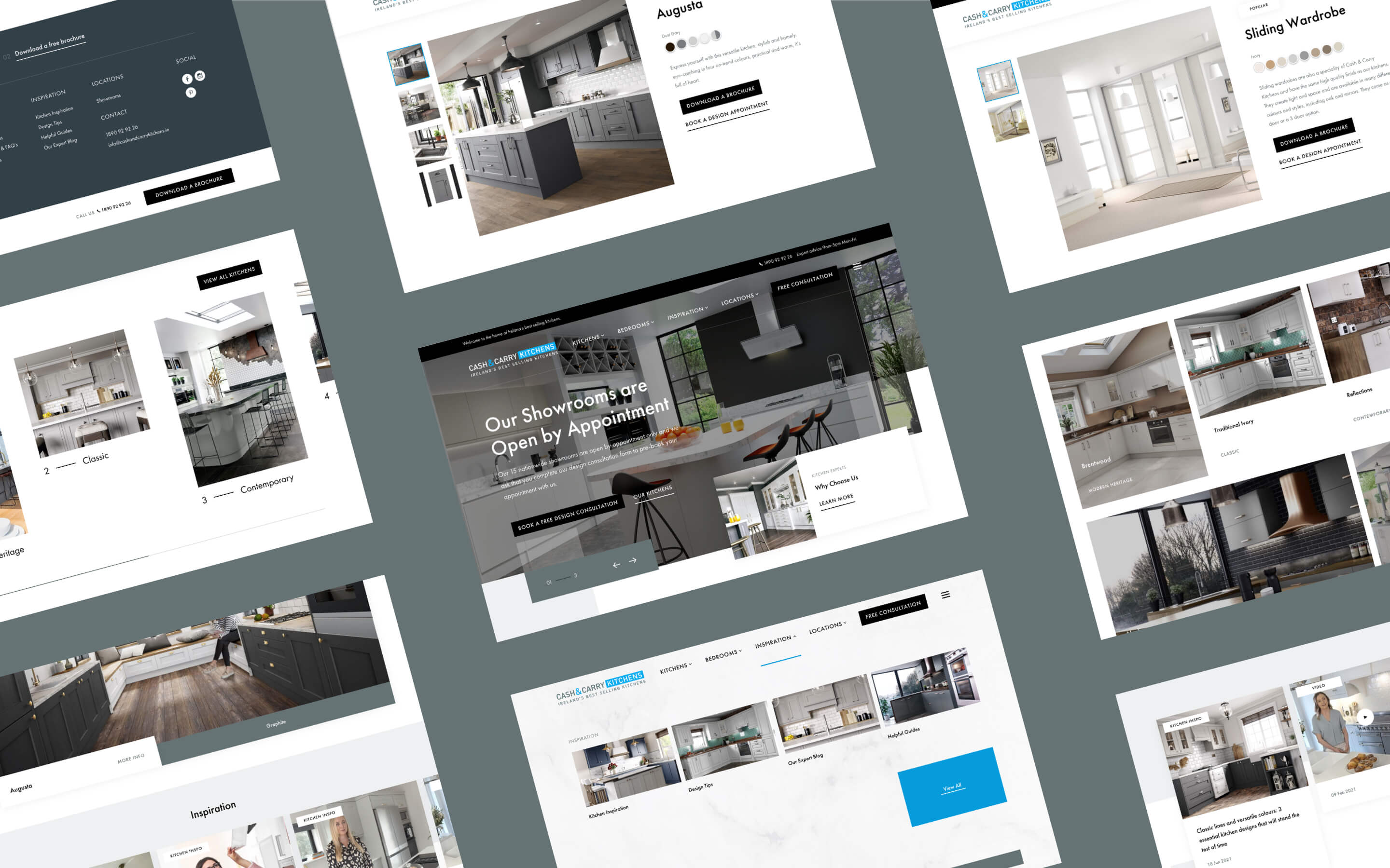
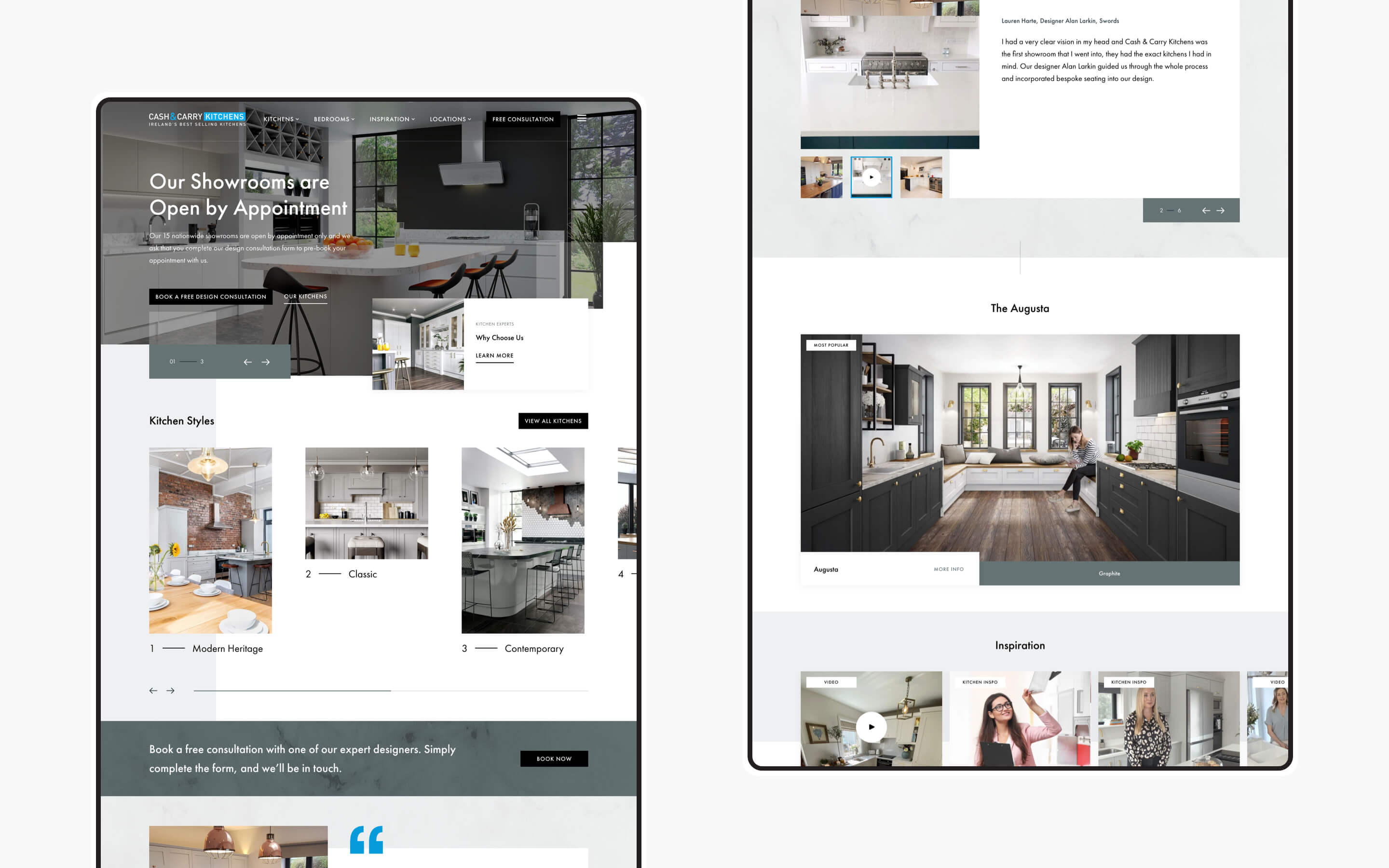
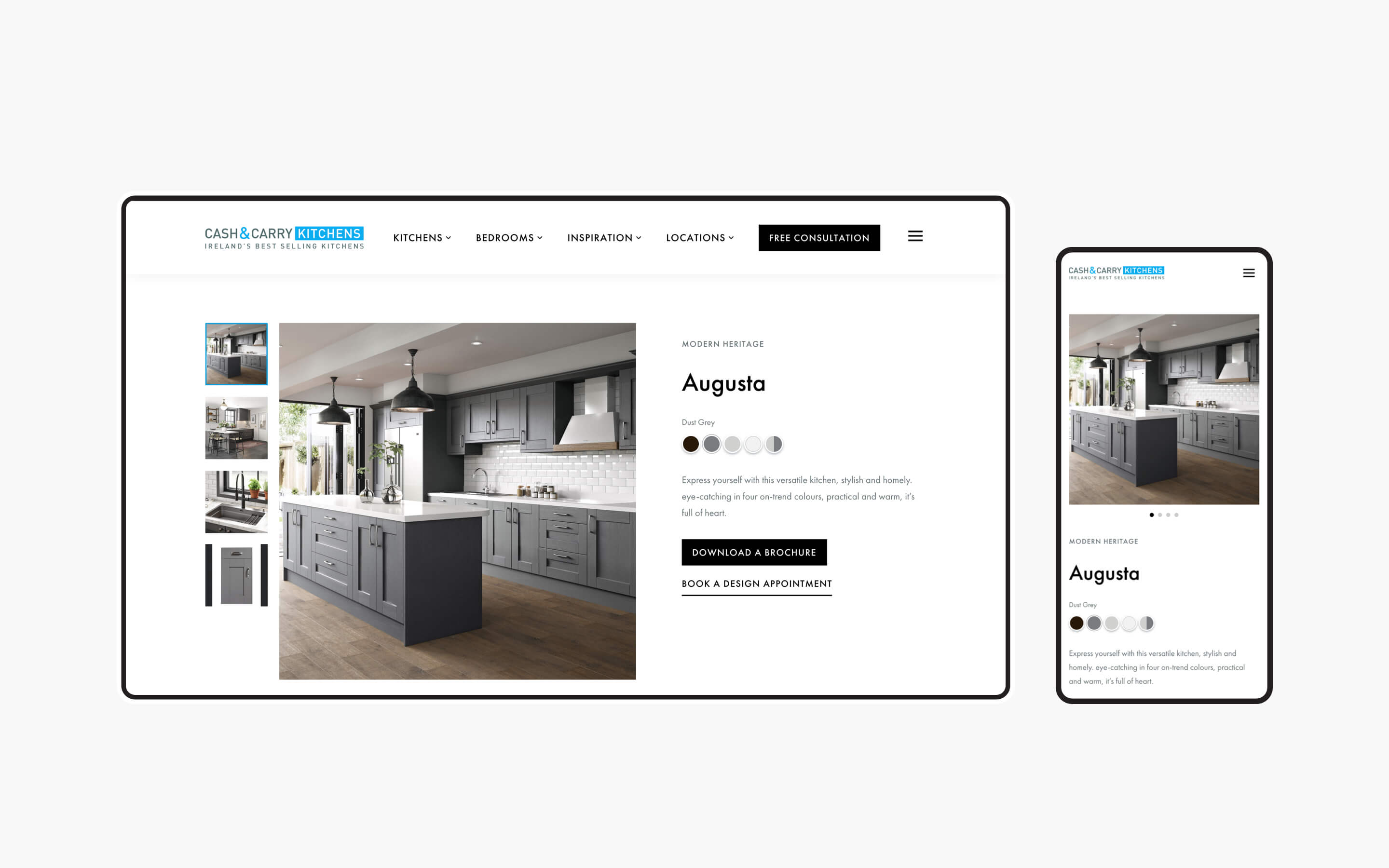
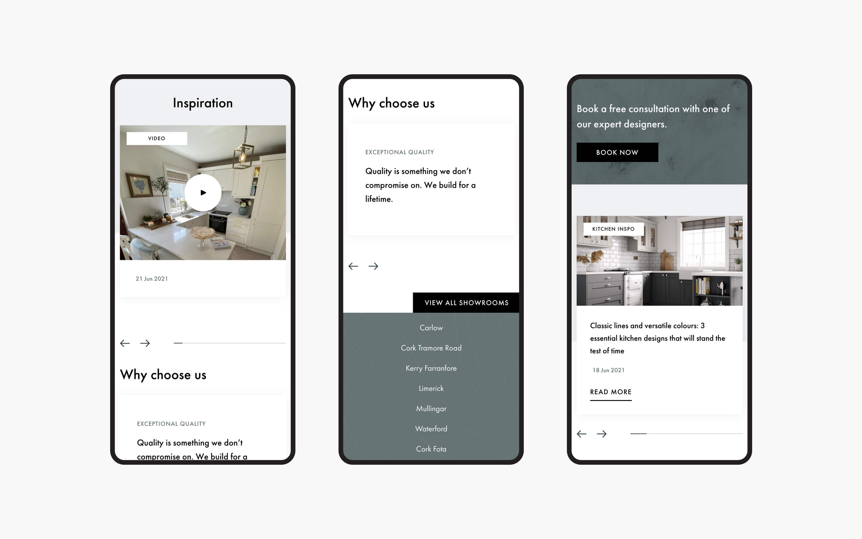
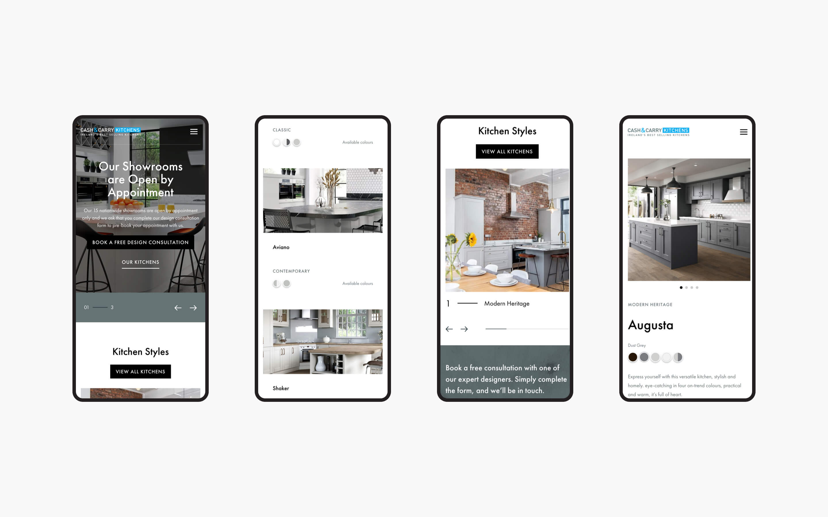
Given the target of increasing the conversion rate of customers on the site, Kooba needed to build a UX that reflected the needs of Cash & Carry’s clientele. Following an initial UX audit, several improvements were made by Kooba’s design team. Firstly, a prominent call to action (CTA) was featured on the homepage, inviting users to avail of a free consultation from Cash and Carry’s team. Secondly, card sorting workshops and user testing revealed the importance of clearly displaying Cash & Carry’s products in the header. By adding “Kitchens” and “Bedrooms” as pages, users could quickly find what they needed. This was further reinforced by the inclusion of imagery for each room offered, which helped display the quality and variety of Cash & Carry’s product range. These data-driven UX adjustments helped drive a significant increase in both lead generation and the website’s conversion rate.
What we did
- UI / UX design and development
- Information architecture
- CMS integration
- SEO analysis and implementation
The result
Bringing conversion to the forefront
Kooba built a comprehensive solution for Cash & Carry Kitchens, serving to drive an increase in inbound traffic through an improved information architecture and the strategic use of CTAs. This was accomplished alongside an attractive presentation of Cash & Carry’s brand, and the seamless integration of imagery across the website. The end result is a beautiful, data-driven, and effective website, which powers the business development of Cash and Carry Kitchens.


