Overview
Flipdish needed a revamped digital presence that conveyed their industry-leading position
We began the project with a careful needs analysis & planning process, working with internal stakeholders and site users to understand motivations and common customer journeys. Aligning this discovery & planning phase with the real-world commercial objectives that Flipdish had clearly stated was key to driving our strategy: it helped establish clear KPIs and conversion rates that would drive every design and development decision we would make as a team.
View the site
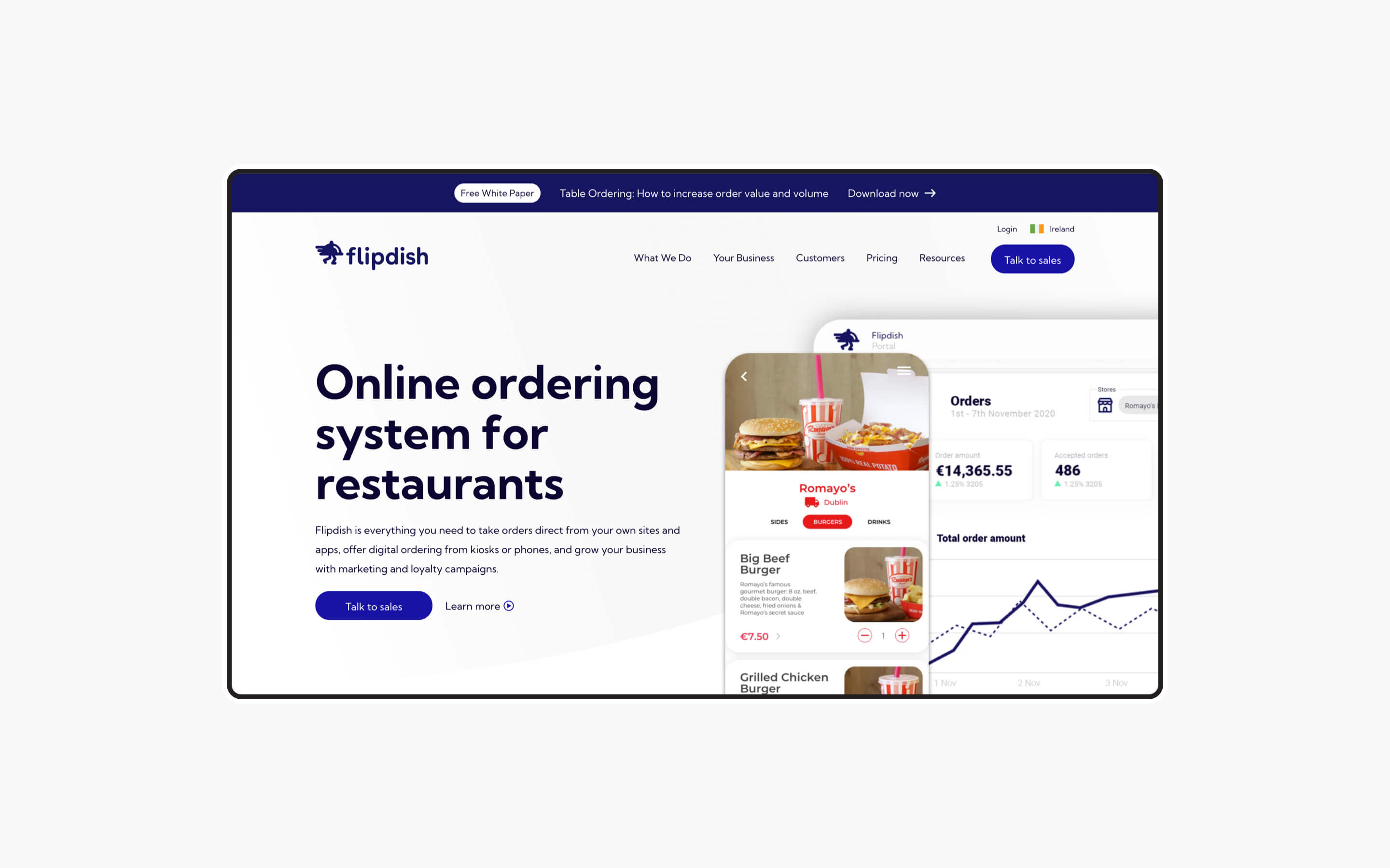
flipdish.com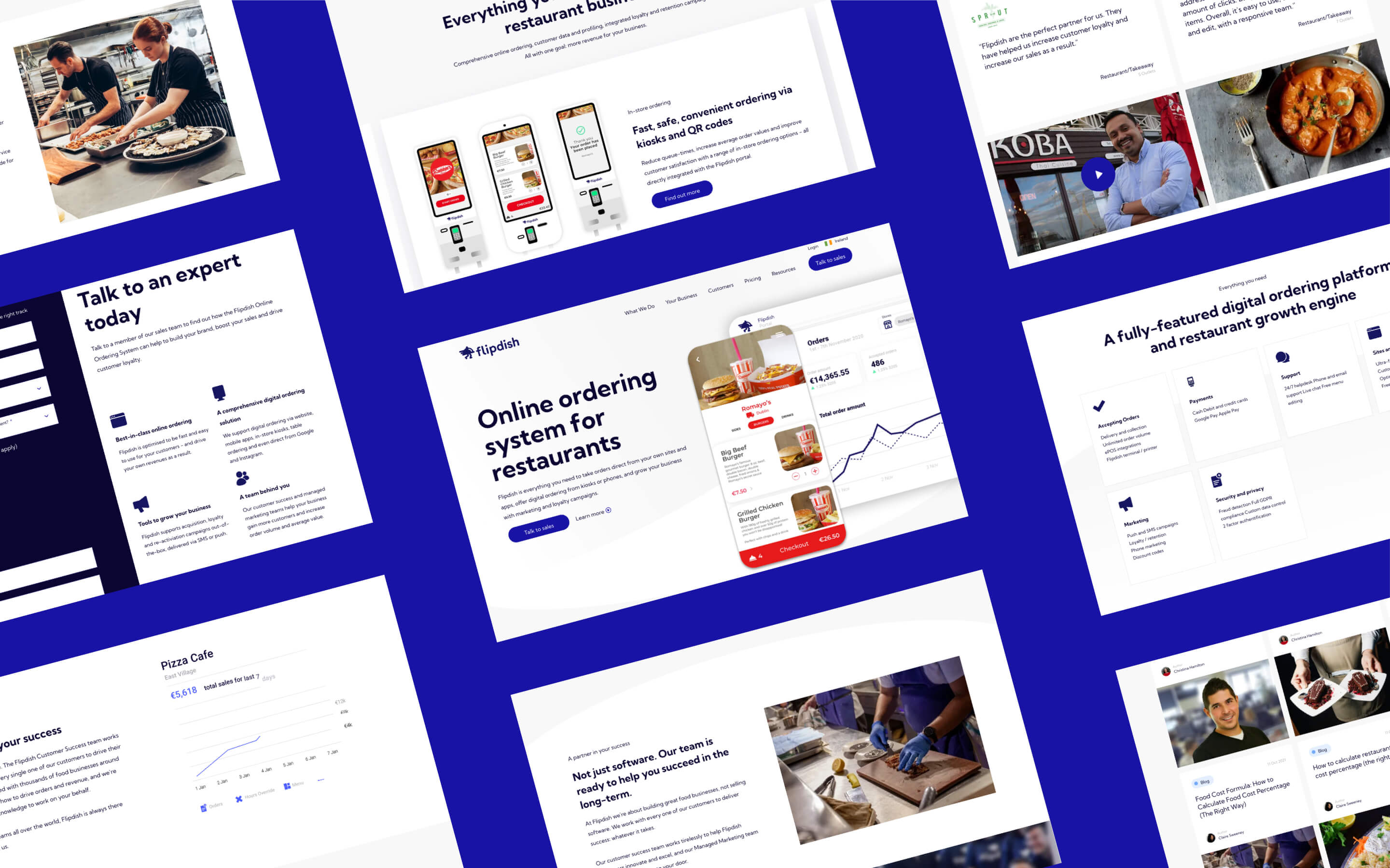
Capturing a software solution digitally
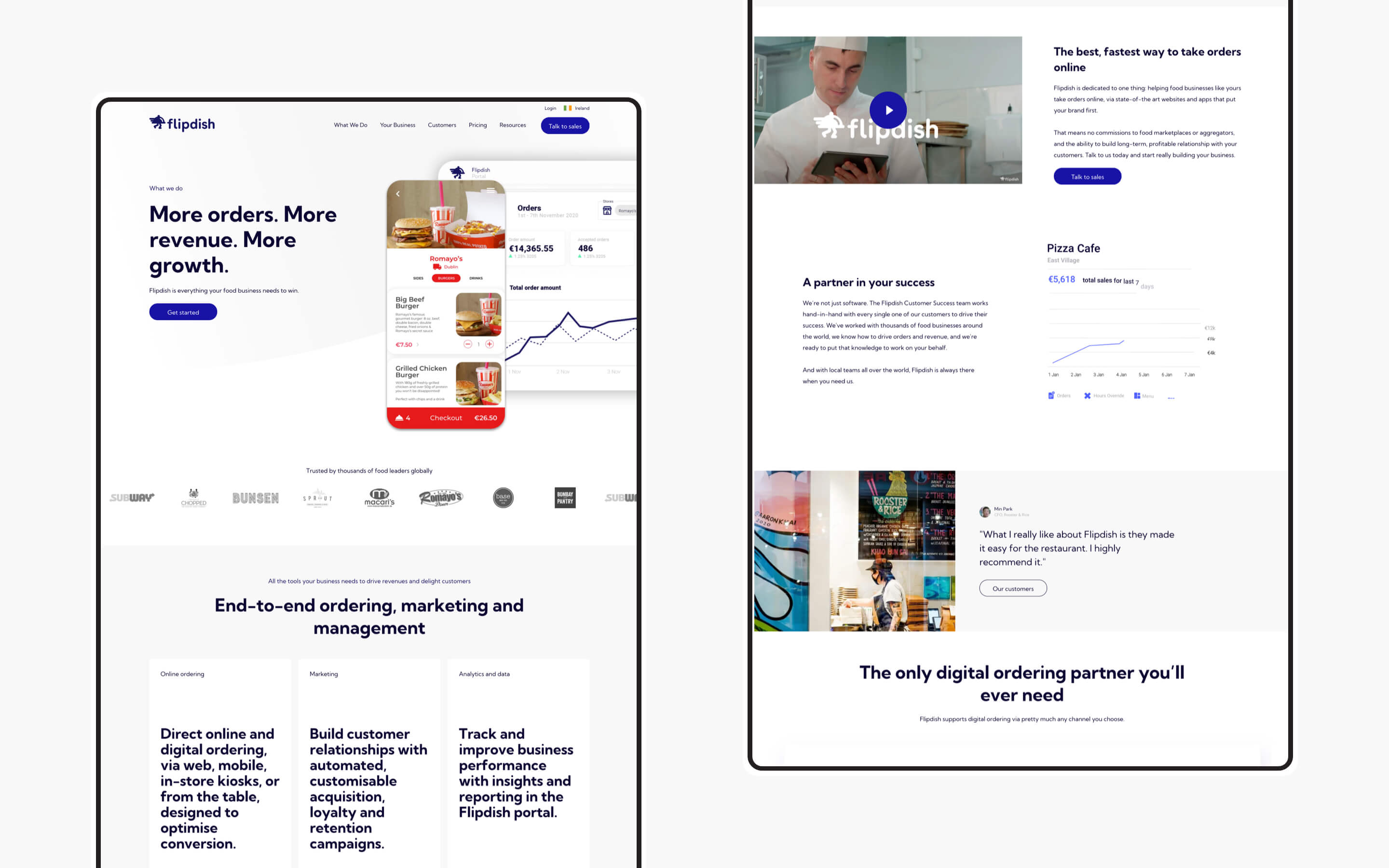
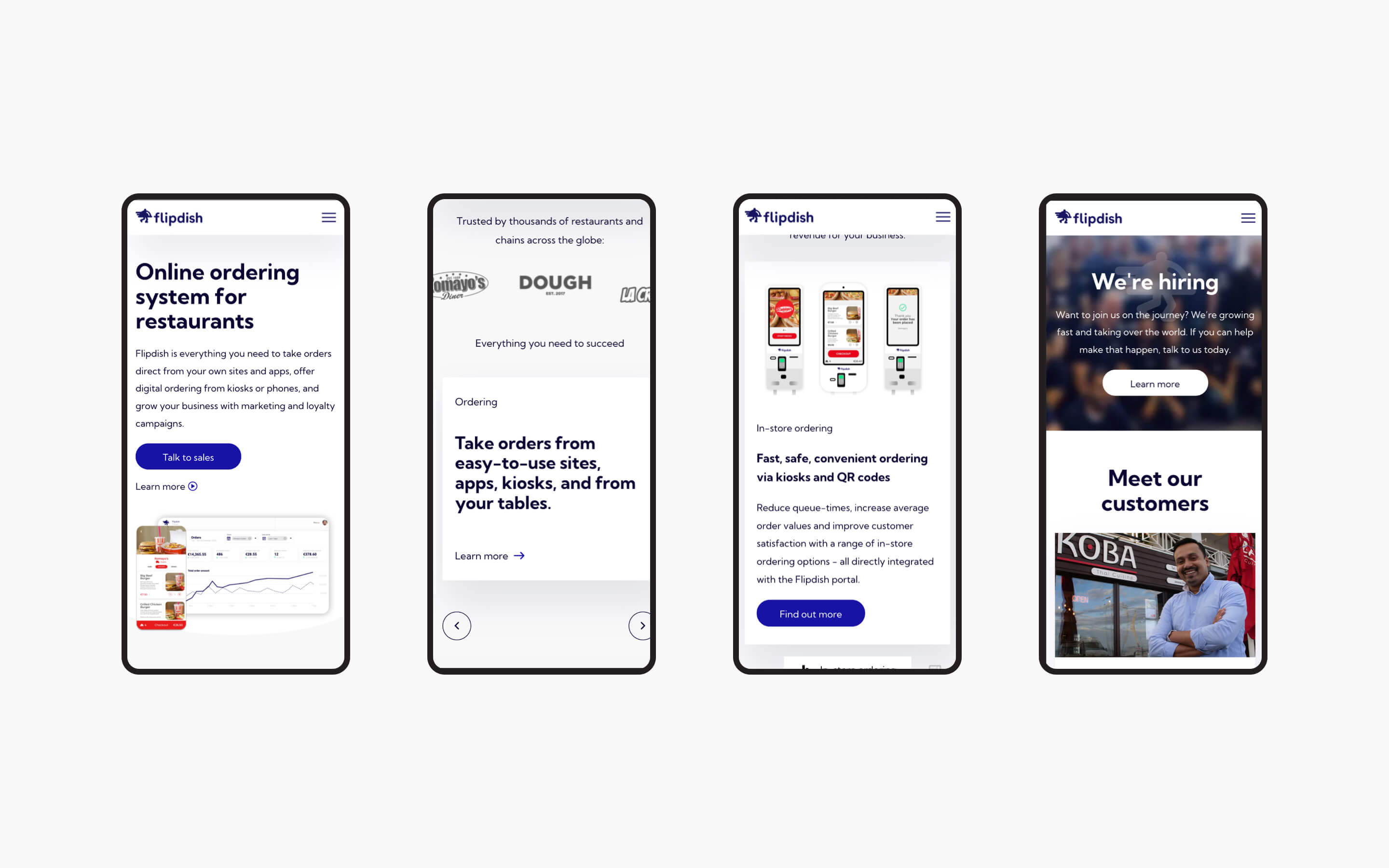
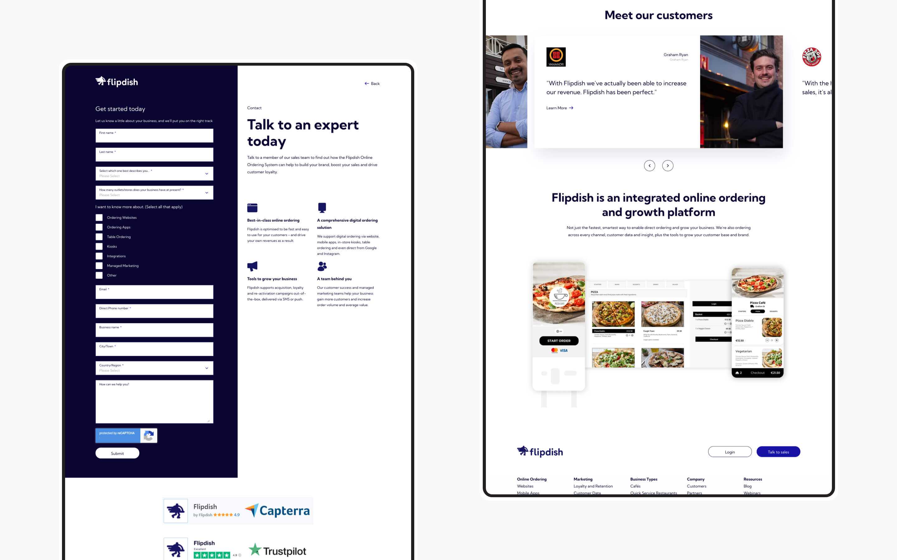
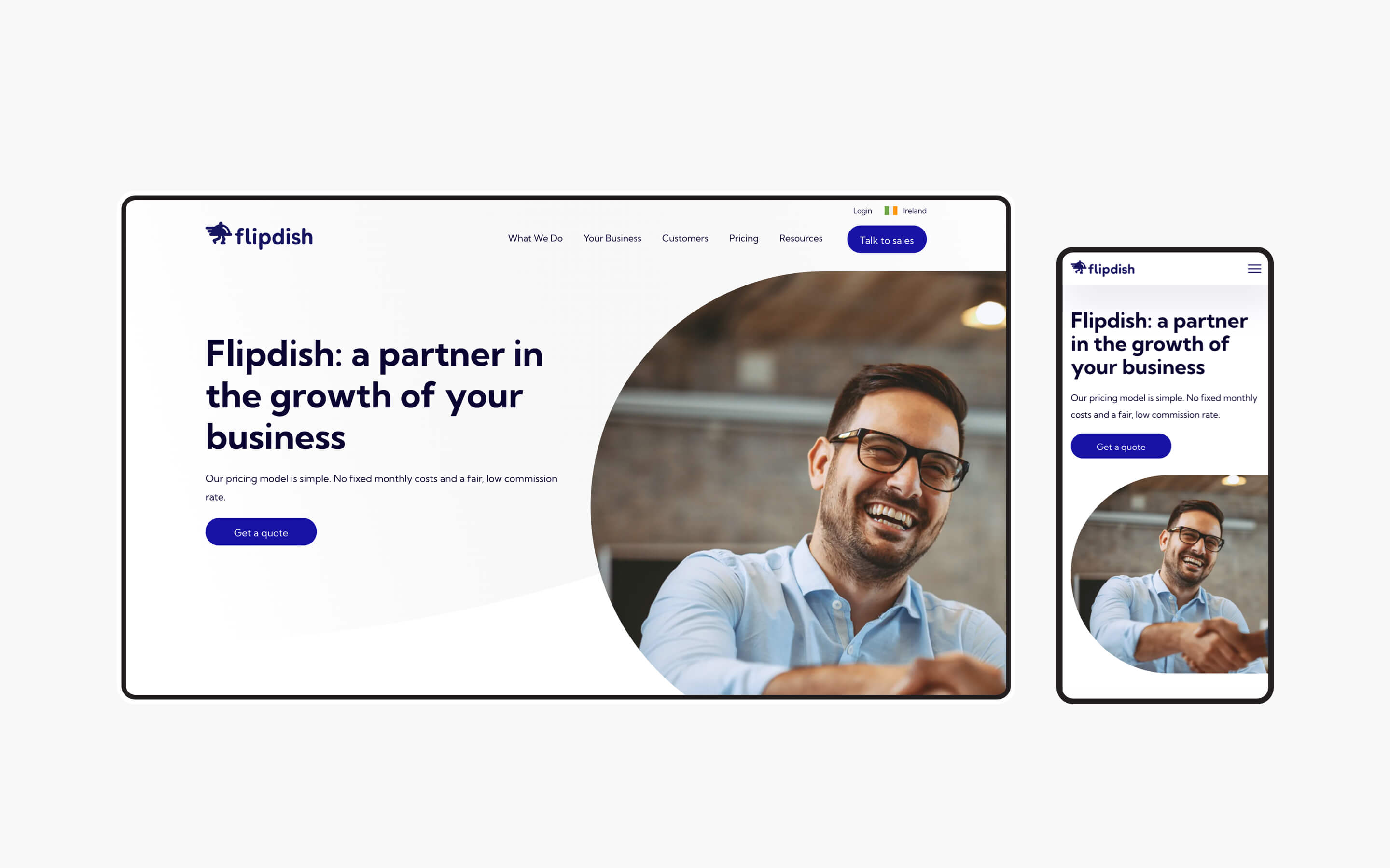
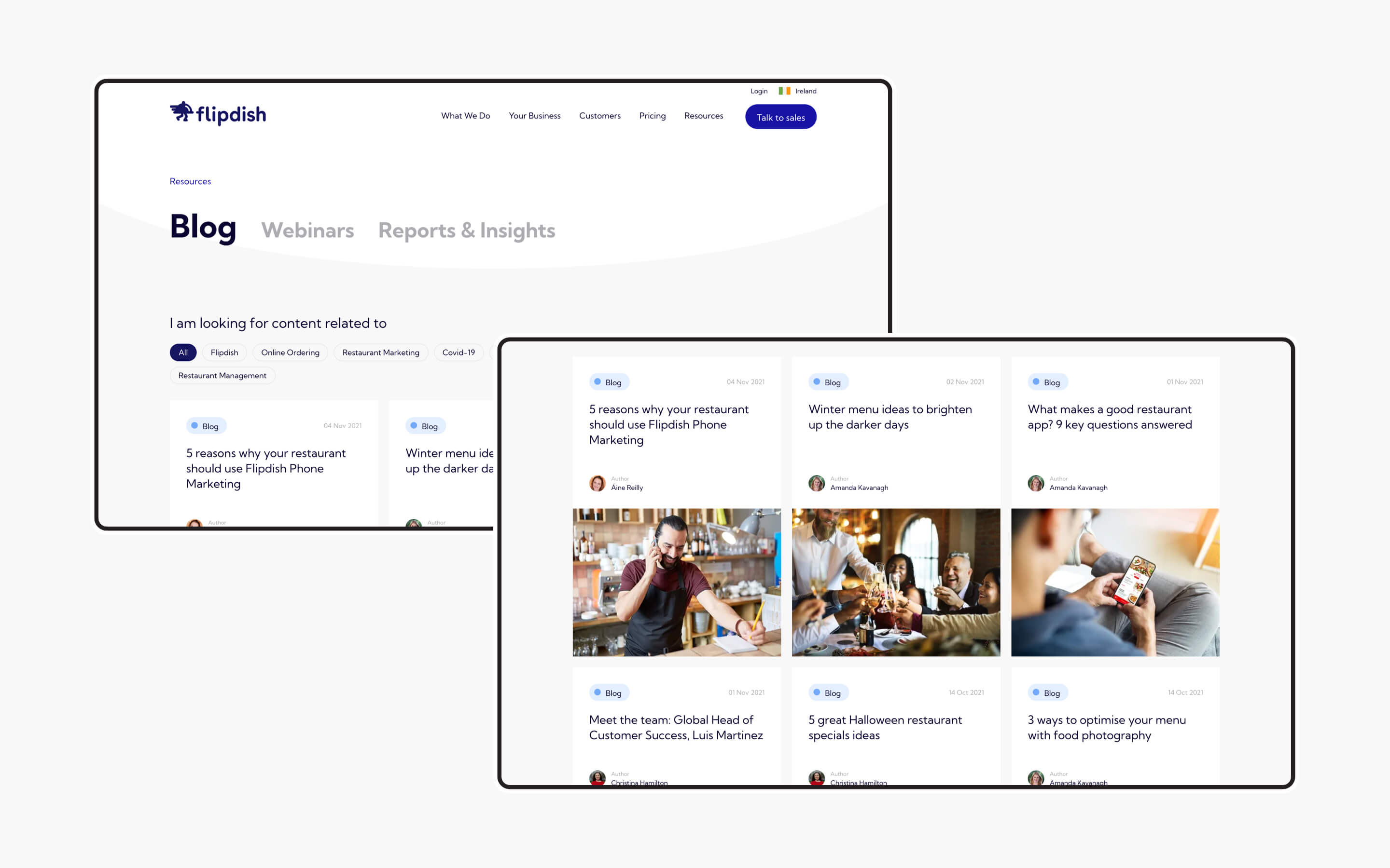
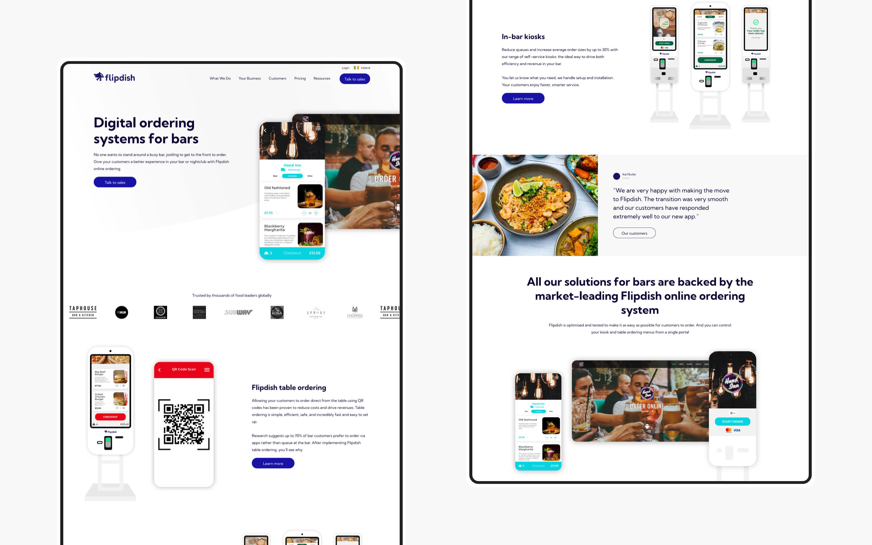
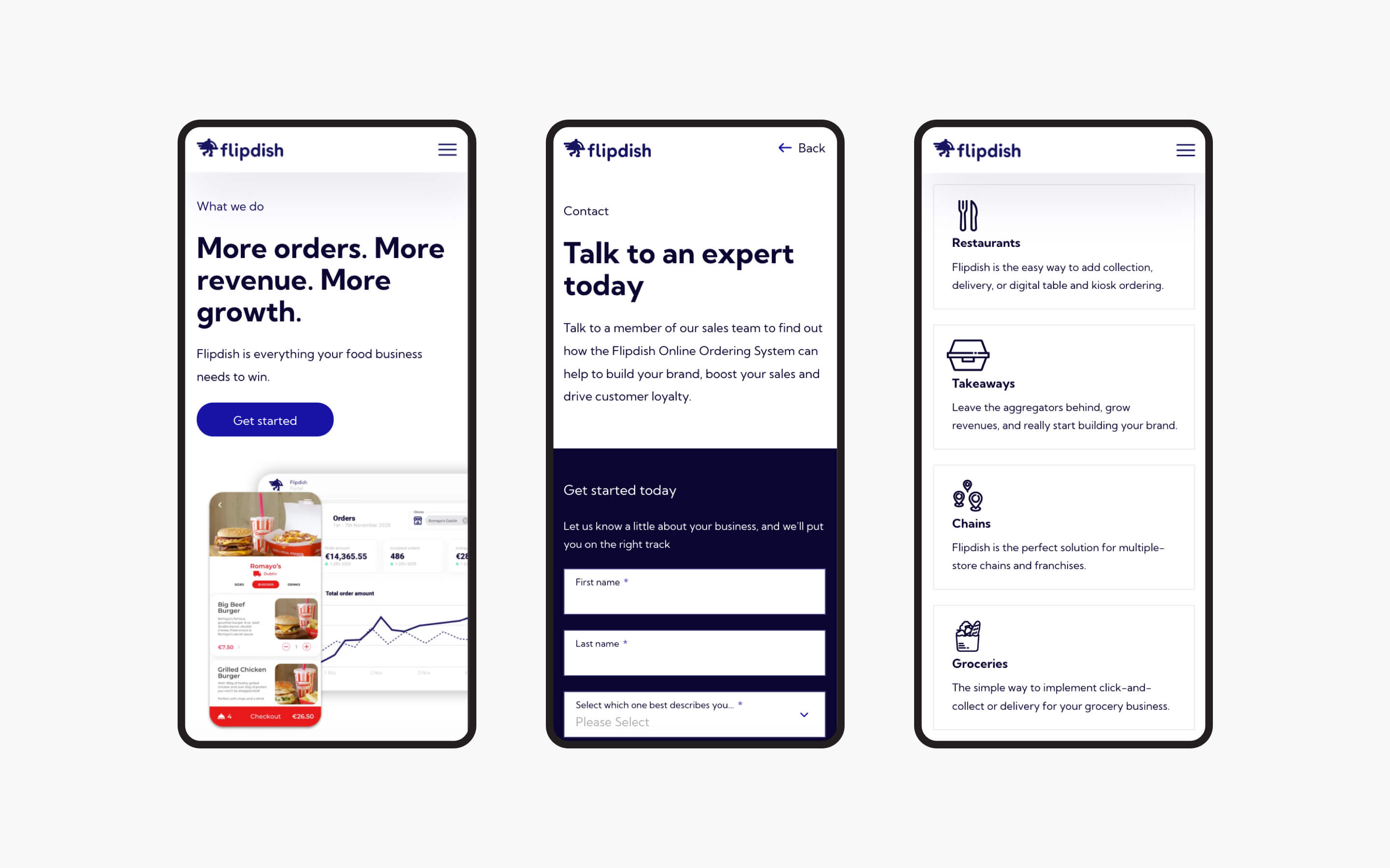
Working with Flipdish we developed a brand new colour and typographic system that worked alongside their core 'brand blue' and brought it into the digital space. This was followed with a new and improved visual direction, displaying and showcasing the product itself, and showing real-life use cases mixed with animations to explain its core functions. We created a navigation that allowed users to find the information they required either by product functionality or business type. This approach required a multi-column navigation bar, which in turn gave us scope to incorporate animated visuals and links, and also featured content from the resources section. This gave users easy and quick access to the right page, and in turn a quicker journey to the all-important 'contact us' end goal.
Success driven by key metrics
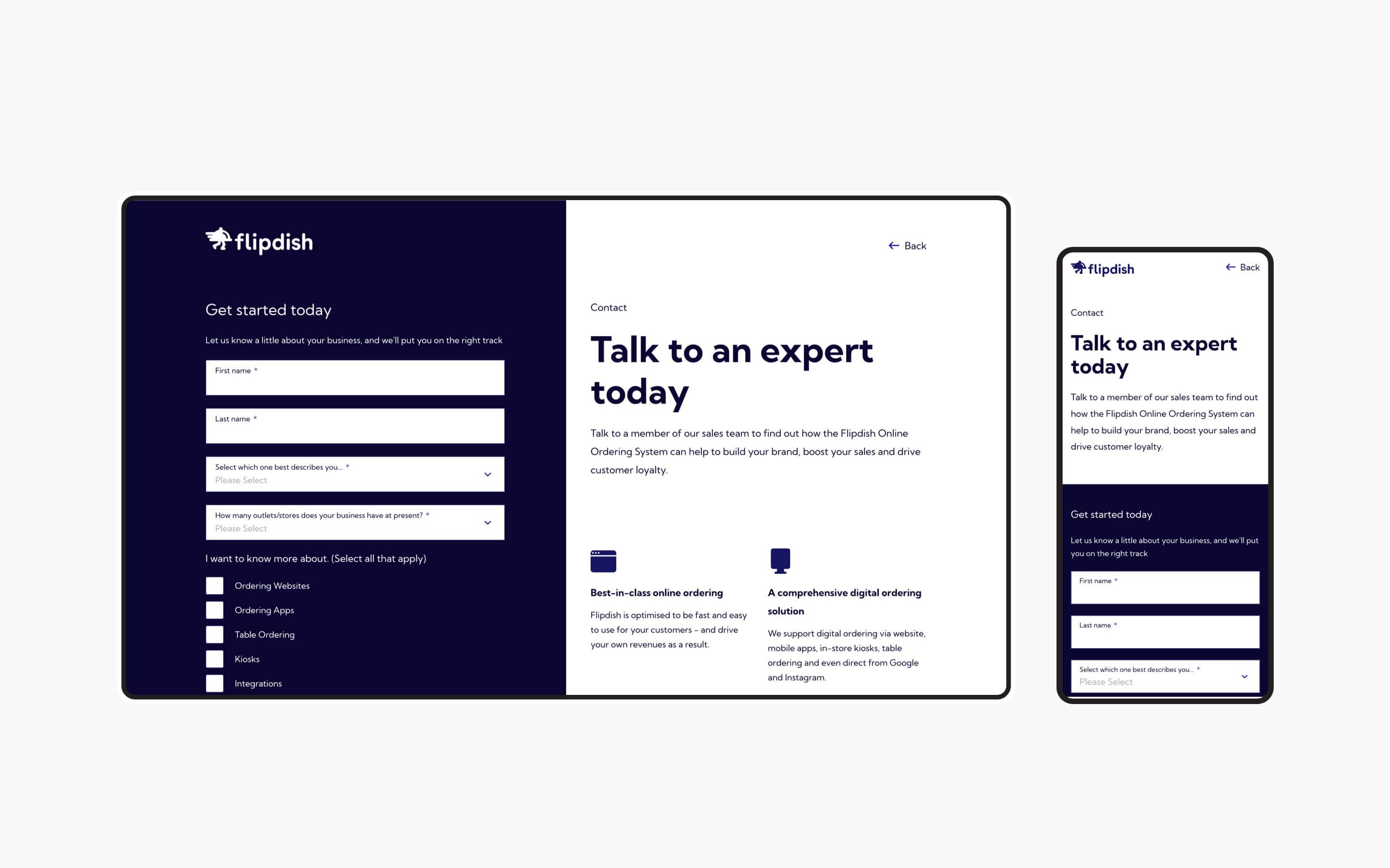
The Flipdish site is now a more goal-driven platform that actively drives each user towards conversion from the moment they land on the site. Each page provides the user with a clear path to the end goal, without having to sacrifice the look of the page. We have been able to achieve higher performance scores even with the visual enhancements of animations, graphics and visuals.
What we did
- UI / UX design and development
- Information architecture
- Content strategy and development
- CMS integration
- Iconography and illustration
- SEO analysis and implementation
The result
Kooba's flagship website
The Flipdish website represents everything Kooba, as an agency, has learned from the past 10 years of designing and developing high-end, world-class, conversion-led website projects. With a 200% increase in sessions, a 293% increase in users, and a further 248% increase in page views, we are confident that the site is not only a huge leap forward from a design standpoint, but also directly addressing the user pain points and exceeding commercial expectations.


