Overview
Putting LIA forward as market leaders
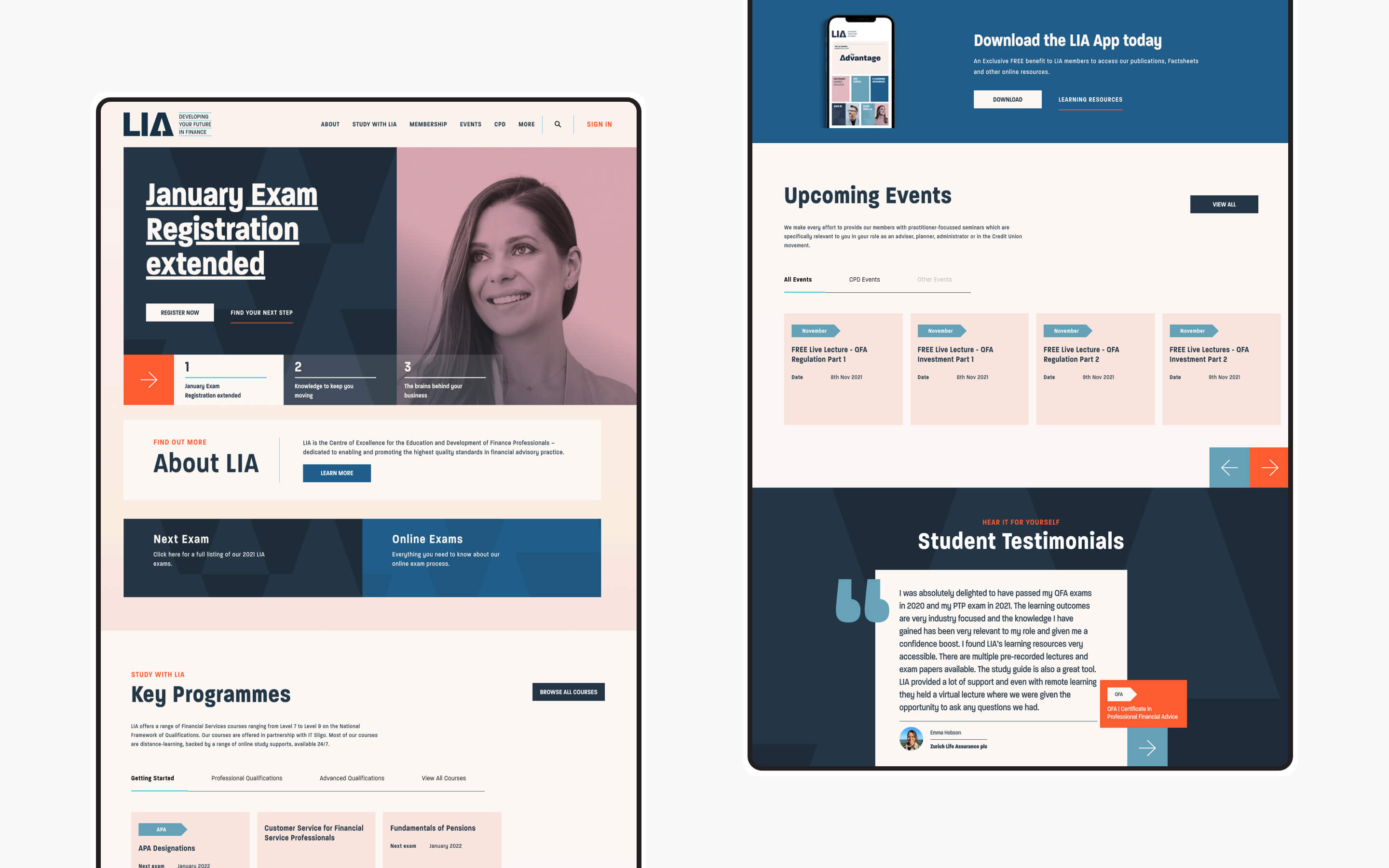
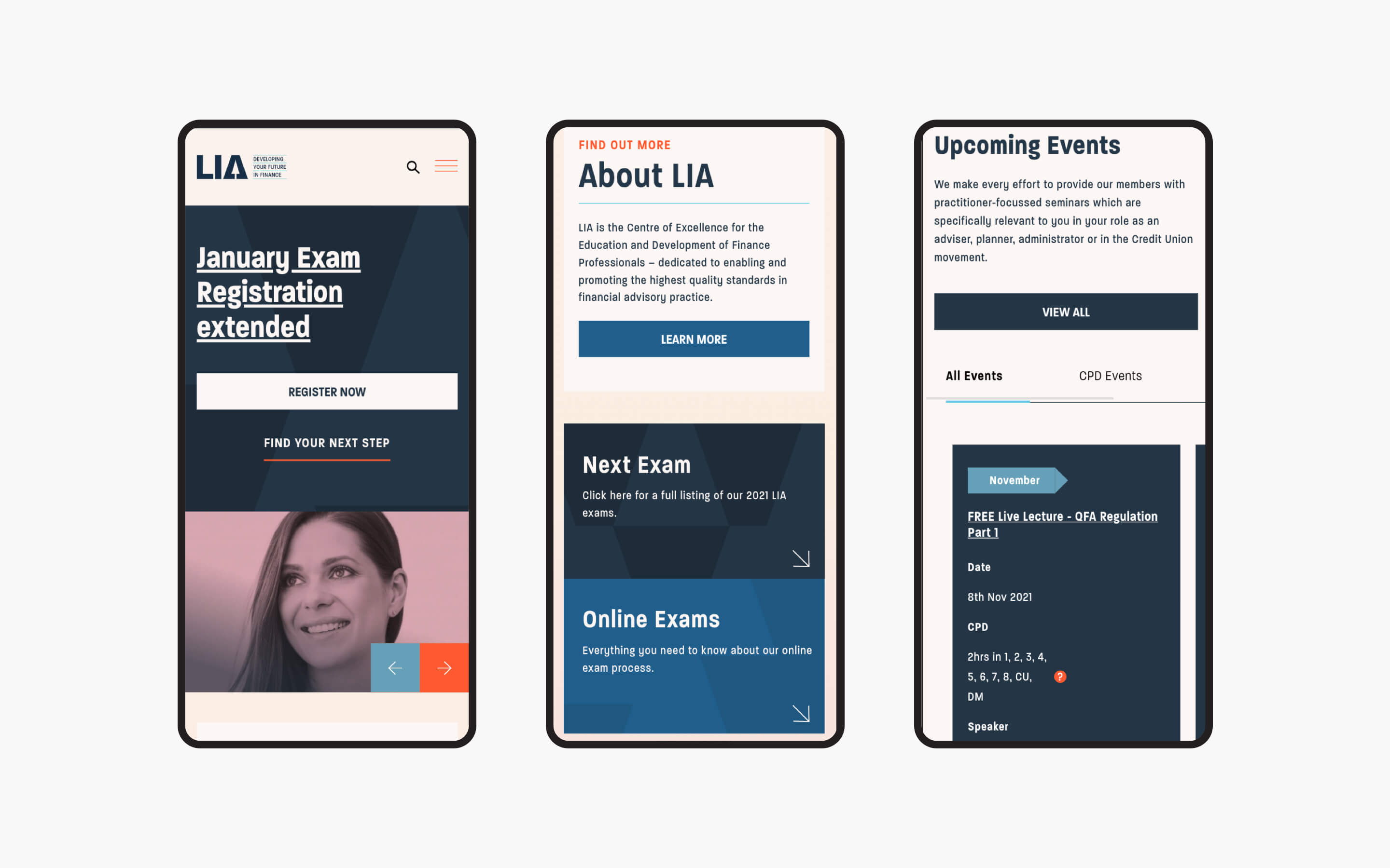
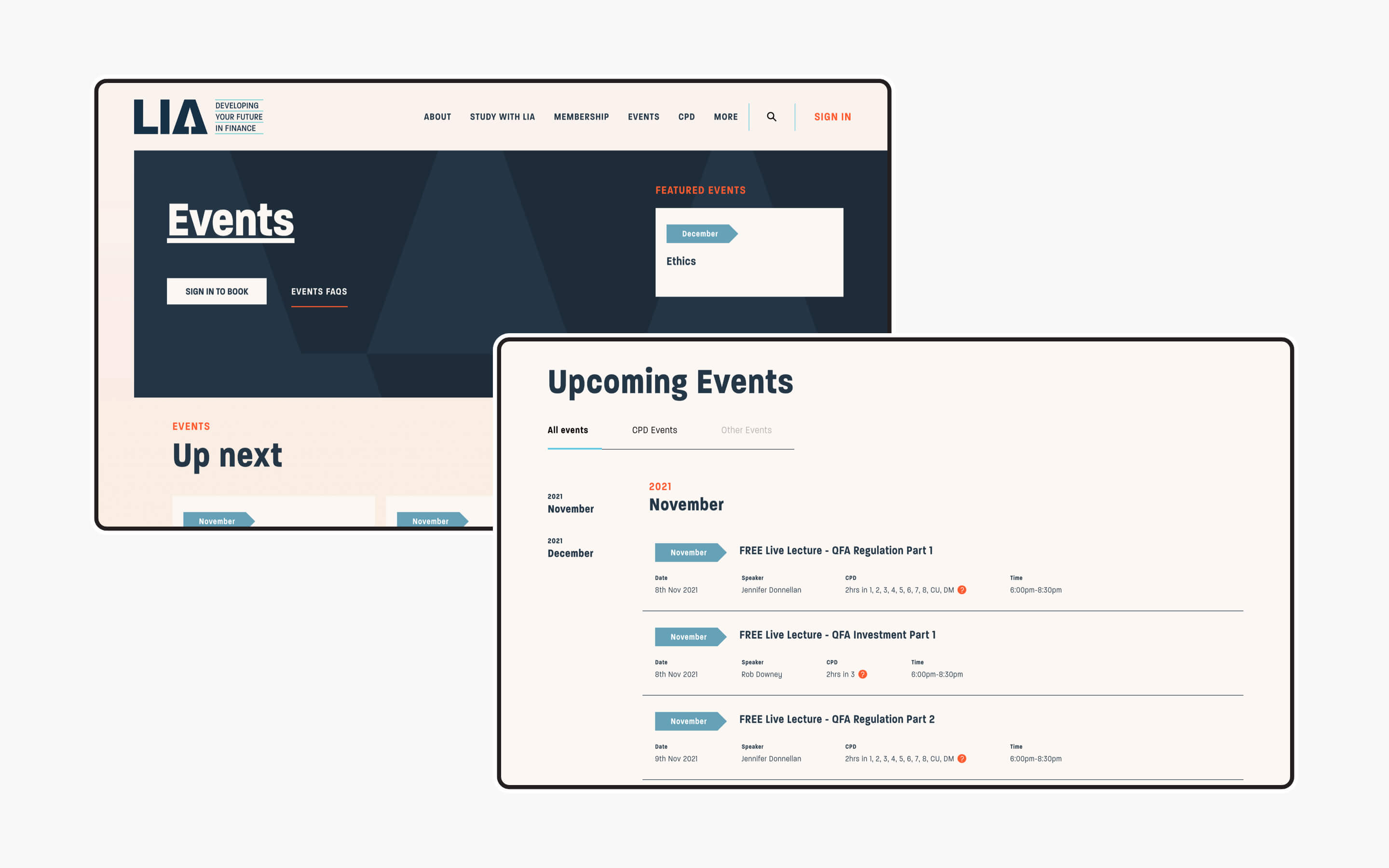
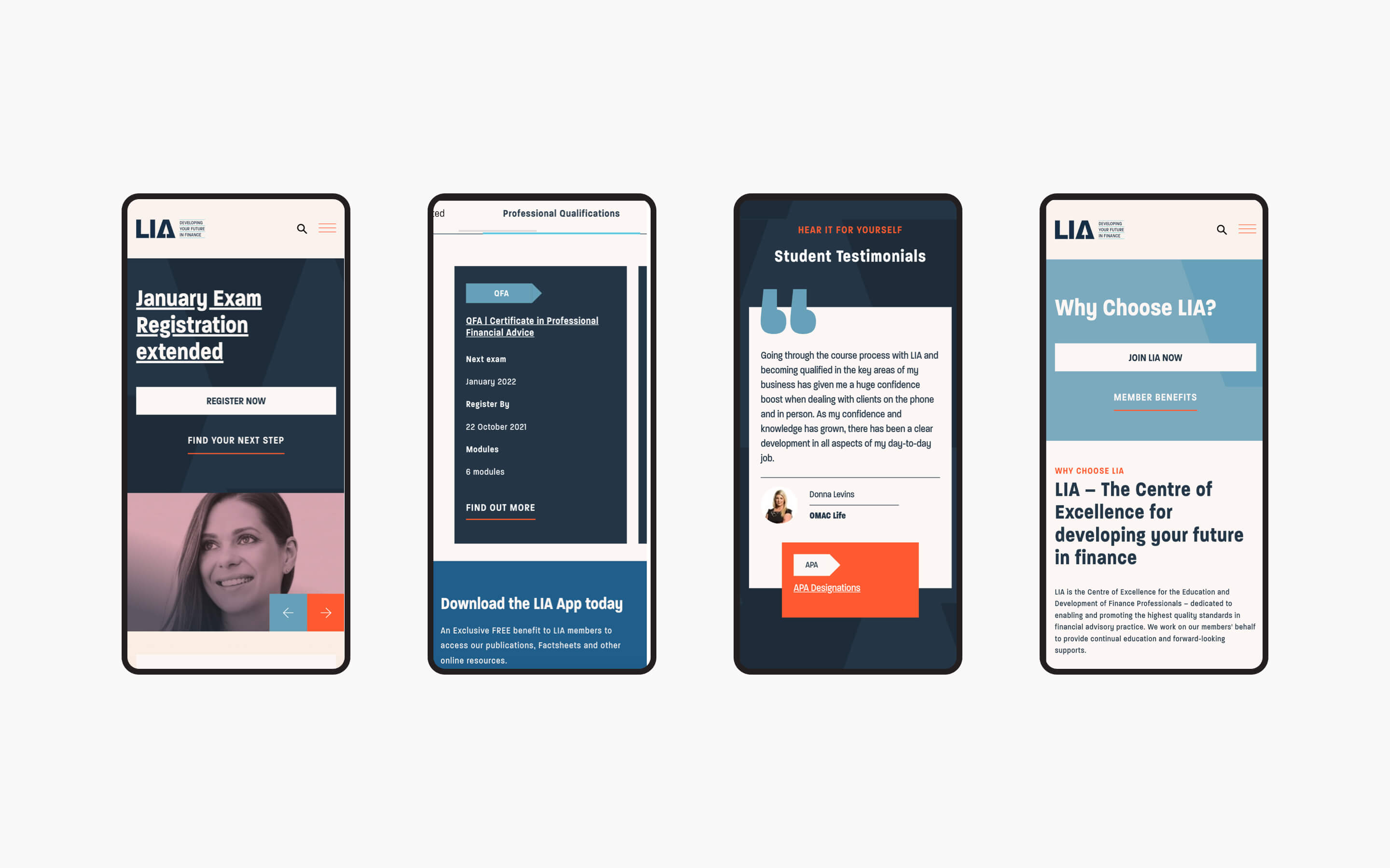
With a fresh brand and a new content strategy, we worked in partnership with LIA to push the envelope with the look and feel of their site. The aim: project the highest levels of professionalism and communicate LIA's market-leading status. Using Kooba's multi-disciplinary approach, we worked across multiple channels (design, marketing, usability, content strategy, and development) to ensure the completed site delivered on those project goals and objectives.
View the site
lia.ie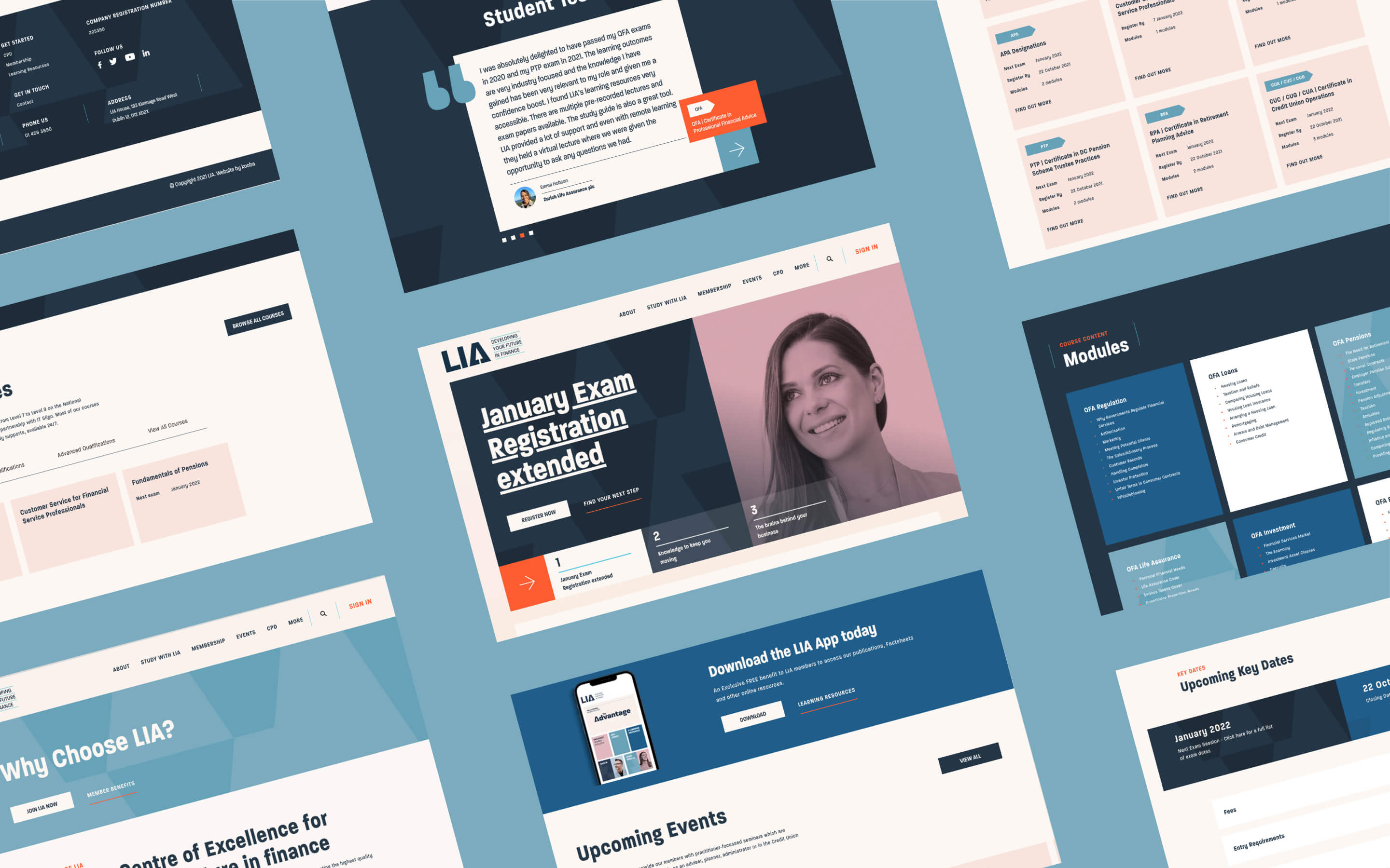
Process-driven design
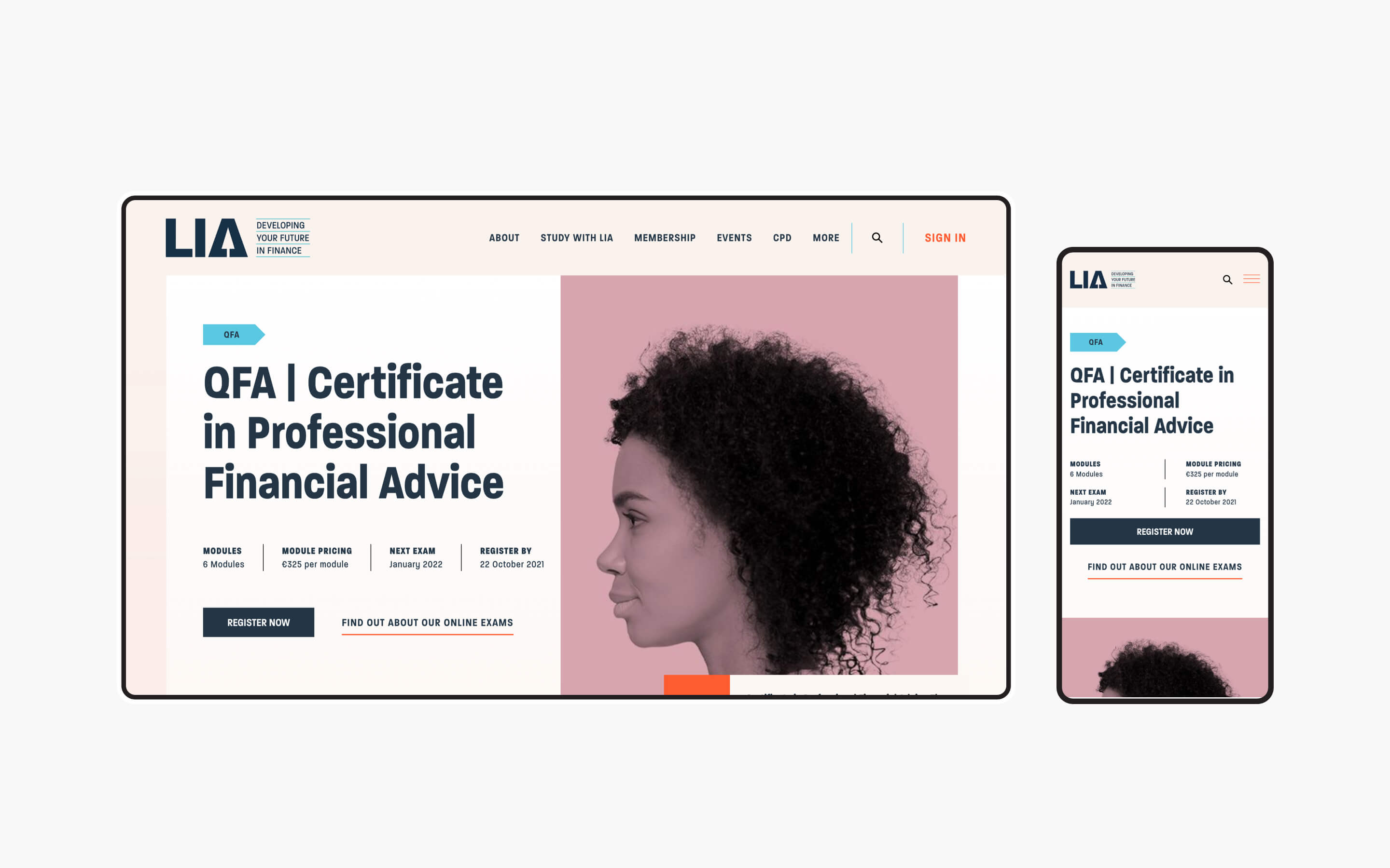
During the UX phase, we paid particular attention to key destination pages such as the homepage, education path, and course pages. As long-term digital partners, the site was familiar to us. Nevertheless, we tool the time to undertake an analysis and discovery phase, identifying the goals and the pain points that acted as blockers for both the LIA and the users. These workshops, in addition to the use of Google Analytics and Hotjar, allowed us to perform a detailed UX review which we then used to explore what worked - and did not work - on the current site. We wanted to enhance and improve every element that was central to the user journey.
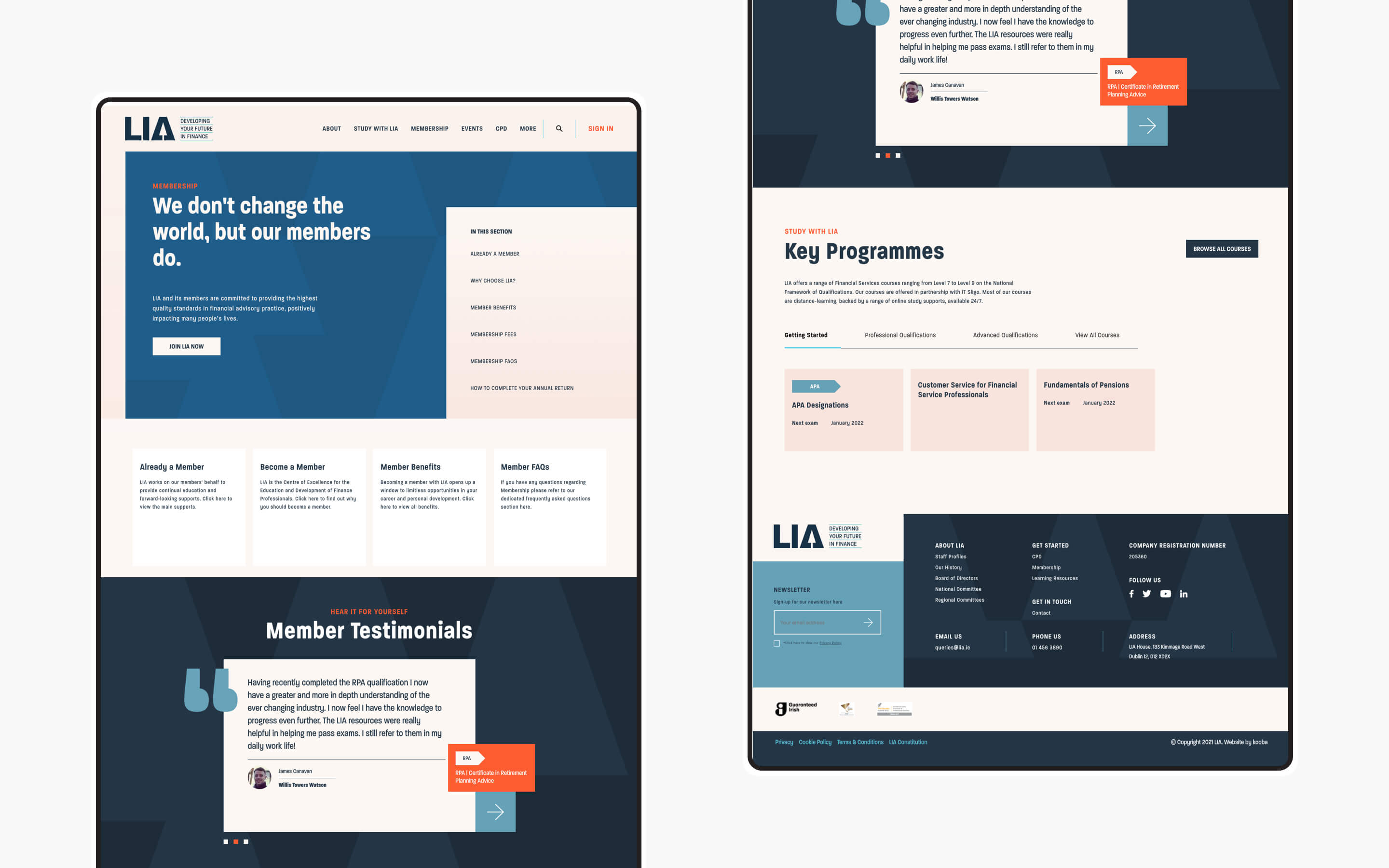
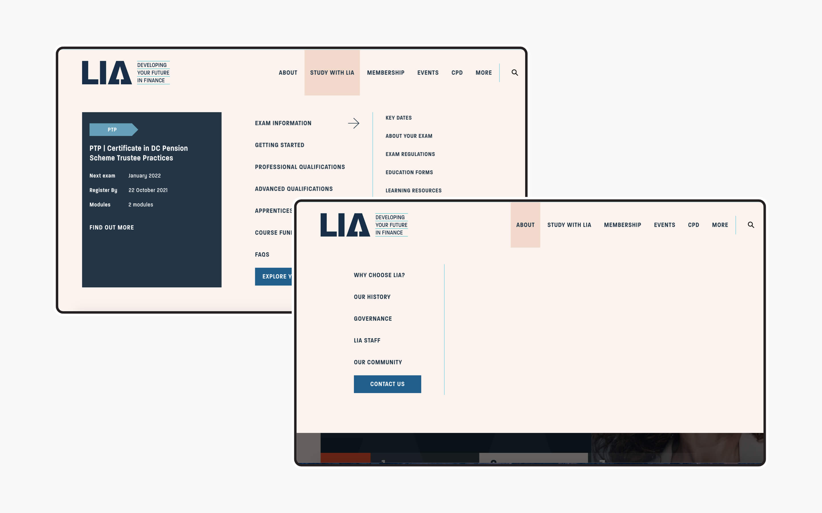
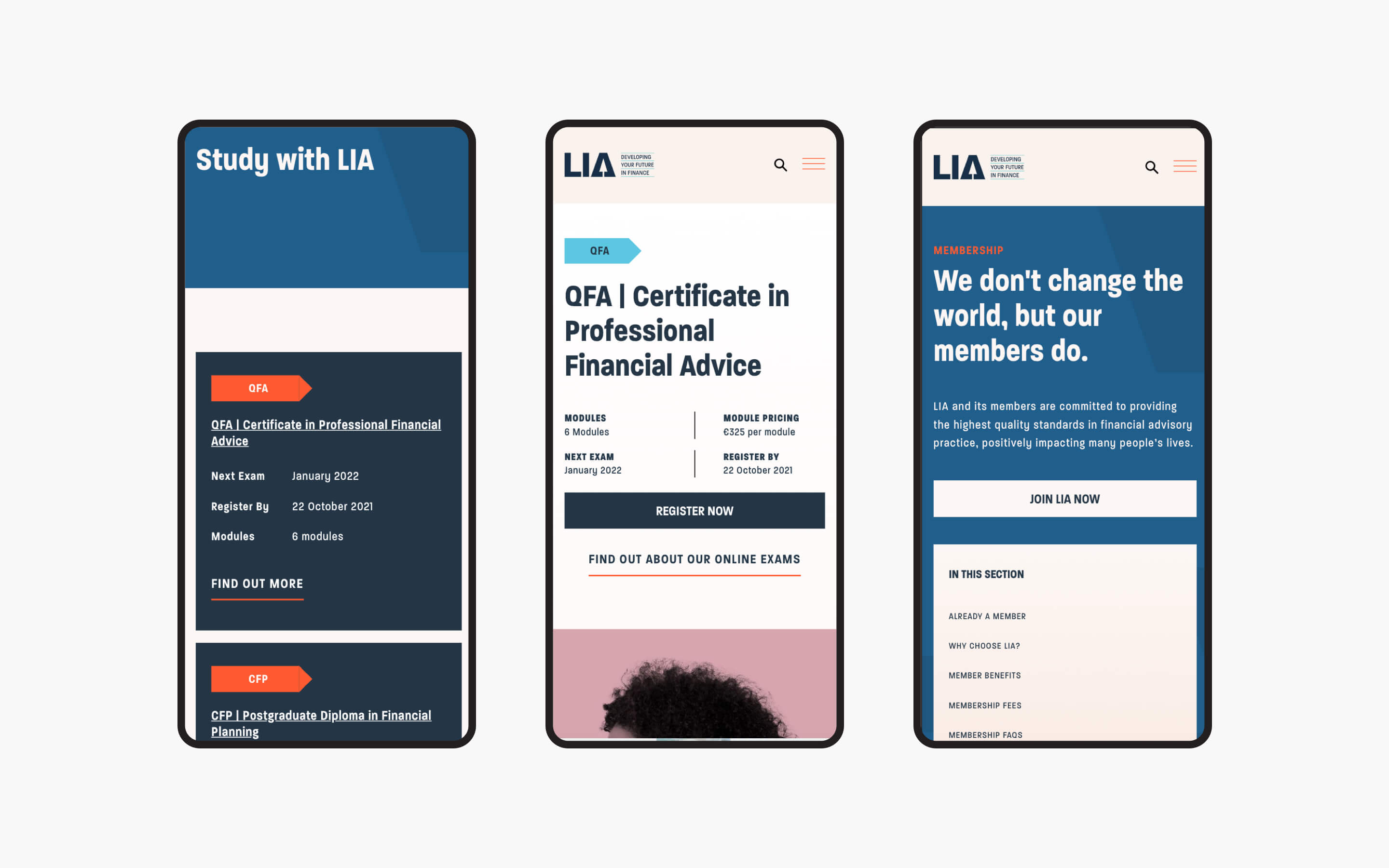
Keeping the user journey consistent throughout the site
Through the UX review, stakeholder surveys, and wireframes we identified multiple innovations for LIA, and ways to optimize those areas of the site users were engaging with most. Alongside the LIA team, we conducted a site structure review and card sorting exercise, leading to a new sitemap and improved user flow. In addition to a new main navigation structure, we also integrated in-page navigation on each of the course detail pages. We wanted to cater to the needs of the user give them the opportunity to quickly access their desired content.
What we did
- UI / UX design and development
- Information architecture
- Content strategy and development
- CMS integration
- SEO analysis and implementation
The result
Digital results that went further than just a simple redesign
The LIA site represented a complete re-branding exercise for the business: one that expressed a new vision for the company that would drive their future online presence. The finished website has delivered an increase in pages per session, session duration and an overall reduction in bounce rate on all key pages. We can see that the improved navigation system is increasing the 'browsability' of the site and users engagement metrics are up across the board.


