Overview
Growing a beautiful brand
In July 2023, ReproMed, a leading fertility treatment centre, reached out to Kooba in order to develop a new website. ReproMed aimed to better convert site visitors into customers via their website, and wanted to build a more engaging, efficient, and visually appealing website. Kooba were delighted to work with and elevate ReproMed’s brand, and aimed to transform their online presence through the intelligent use of UX and UI design. An initial UX audit conducted by Kooba revealed several key areas of improvement for the ReproMed site. The look and feel of the UI was overly cold and sharp, the status and credibility of the company was not prominent, and there was no clear path for users to progress through the site. By addressing these issues, Kooba could improve the experience of website visitors and generate new leads and higher revenue for the company.
View the site
repromed.ie
Careful messaging
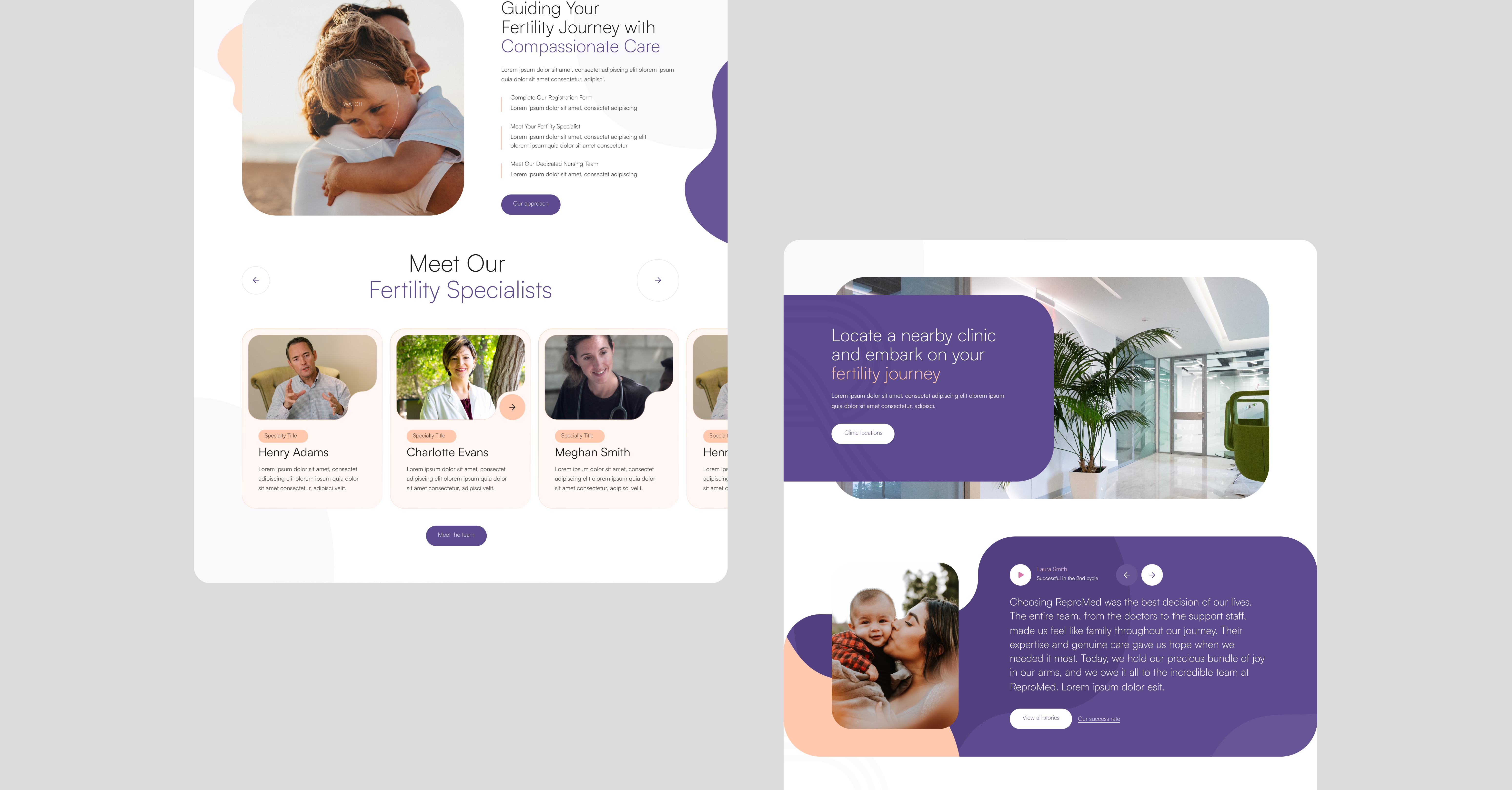
Kooba were eager to recentre the focus of ReproMed’s site on the end users themselves, serving to better communicate the real value of ReproMed’s work. The rebuilt website prioritised soft, approachable messaging, and this was further reinforced by the use of gentle geometric forms and a natural colour palette. This reworked UI effectively communicated ReproMed’s brand values of assurance, quality, and client satisfaction, and encouraged site visitors to further engage with ReproMed’s content. Given the significant investment of time and money represented by fertility treatments, it was crucial that the site confer a sense of assurance and credibility. This was accomplished by the prominent placement of testimonials and the clear display of ReproMed’s staff and their credentials.

Dynamic solutions
A core element of the ReproMed website was the thoughtful and considered use of motion and animation. The homepage features a prominent video, displayed behind a gently undulating frame. The overall impression is that of gentle motion, perfectly matching the brand identity of ReproMed. This use of motion was combined with dynamic and interactive animations for several key features of the site. This included all the call to action (CTA) buttons, as well as several interactive modules on the home page. Again, this provided constant feedback to users, and made the website seem more alive and engaging.


Conversion overhaul
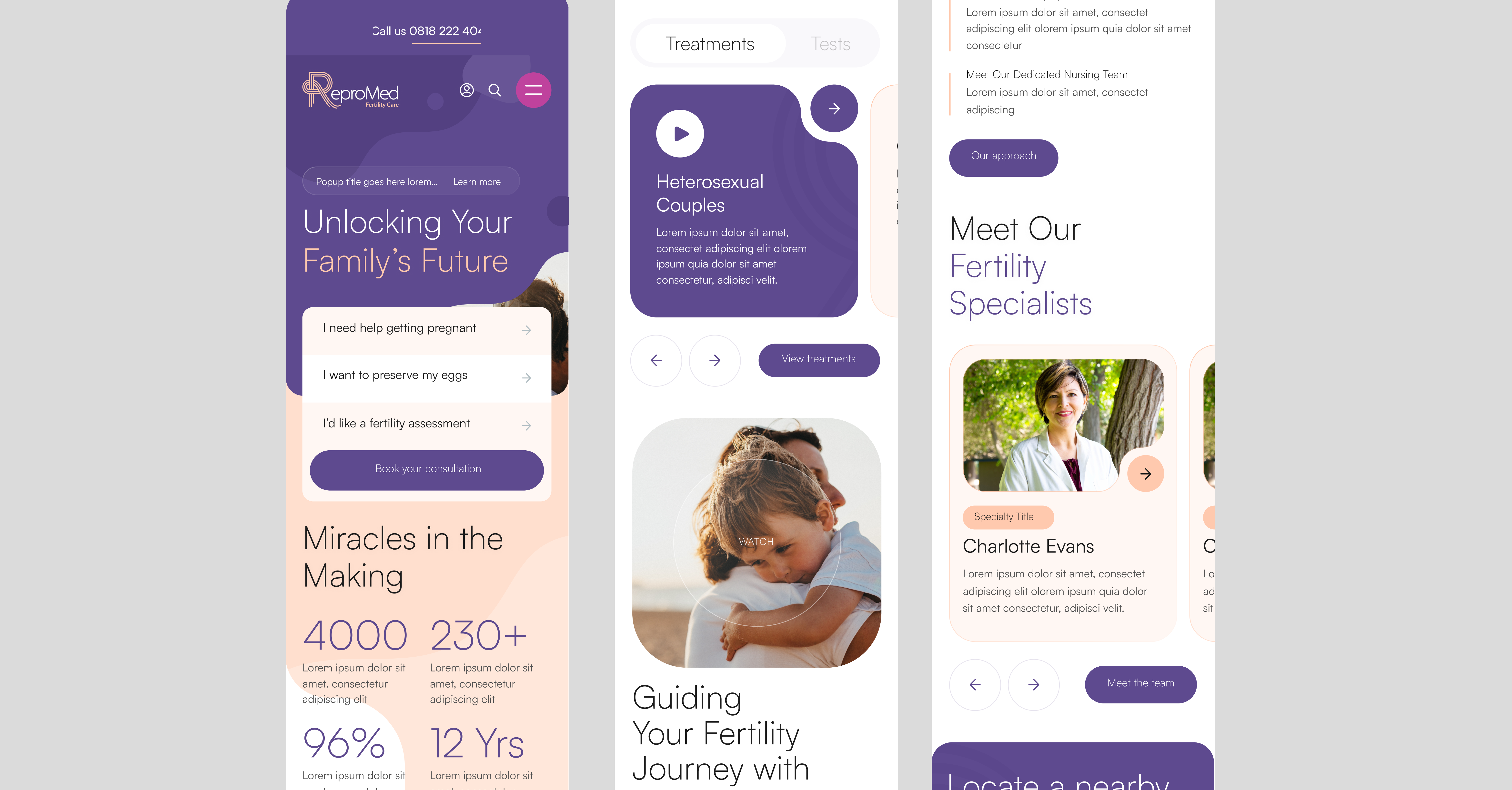
The UI of the website was paired with a redesigned UX with the goal of more effectively converting visitors and generating leads. Central to this redesign was a prominent CTA on the homepage, encouraging users to select which service was most relevant to their needs. Once an option was clicked, users would be presented with more detailed information on their chosen treatment, including FAQs, testimonials, and informative explanations. This layout was intended to specifically target and engage potential customers, providing them with all the information needed to convert via the “Book a consultation” CTA.
Kooba has delivered a beautiful and dynamic website for ReproMed, perfectly representing our brand and values. Our redesigned web solution allows us to better connect with and convert our audience, and improves the experience of all our users.
What we did
- UI / UX design and development
- Information architecture
- CMS integration
- Iconography and illustration
Result
The end result of Kooba’s redesign and redevelopment was a website which confidently communicated ReproMed’s brand and expertise, and effectively channelled users towards conversions. A reworked UI and UX helped better engage users, convey ReproMed’s brand, and ultimately drive valuable leads. By building a reassuring, attractive, and effective user experience, Kooba dramatically improved ReproMed’s digital presence for years to come.


