Overview
A fresh challenge for an existing client
In May 2022, Waterford Institute of Technology (Waterford IT) and The Institute of Technology, Carlow (IT Carlow) merged to form one institution known as South Eastern Technological University (SETU). Having previously built a successful site for Waterford IT, Kooba were approached by SETU to assist this amalgamation through the development of a new website and digital presence.
View the site
setu.ieIncrease in courses page views
Increase in courses page engagement
Accessibility First
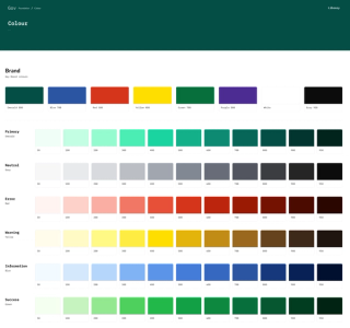
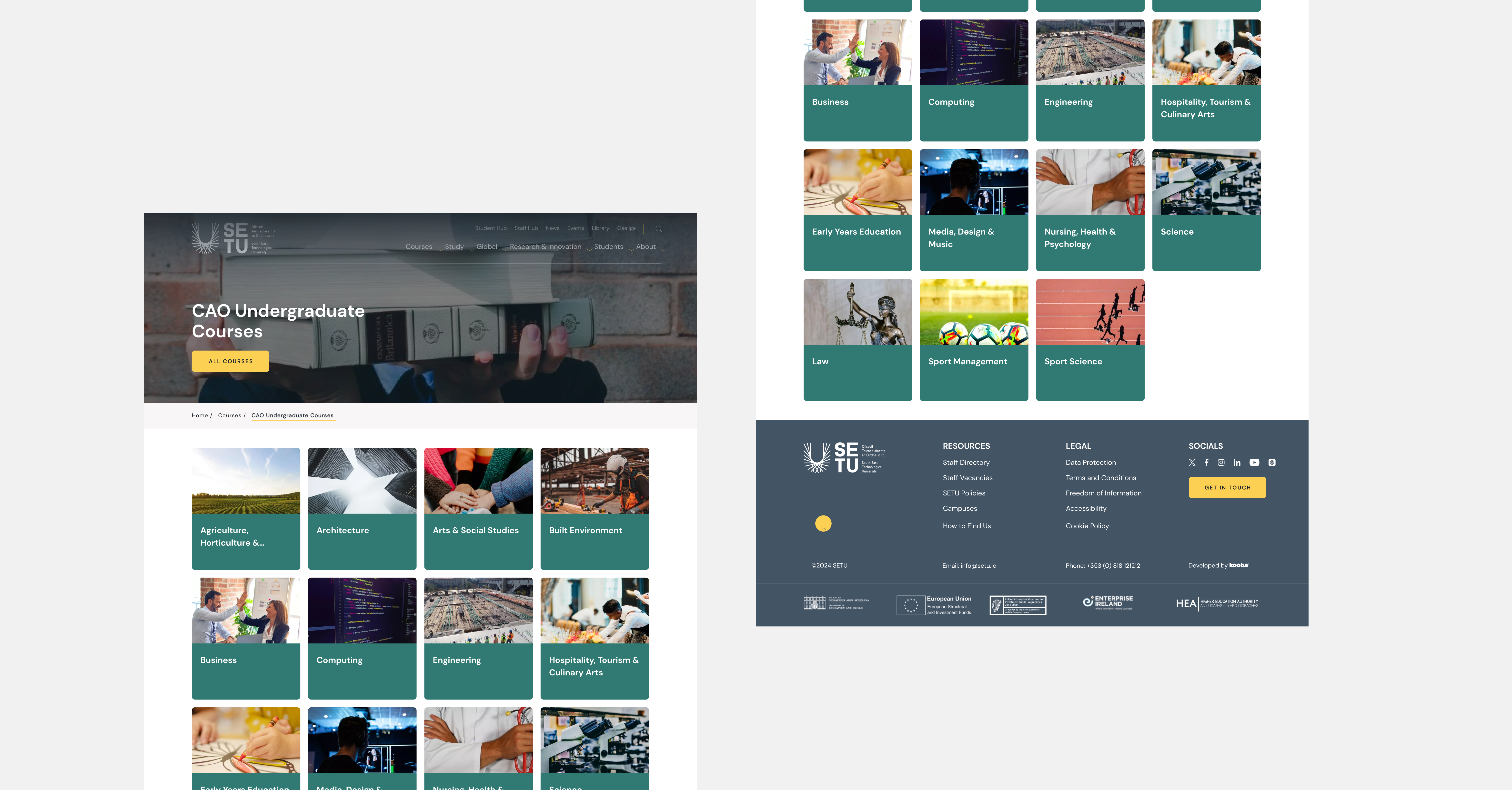
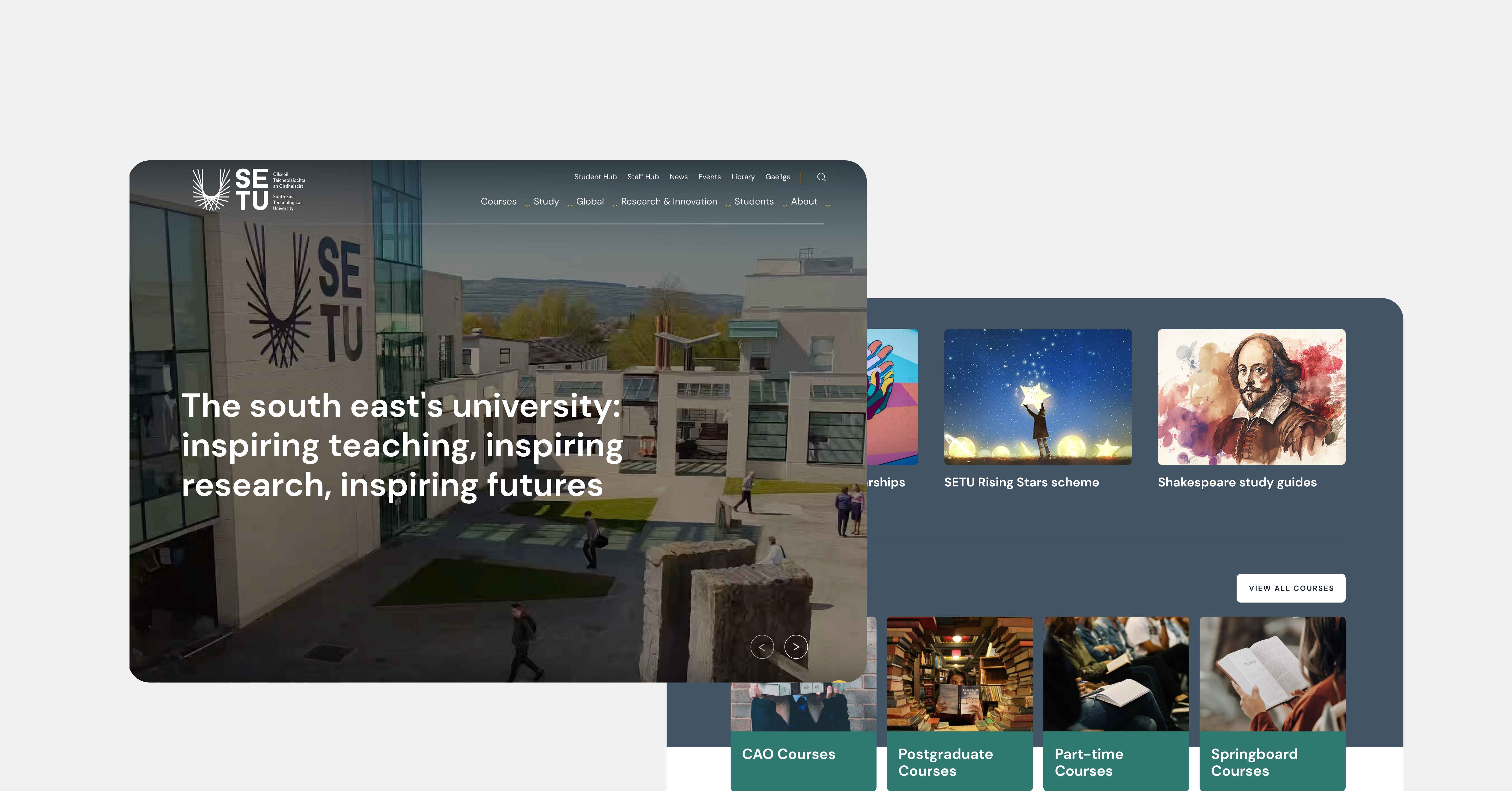
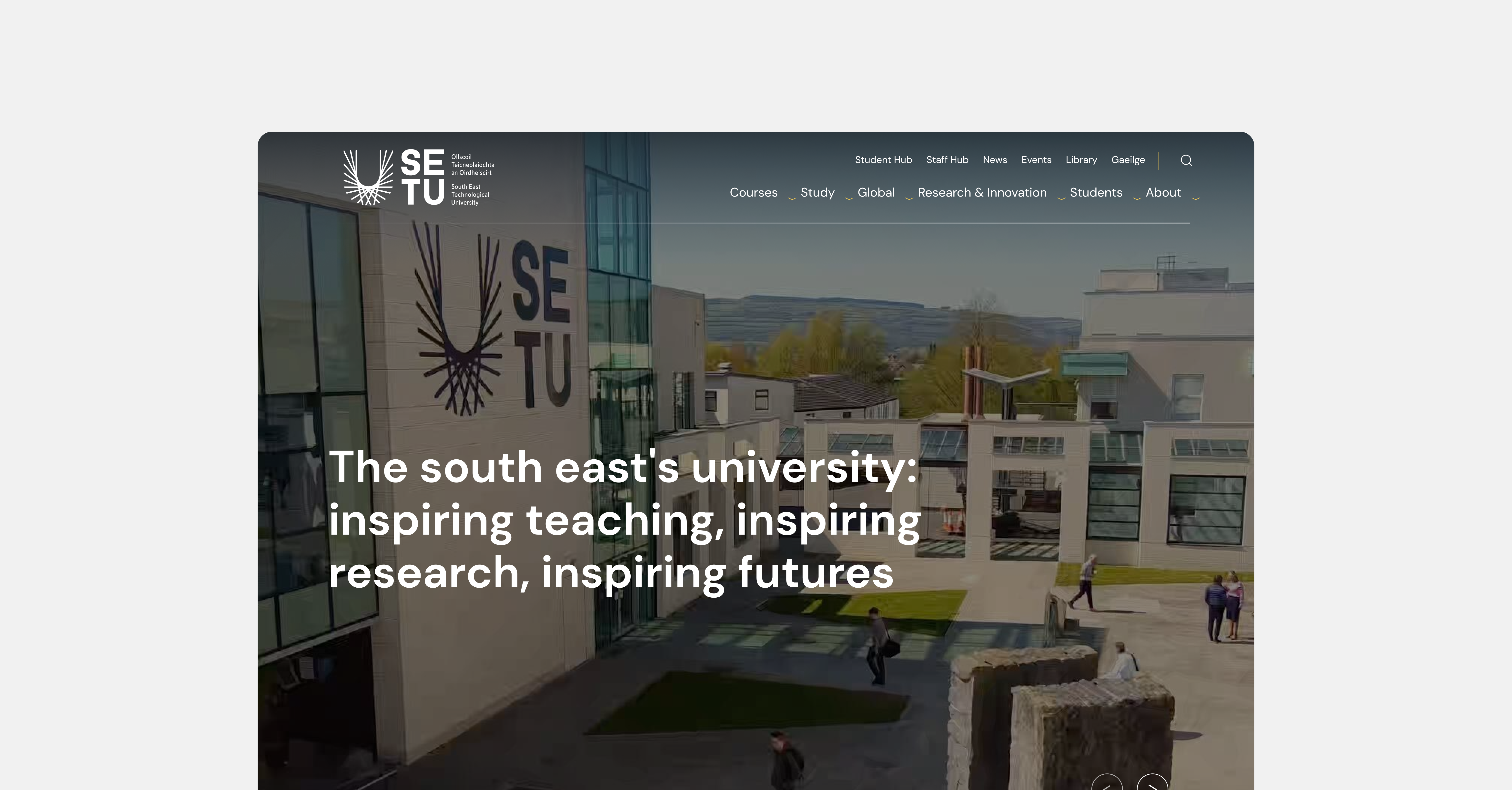
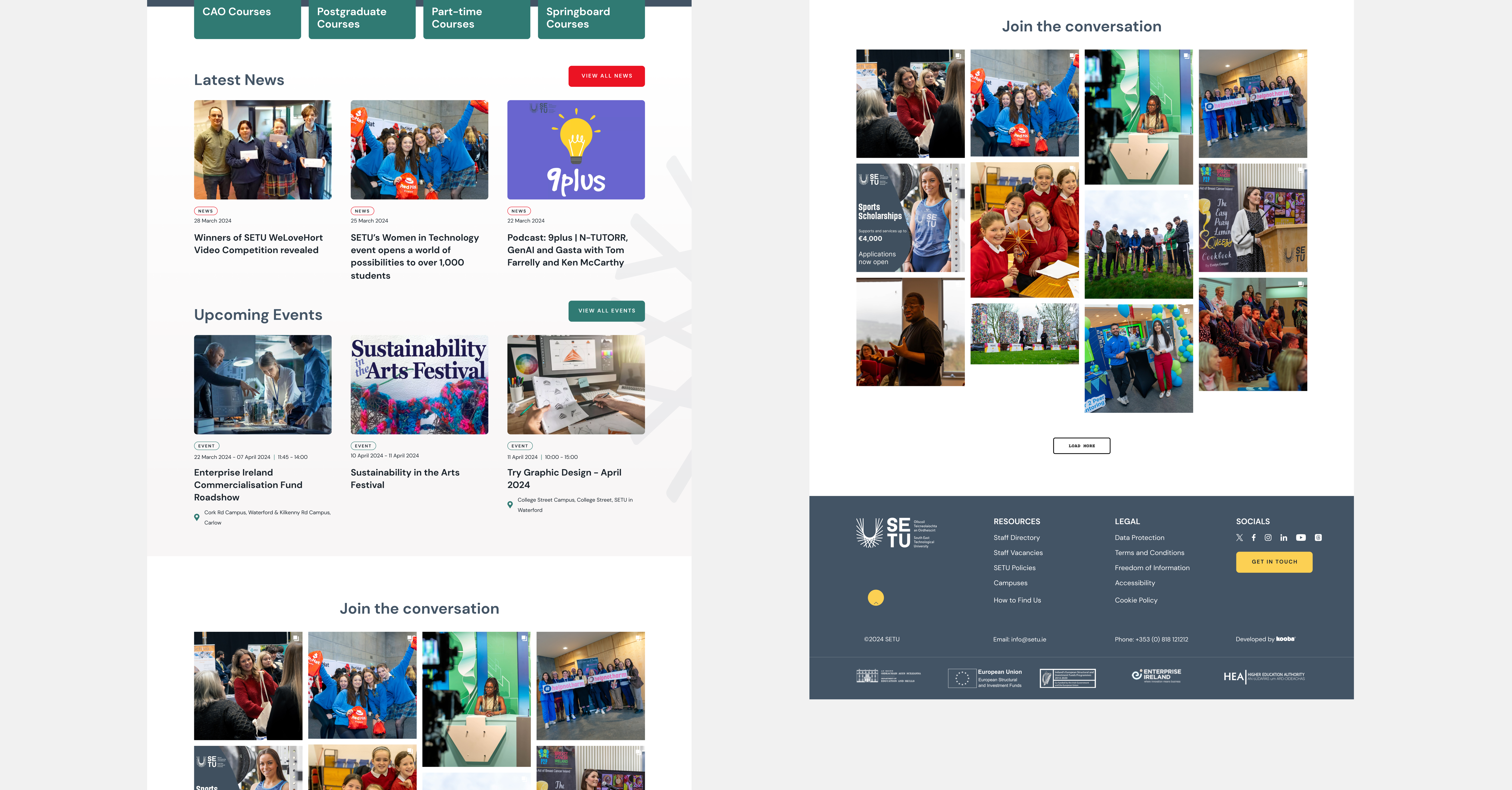
From the outset, accessibility was set as a priority by SETU. It was crucial for every student and staff member to be able to access the SETU website, which was intended as a resource hub for administrative and educational content. By integrating accessibility into the design process from the beginning, Kooba could provide this in an efficient and thorough manner. Accessibility was baked into every feature of the site, most obviously through the user interface (UI). By using a high contrast colour palette, a large font size and a clear font design, the visual elements of the site were built to be as easy to view as possible. Content was also colour coded, providing an indication of its subject at a glance. This not only made the site accessible to visually impaired users, but also improved the experience of every visitor through a clearer display of important information.
Below the Surface
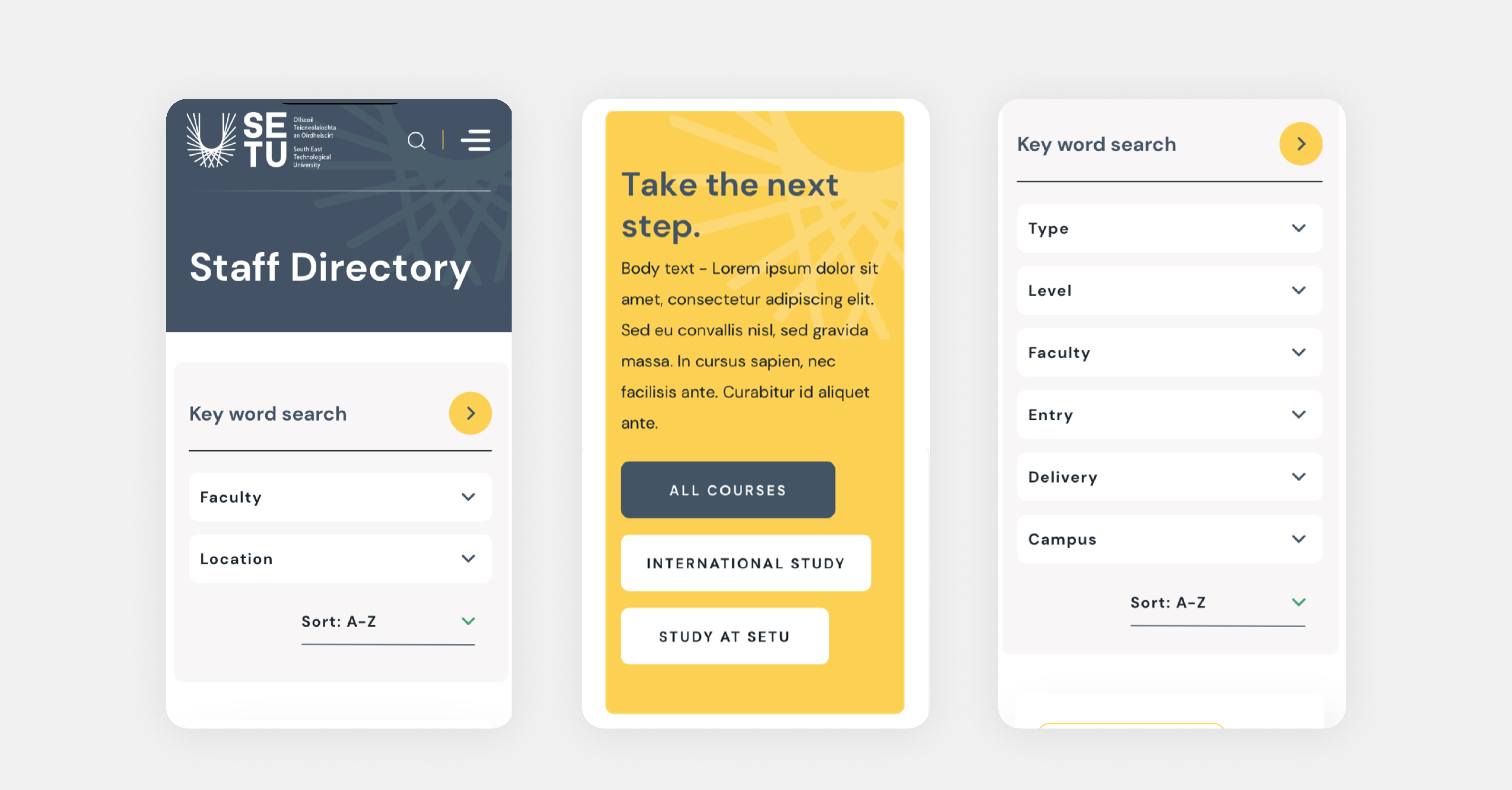
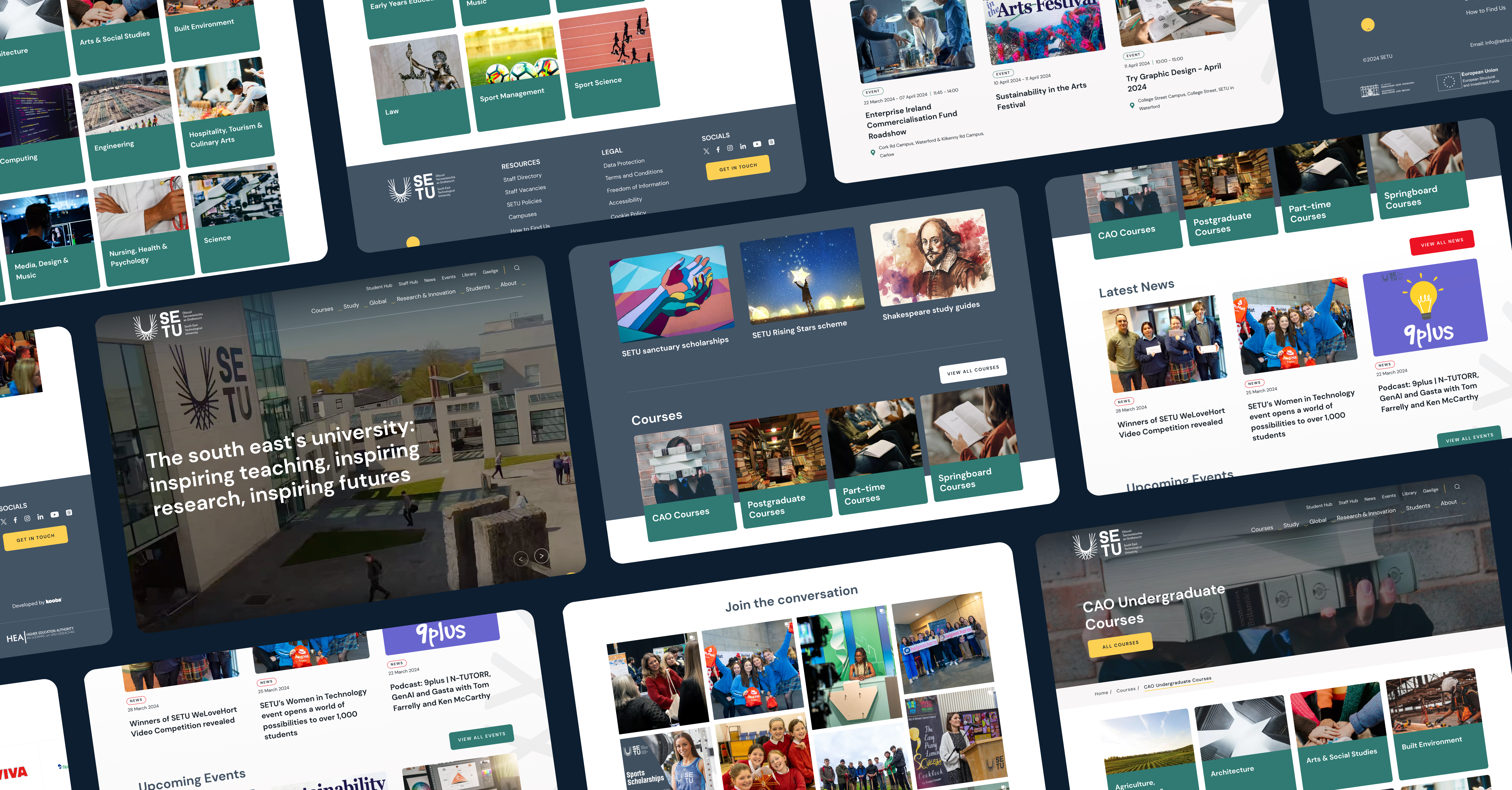
By incorporating accessible principles into the design process from the very beginning, SETU were able to add inclusive features “below the surface” of the final website. These features might not be noticed by average users, but can be transformative for those using screen readers and other assistive technologies. The HTML of the SETU website was written in a logical and clear way, making it easy to navigate the site using a limited number of keyboard shortcuts. Likewise every element on the website was coded with a clear associated value, making it simpler for screen readers to describe content to users. A logical approach was extended to the content templates used across the site, which were developed in an accessible and user-friendly way. This approach applied to the user experience (UX) design of the website as well. By building a clear and simple layout it became easier to access any particular page a visitor desired without having to search extensively.

Step by Step
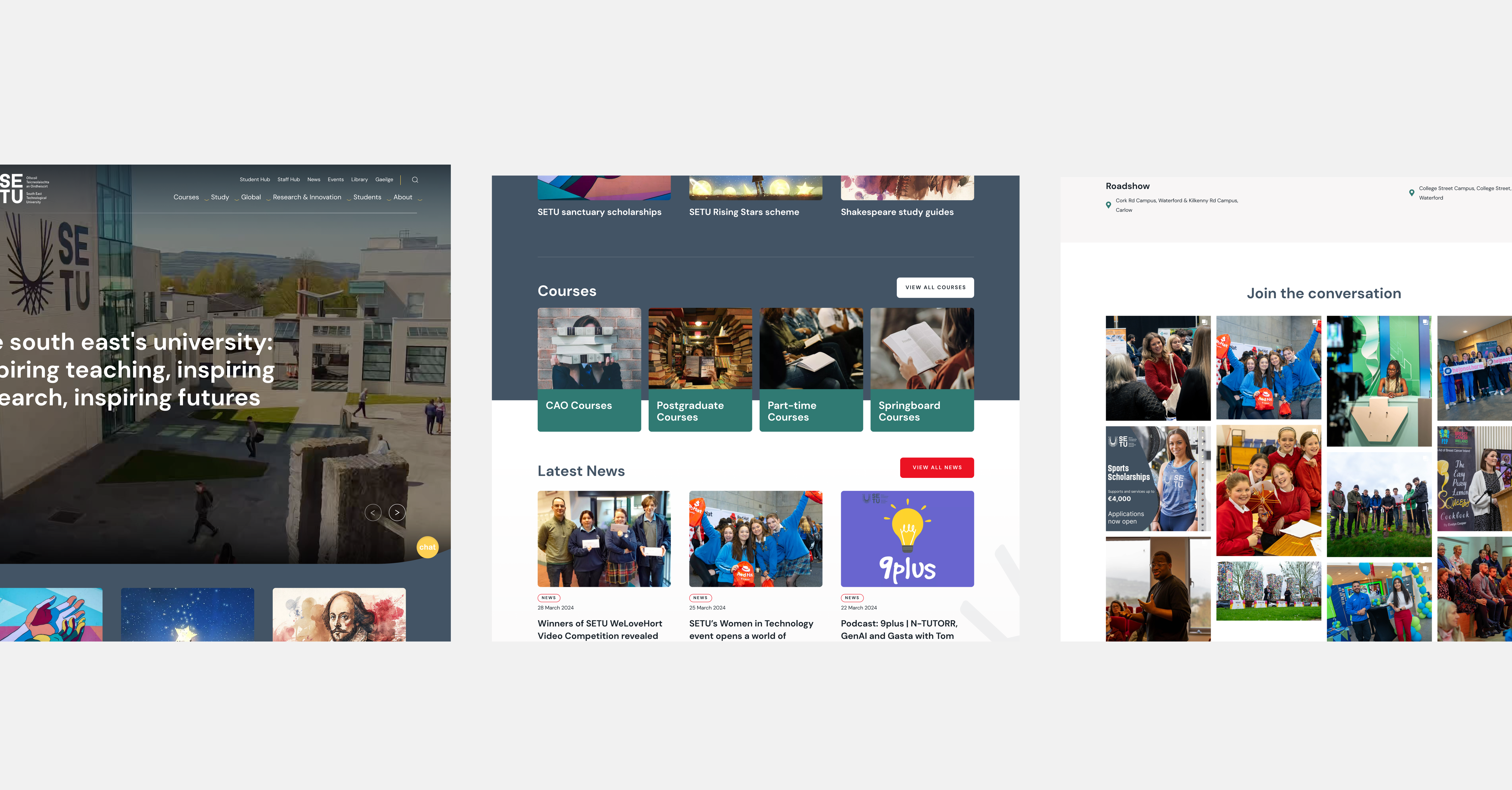
Beyond accessibility, Kooba’s work with SETU centred on the unique challenge of building a website that reflected the existing identities of IT Carlow and Waterford IT, as well as the fresh brand of SETU itself. This meant understanding the branding, UX, and site pathways of both existing universities, and adapting these to the new demands of the SETU website. To accomplish this complex task, Kooba’s design team decided to implement a two stage process. An interim SETU website would be built to exist alongside IT Carlow and Waterford IT’s site, with a final site developed to go live following the complete amalgamation of the universities. This minimised the time pressure of the project, and allowed for a more considered development of a website that accounted for every stakeholder's interests.
Built with accessibility at its core, our website is crafted to serve the diverse needs of students, staff, researchers, and the wider community across the South East region and beyond.
What we did
- UI / UX design and development
- Information architecture
- Content strategy and development
- CMS integration
The result
A Website for Everyone
SETU’s website needed to be inclusive in several ways. Firstly, it needed to be fully accessible to every user, allowing students and faculty to find whatever resources necessary as simply as possible. Secondly, it needed to represent the identity of the institutions which composed it (IT Carlow and Waterford IT) as well as the new brand of SETU. On both these objectives the project was a complete success. Following an accessibility audit conducted to test the site against WCAG 2 guidelines, SETU’s new site earned an excellent AA+ score, making it fully compliant with all existing and upcoming accessibility standards, and allowing every visitor to easily navigate the website. User engagement was also dramatically improved, with a 500% increase in views on the new courses page and a 278% increase in engagement across the courses pages. Through thoughtful UX and UI design the project also succeeded in meeting the needs of every stakeholder, producing a truly inclusive website in every sense. The finished SETU website won Best in Universal Design at the 2025 Spiders, reflecting this commitment to accessible design.
| Award | Ceremony | Year |
|---|---|---|
| Best in Universal Design | Spider Awards | 2025 |
