Overview
Reflecting focus and direction
St. Vincent's Private Hospital is the single, biggest acute private hospital in Dublin offering the highest number of consultants and the widest range of specialist care in Ireland. Kooba and SVPH teamed up to revitalise the website.
View the site
svph.ieincrease in sessions
increase in organic search rankings
Letting data drive us
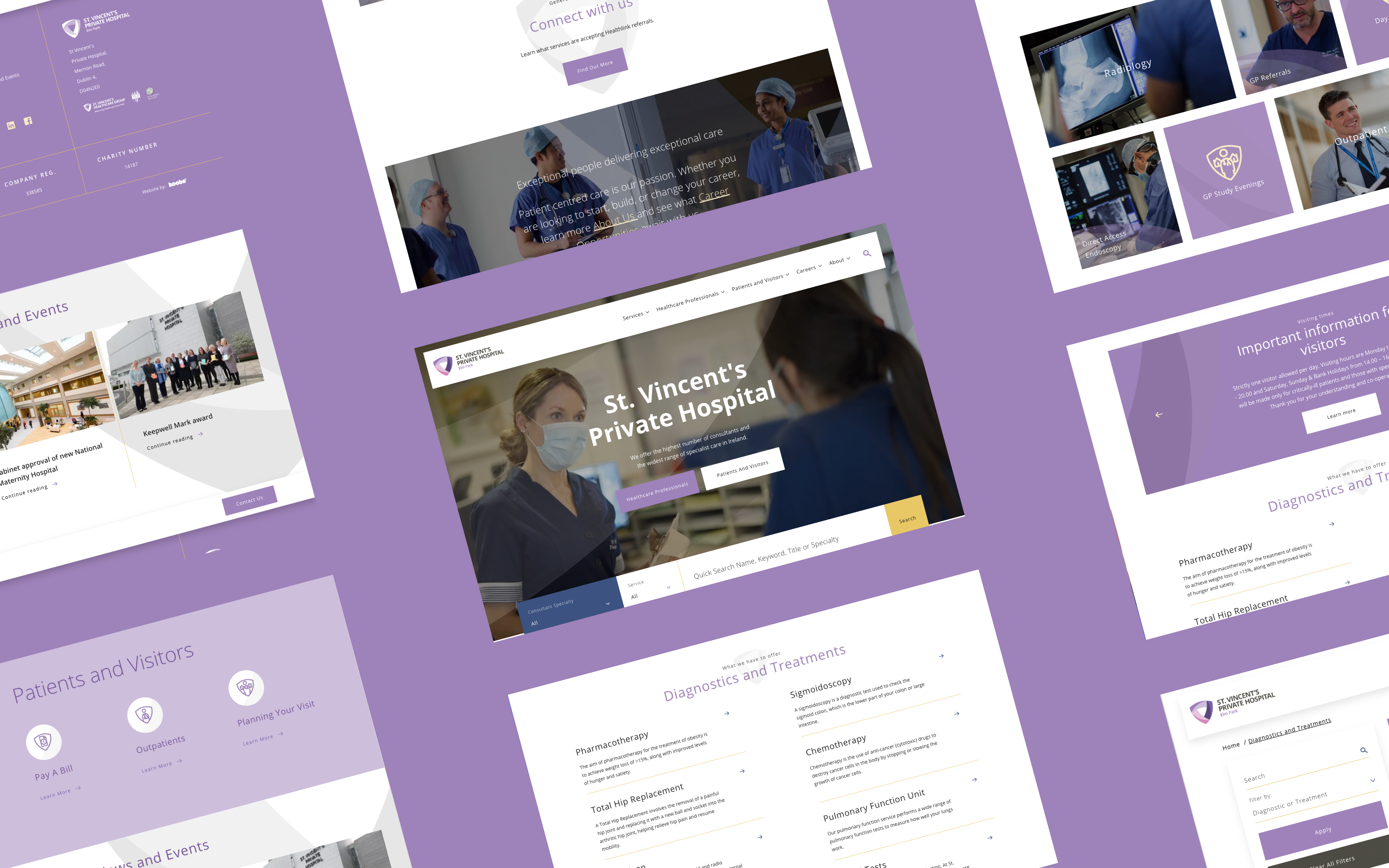
UX for this project was paramount. The key objective was the design a new website that would address the needs of all key stakeholders, including physicians, patients, hospital visitors and general healthcare individuals. This presented a key challenge: creating a site that was a lot of things to a lot of people. Through our UX exercises we were able to build out the profiles of the type of audience on the site. These key understanding provided valuable insight and ensured any website decisions we made were backed by user data.
Prioritising key content and user journeys
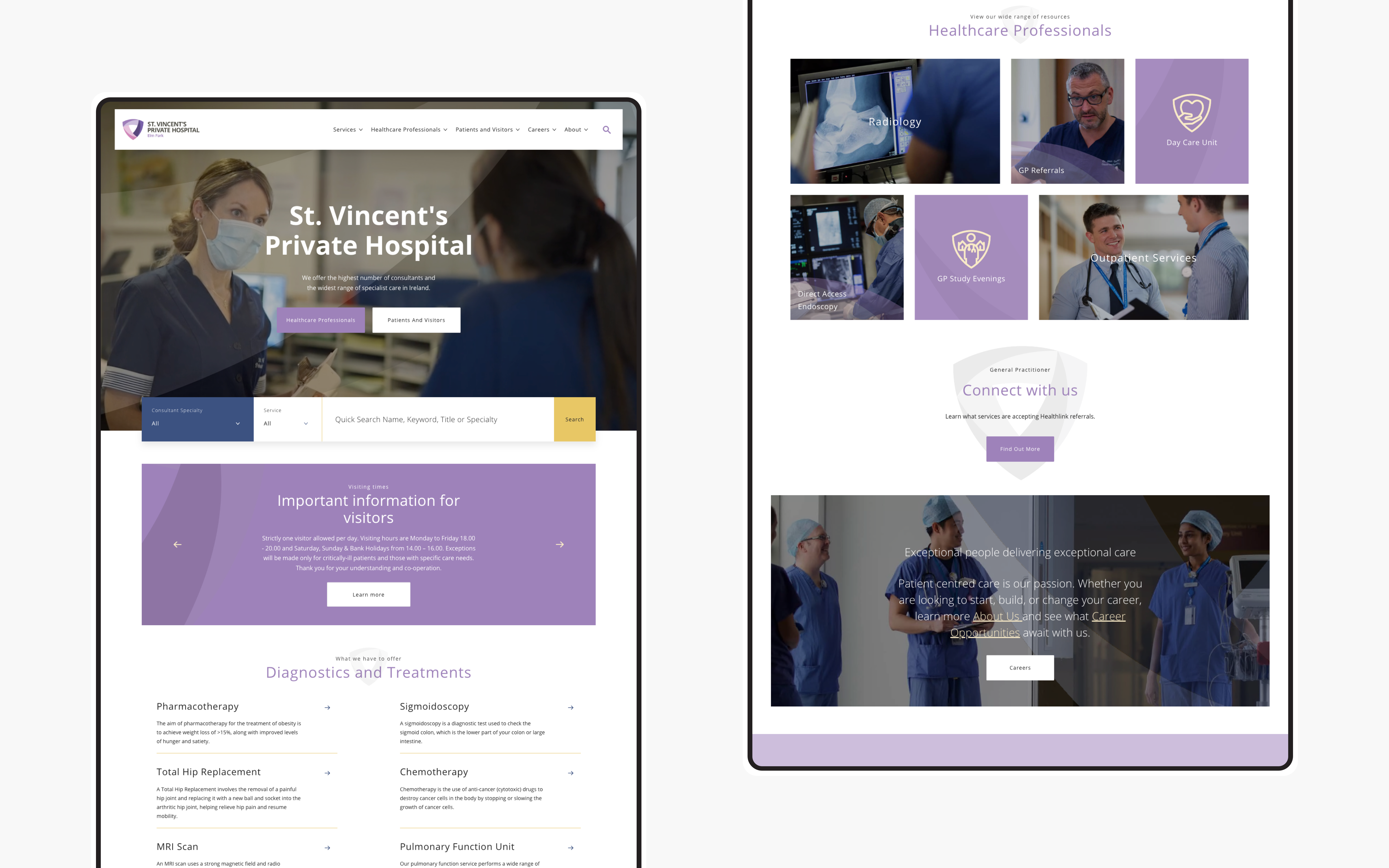
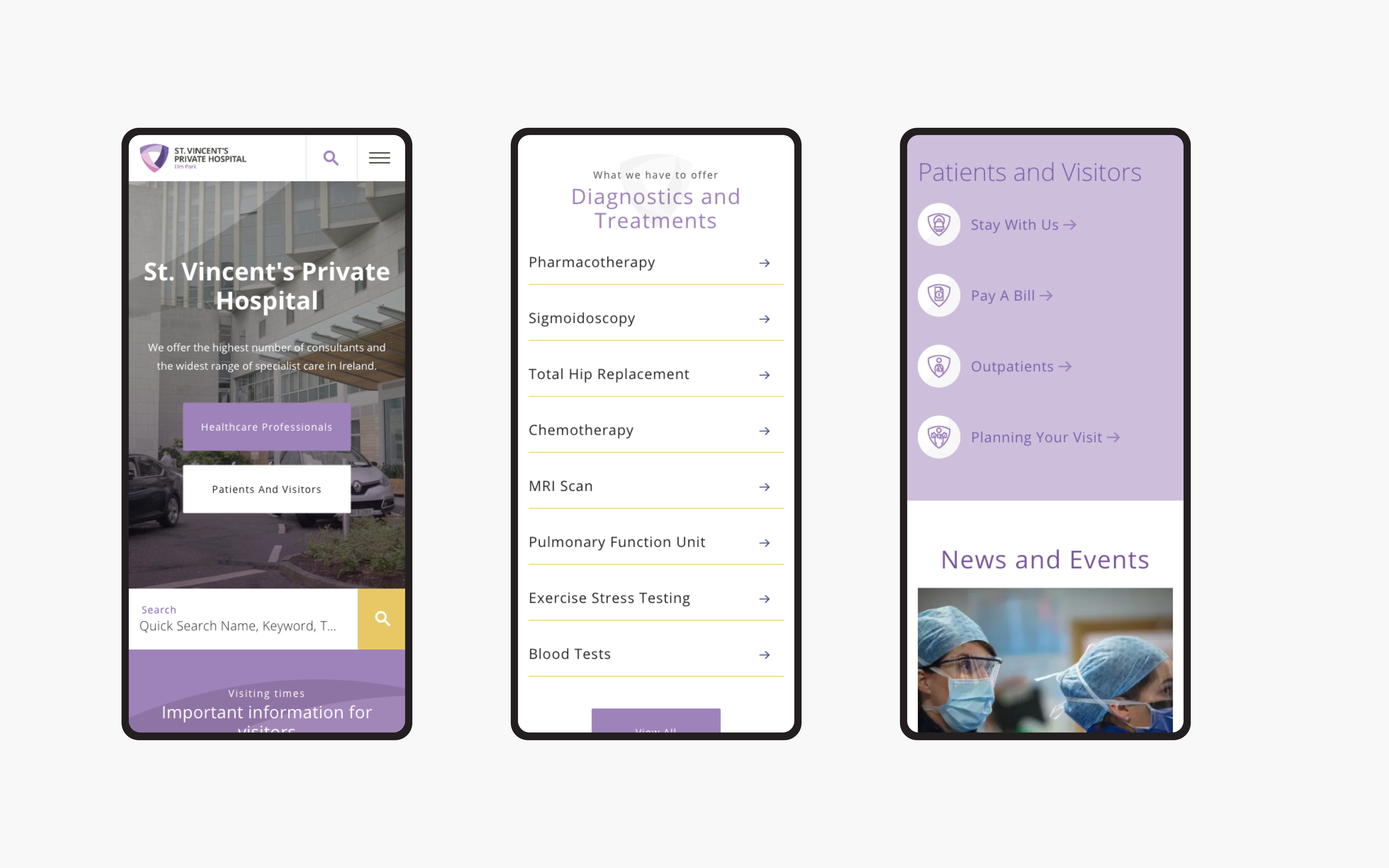
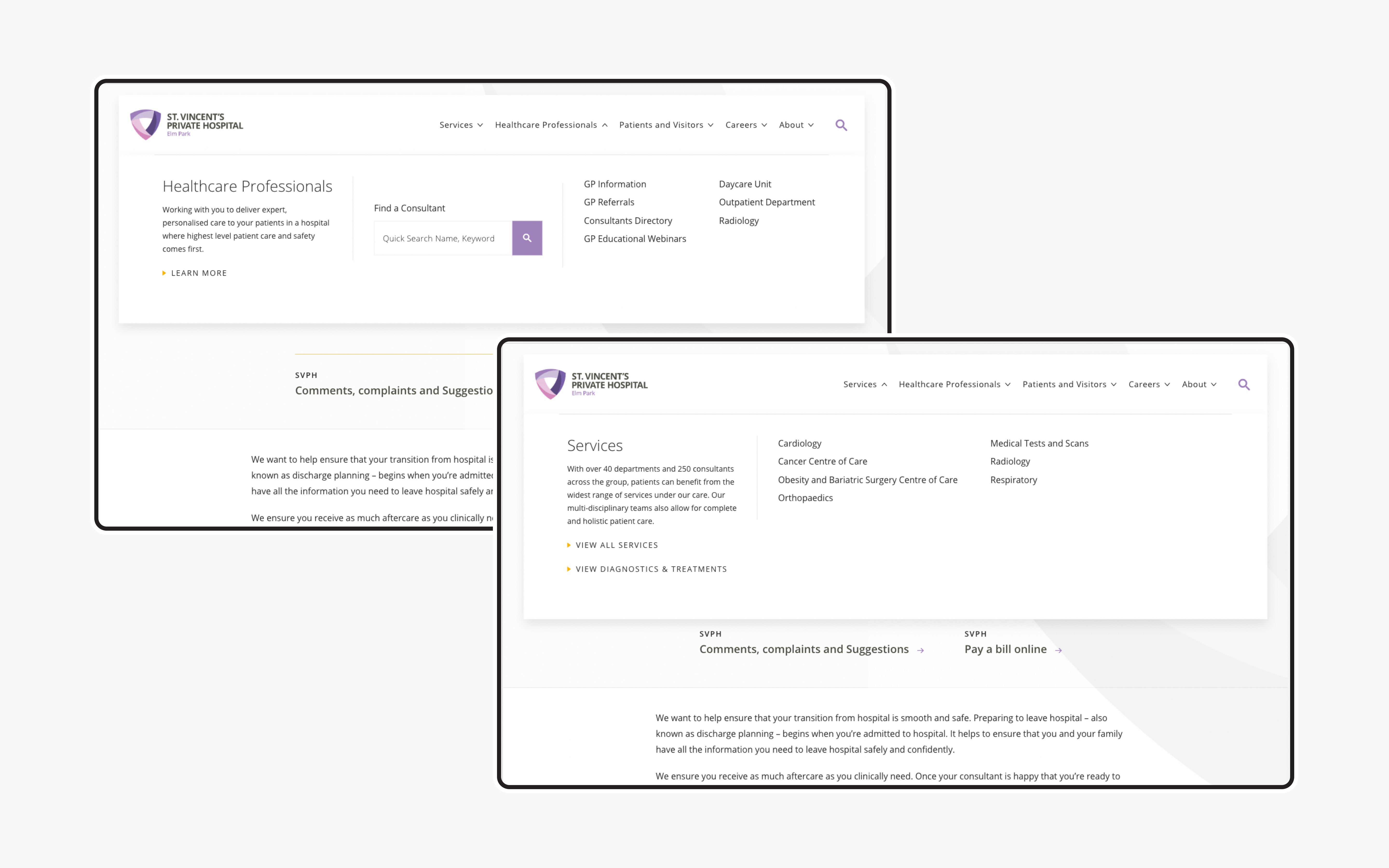
Our initial research highlighted the need for an optimised navigation system. We looked at the ways users were navigating through the site to design a more structured and categorised menu format that makes it easy for the user to digest the information and move quickly to their desired content. The homepage boasts mixed media types with featured programmes, testimonials, news, blogs etc. which leads to a more immersive and memorable experience for the user. Research also showed us that the search module was a crucial element of the website. Therefore, having the search module layered across the website within the banner fold makes it easier for the users to locate it and allows them to interact with it immediately as they enter the website.
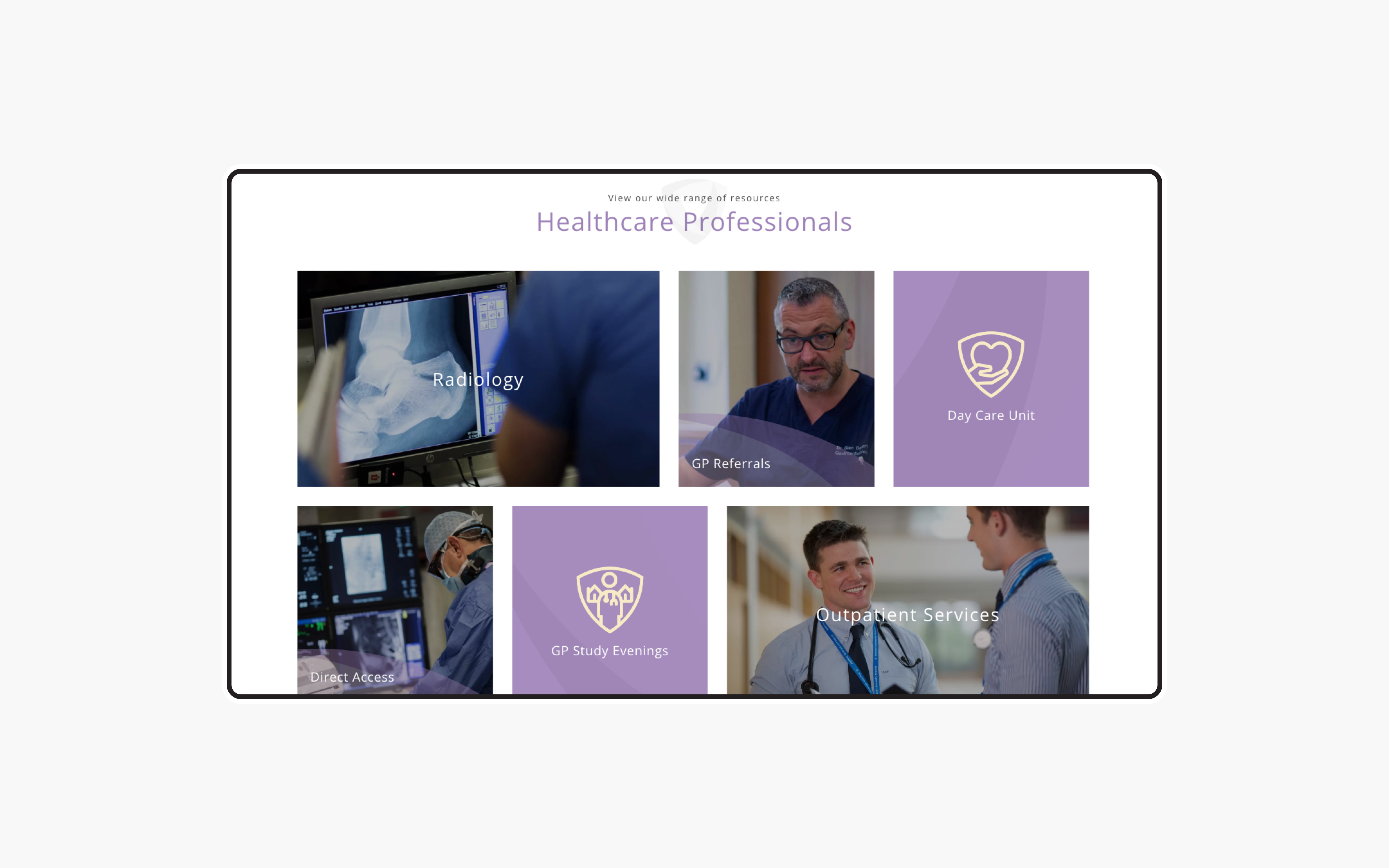
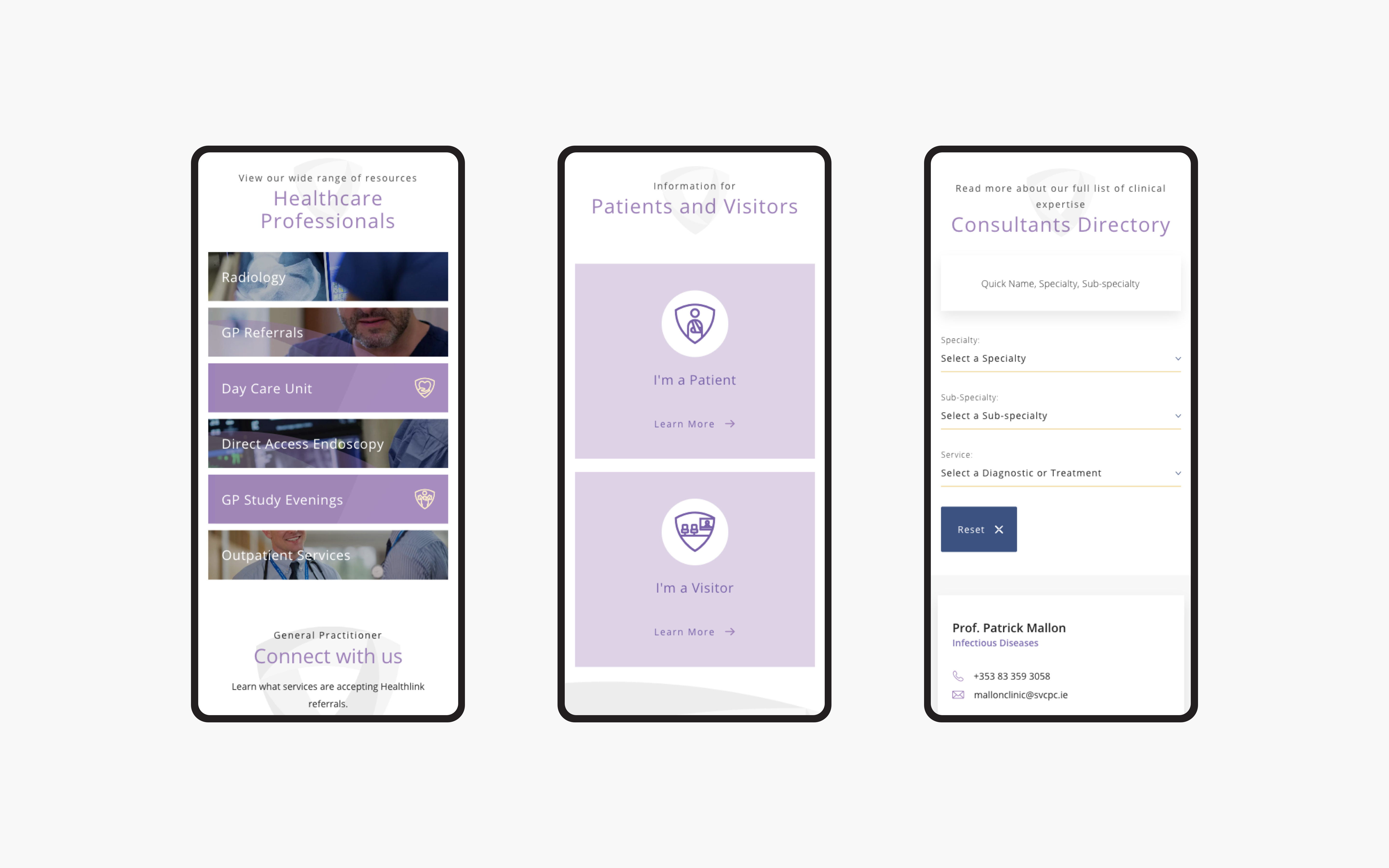
An innovative way to present services
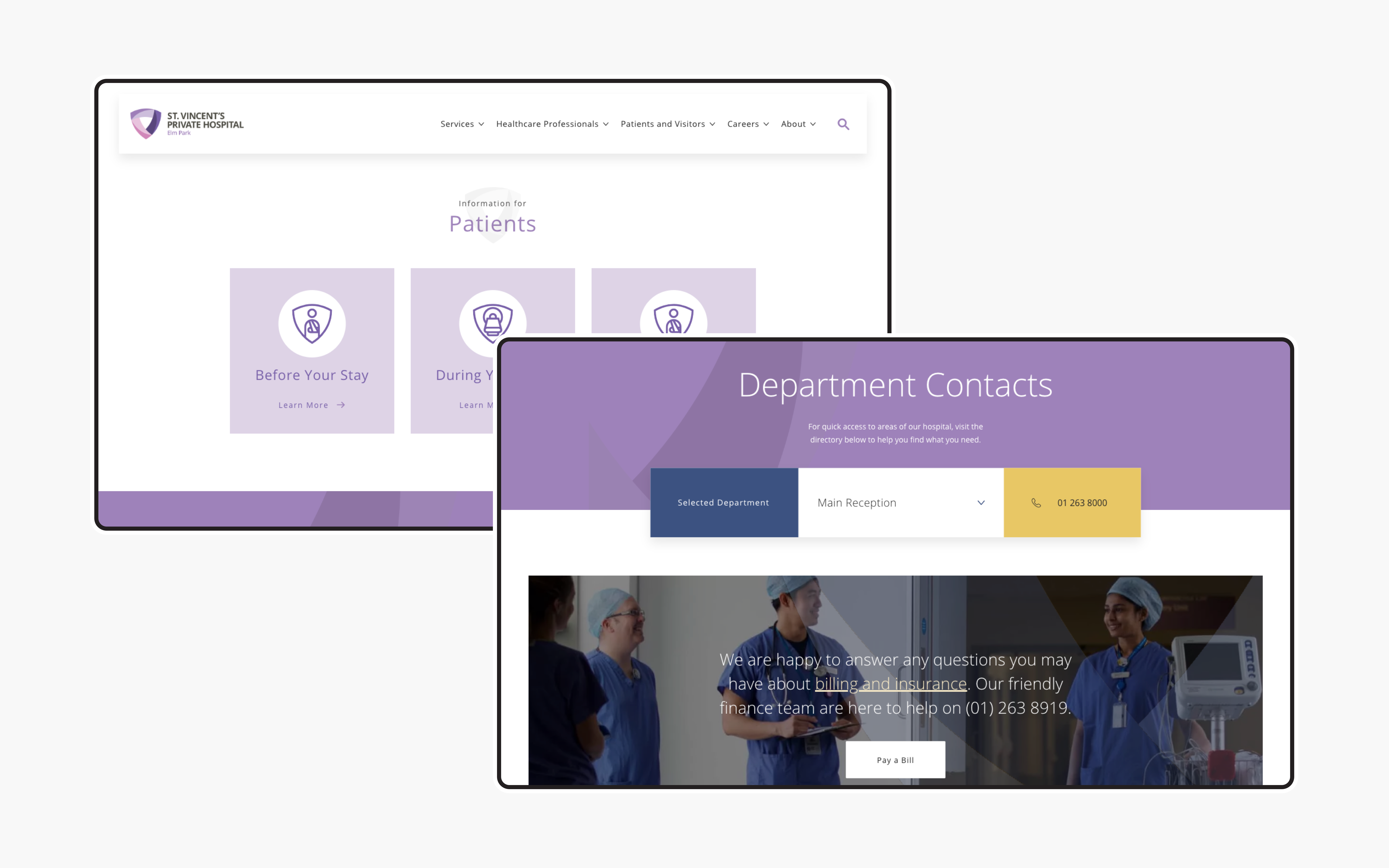
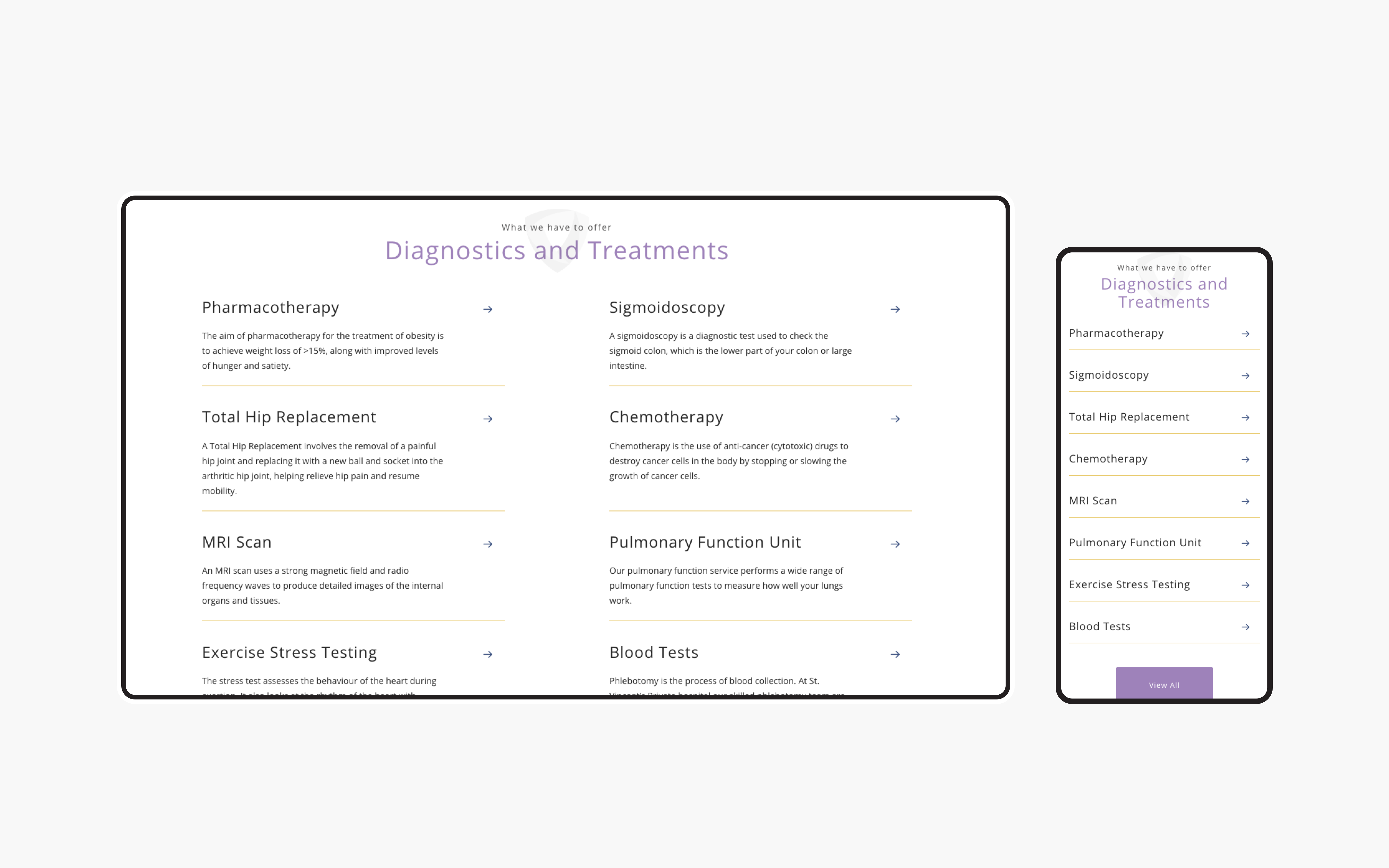
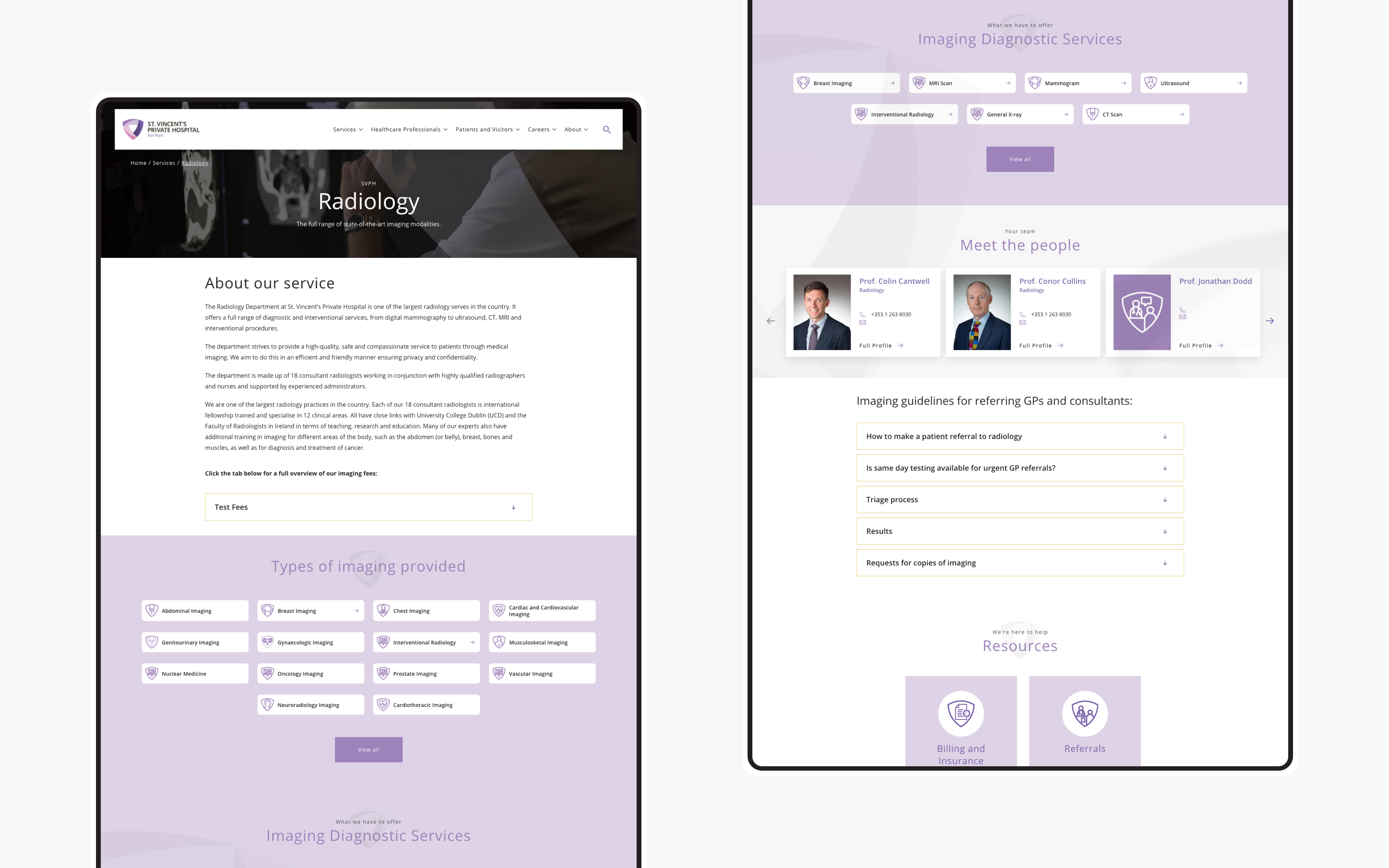
One of our findings within our UX review was the need for additional sections on the site. Although these sections didn't currently exist for St. Vincent's Private Hospital we felt they would add significant value for site users. We created content and feature specification, user flow analysis and design, wireframes and subsequent templates for 3 key sections: Centre of Care, Diagnostics and Treatments and Patients and Visitors. Each of these sections was made up of their own key content and helped users further drill down to their desired information in a matter of a few clicks.
What we did
- UI / UX design and development
- Information architecture
- Content strategy and development
- CMS integration
- Iconography and illustration
- SEO analysis and implementation
The result
A platform for multiple audiences
When we compare performance of the old SVPH with the new we can see huge improvements, indicating our UX research and implementation are working. Given the search feature was such a key aspect of the site we are delighted to see that this is one of the most interacted with modules on the homepage. On the Patients and Visitors page we can see that 75% of users are interacting directly with the funnelling cards, however, a good percentage of users are also scrolling all the way to the footer and engaging with the content throughout. Overall we can see 34% increase in page views and a further 24% increase in the number of users on the site.


