Overview
Improving at the cutting edge
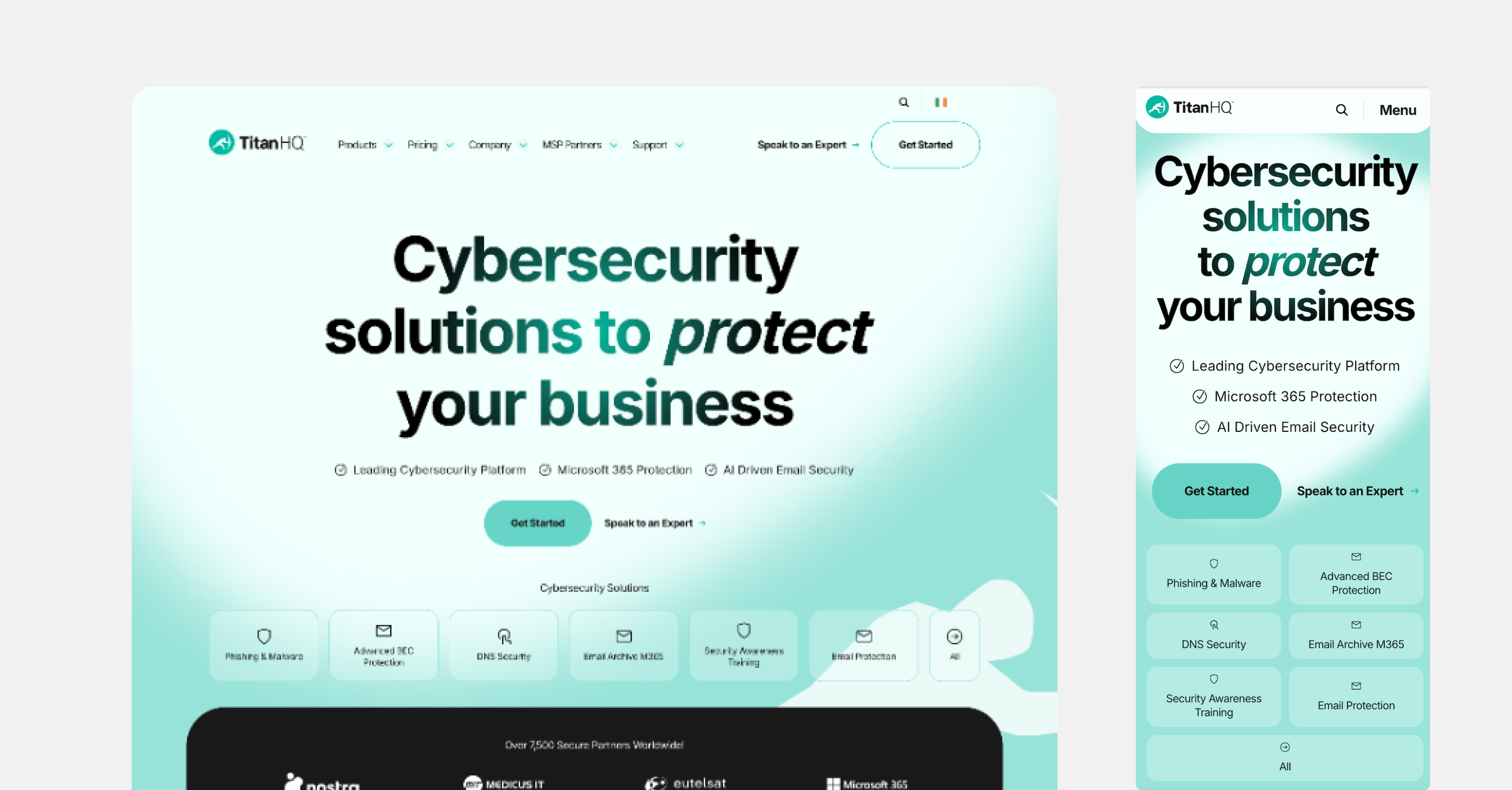
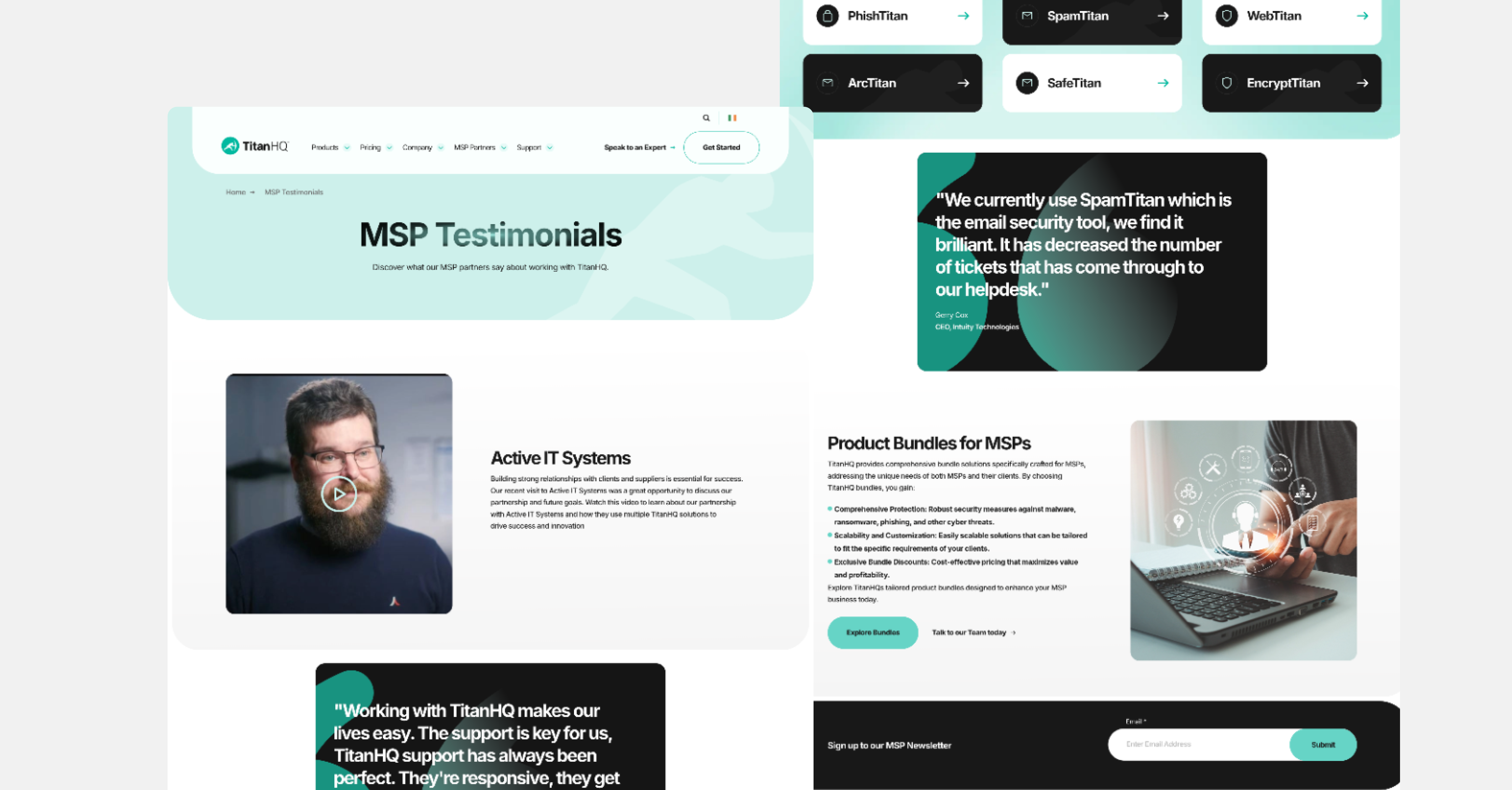
In 2023, Kooba undertook a new project with TitanHQ, a pioneering cyber-security platform and existing Kooba client. Having grown and developed as a company, TitanHQ sought to refresh its digital presence, bring in more leads, and update its visual brand. Between collaborative workshops and data-driven reporting, both Kooba and TitanHQ stakeholders agreed it was time to refresh the user experience (UX) and push the envelope on the site's look and feel. Since the original site launch in 2016, the business has evolved, and the website needs to communicate this along with its cutting-edge product offerings.
View the site
titanhq.comIncrease in engagement rate on product page
Increase in engagement time per user
A data-driven rethink
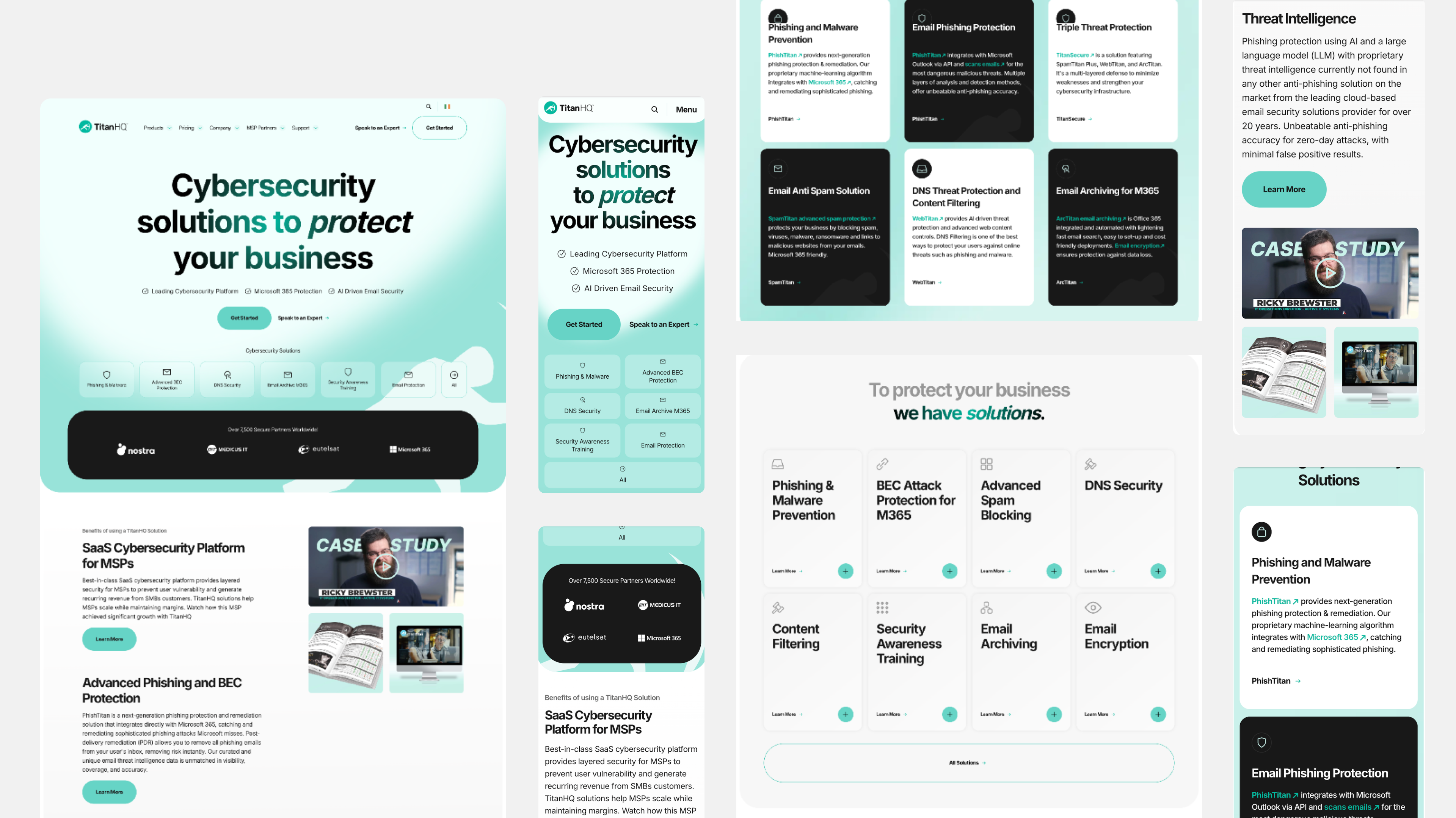
Kooba’s initial audit identified several critical areas for adaptation. The site brought in considerable traffic, and users displayed strong initial engagement rates. However, for an information-heavy site, dwell times and engagement times were lower than desired, and visitors could struggle to easily access the resources available on different pages. The user interface (UI) also showed room for improvement, as a click analysis revealed confusion amongst users over which content was and wasn’t clickable. This was an exciting project, with clear gains to be made if TitanHQ could better convert its existing traffic. From the beginning, Kooba’s design team centered their attention on three specific issues: Firstly, visitors were exiting on the pricing page rather than converting. This indicated that users were successfully navigating the page, but struggling to convert at a critical point in their customer journey. Secondly, traffic analysis found that users showed interest in TitanHQ products. However, fewer users than expected were viewing the products page, suggesting a loss of potential leads. Finally, despite the website featuring a large volume of high-quality content, visitors left too early to access the valuable resources available on TitanHQ’s work.
Managing the pricing pathway
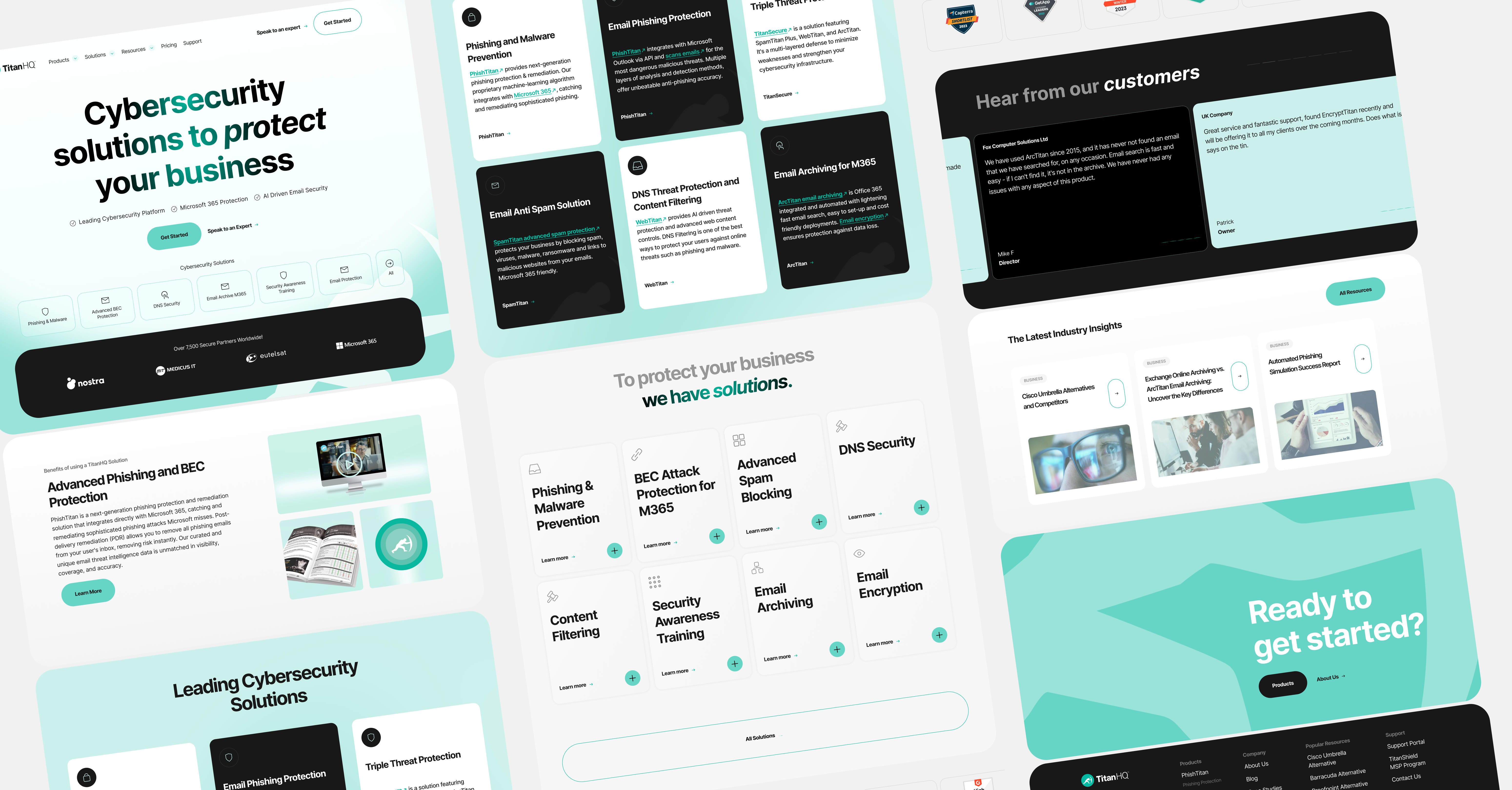
Solving the issue of the pricing page proved central to driving up TitanHQ’s conversion rate and generating an increase in leads. Visitors were eager to enter this page but frequently left it immediately. Several causes for the page’s underperformance were identified and acted on. An overhauled UX pushed users towards the product page before the pricing page, ensuring that they better understood what they wanted to pay for, and both the pricing and product pages were presented clearly on the homepage. The result was dramatic, with the proportion of users from the SafeTitan product page clicking on the pricing page increasing by 109%. Likewise, improved CTAs drove more traffic to the product and pricing pages, with a further click analysis finding that 20% of clicks on the homepage were directed to these buttons. This improved UX ensured a smooth and efficient customer journey, and a decrease in lost leads.

Perfecting the product page
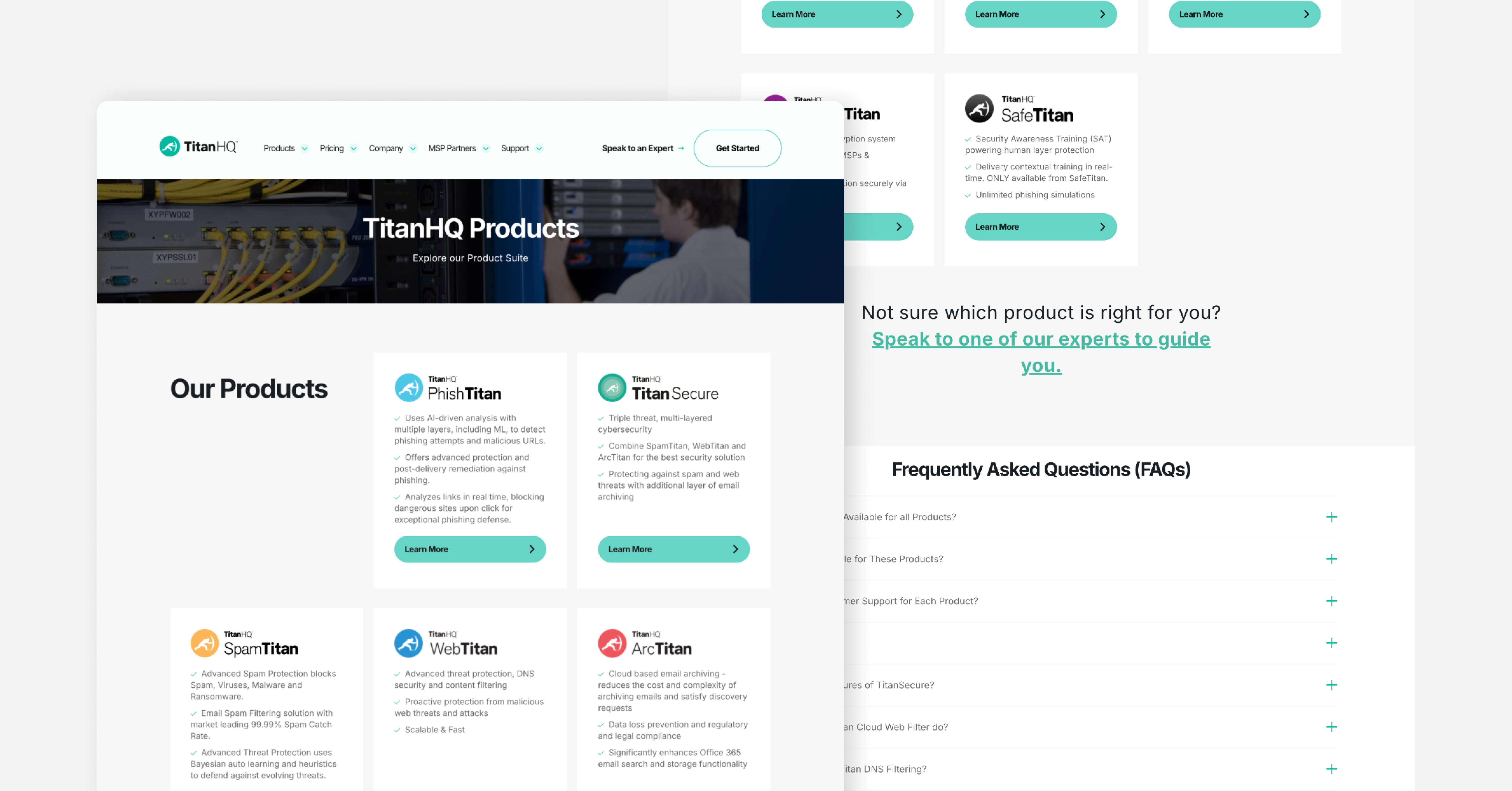
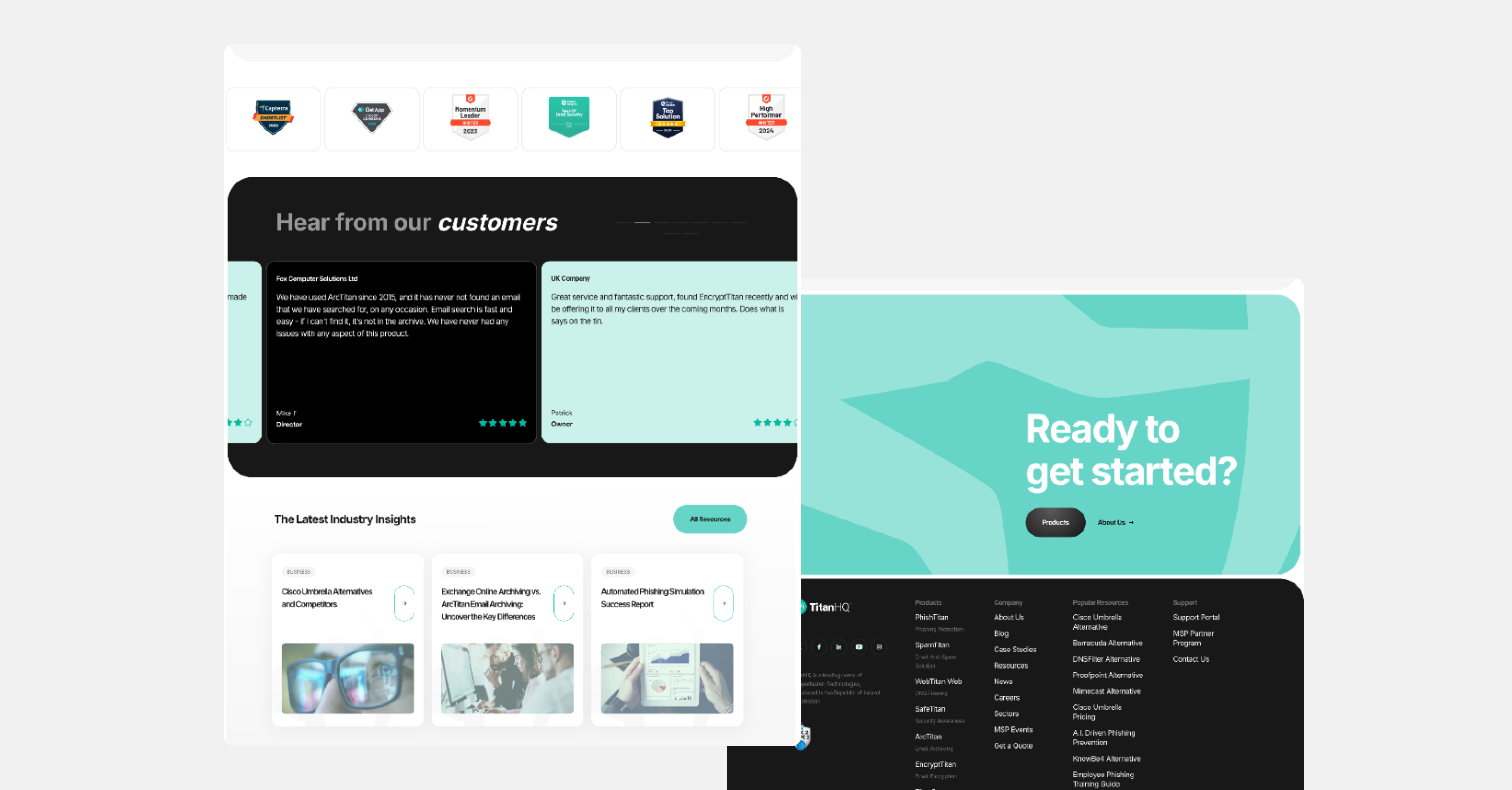
Given the high volume of paid search traffic on the TitanHQ site, the specific strengths of their products needed to be displayed and communicated. A reworked product section accomplished precisely this by providing each product with its page, complete with a host of informative content. This worked as planned, with the redeveloped product page seeing a 10% increase in sessions, which lasted on average 15% longer. More importantly, this increased viewing time translated to a 204% increase in the page’s engagement rate, meaning users were more likely to scroll through and learn more about the products on show. The product page was also futureproofed by developing customizable content templates, allowing TitanHQ to update its website effortlessly in response to product improvements.
What we did
- UI / UX design and development
- Information architecture
- Content strategy and development
- SEO analysis and implementation
The Result
A UX revolution
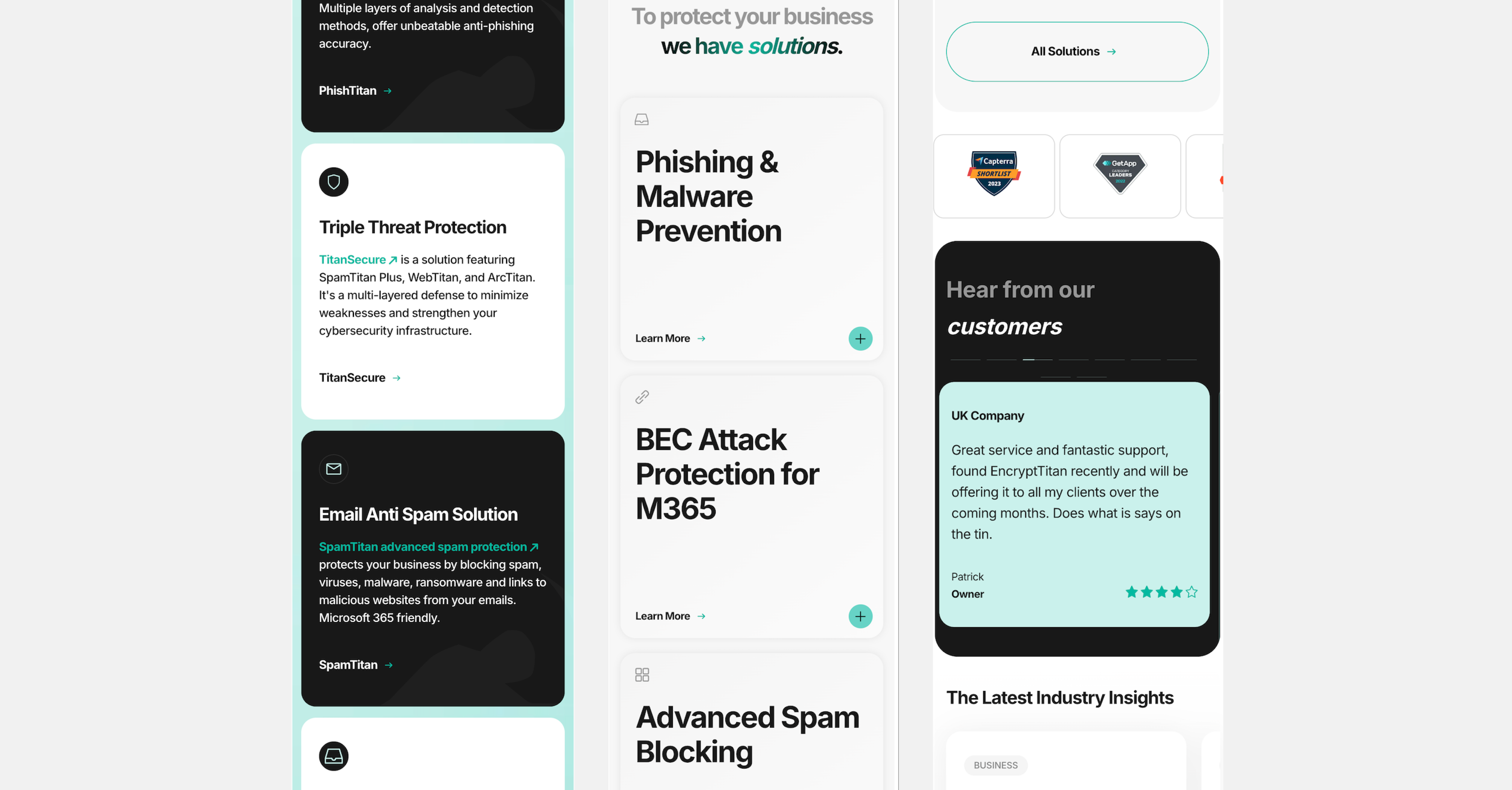
Through a thorough UX audit, careful analysis of pain points, and intensive discussions with TitanHQ, Kooba was able to identify several promising upgrades to their existing site. Kooba’s design team rebuilt the UX to facilitate smoother user journeys and better access to the content needed to drive conversions. Simultaneously, the UI was redesigned to be more dynamic, clear, and modern. The result was a significant improvement across several key metrics, including increased user traffic, improved engagement rates, and more visits to the most valuable pages.


