Overview
Attracting the right people for the road
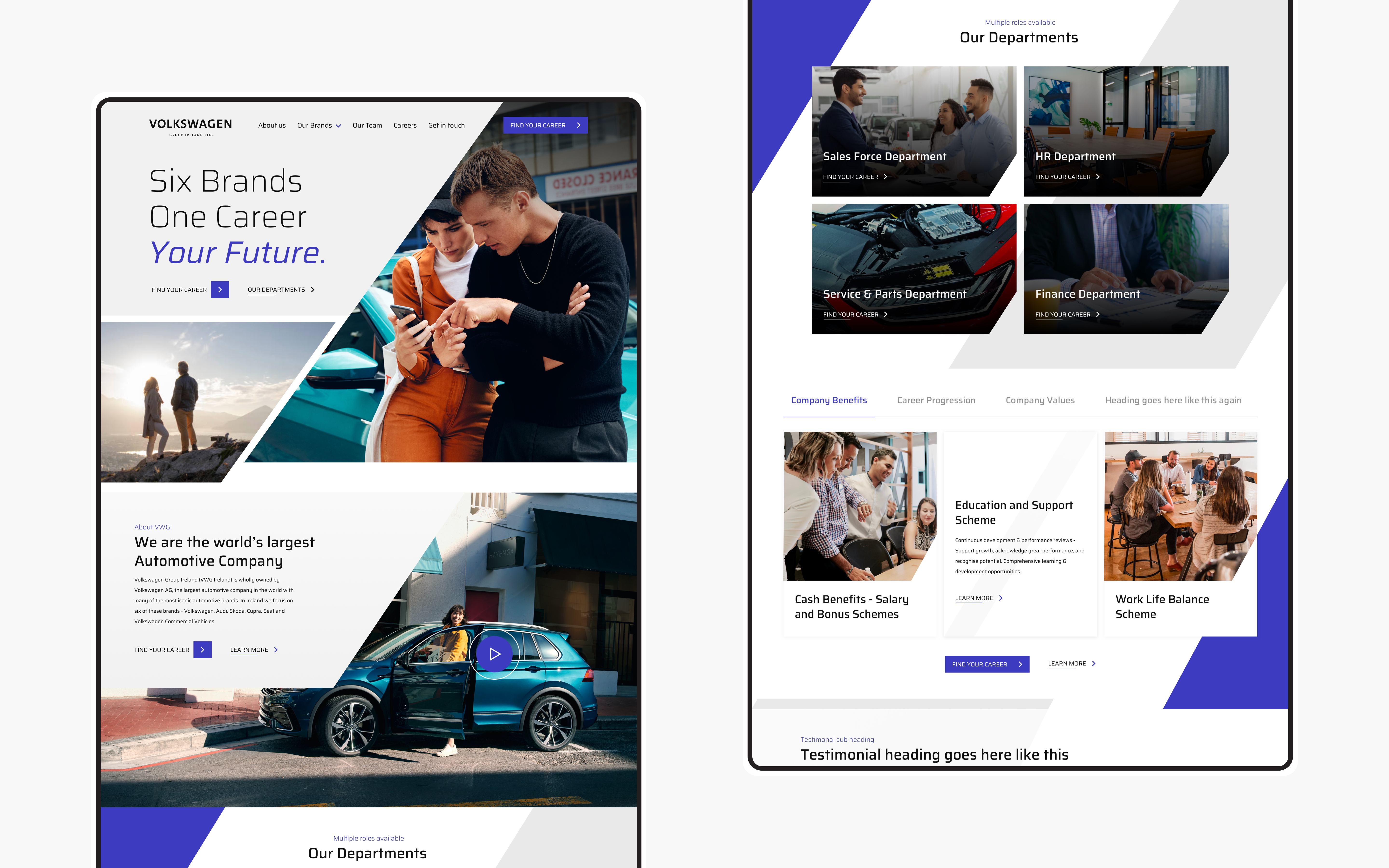
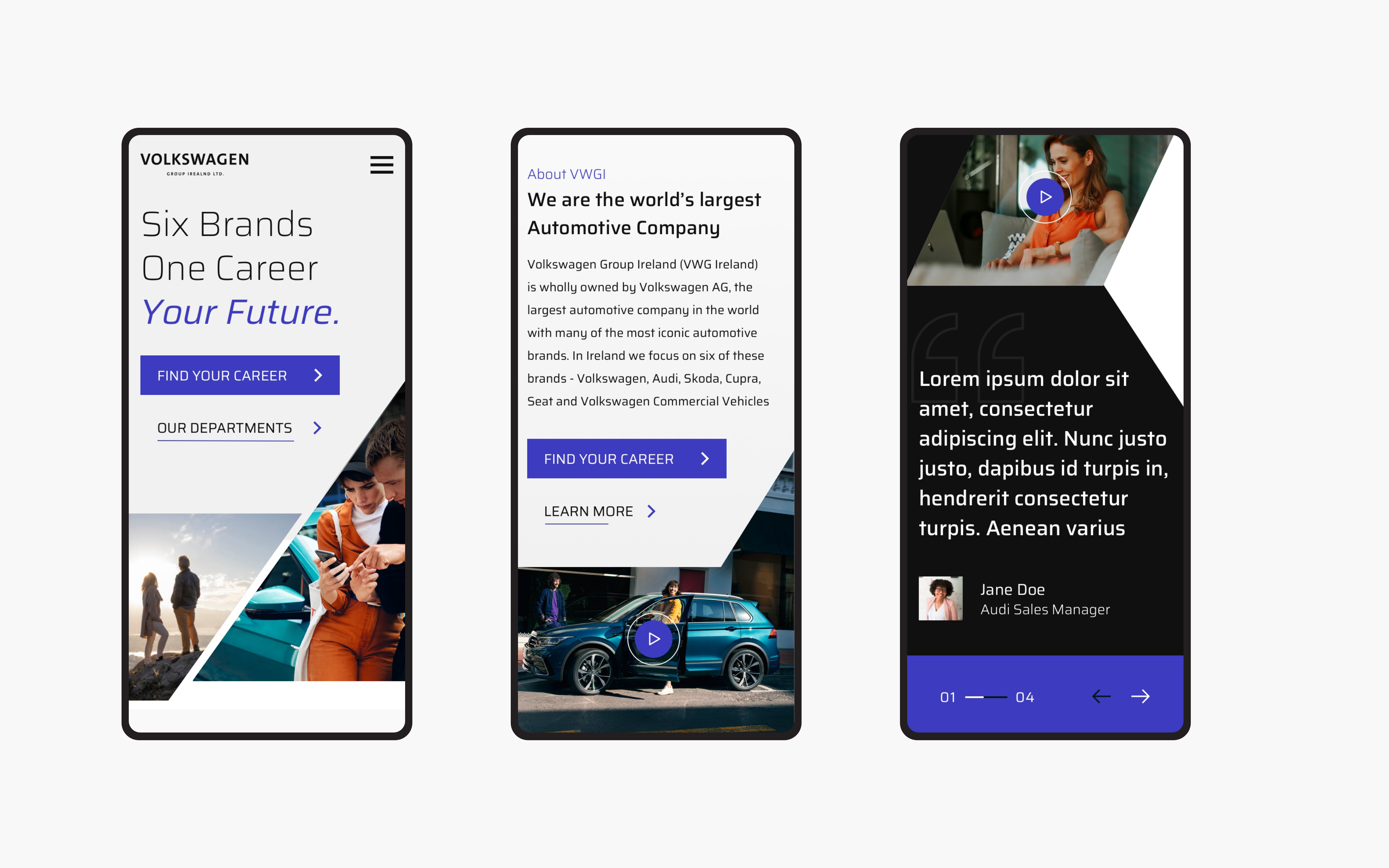
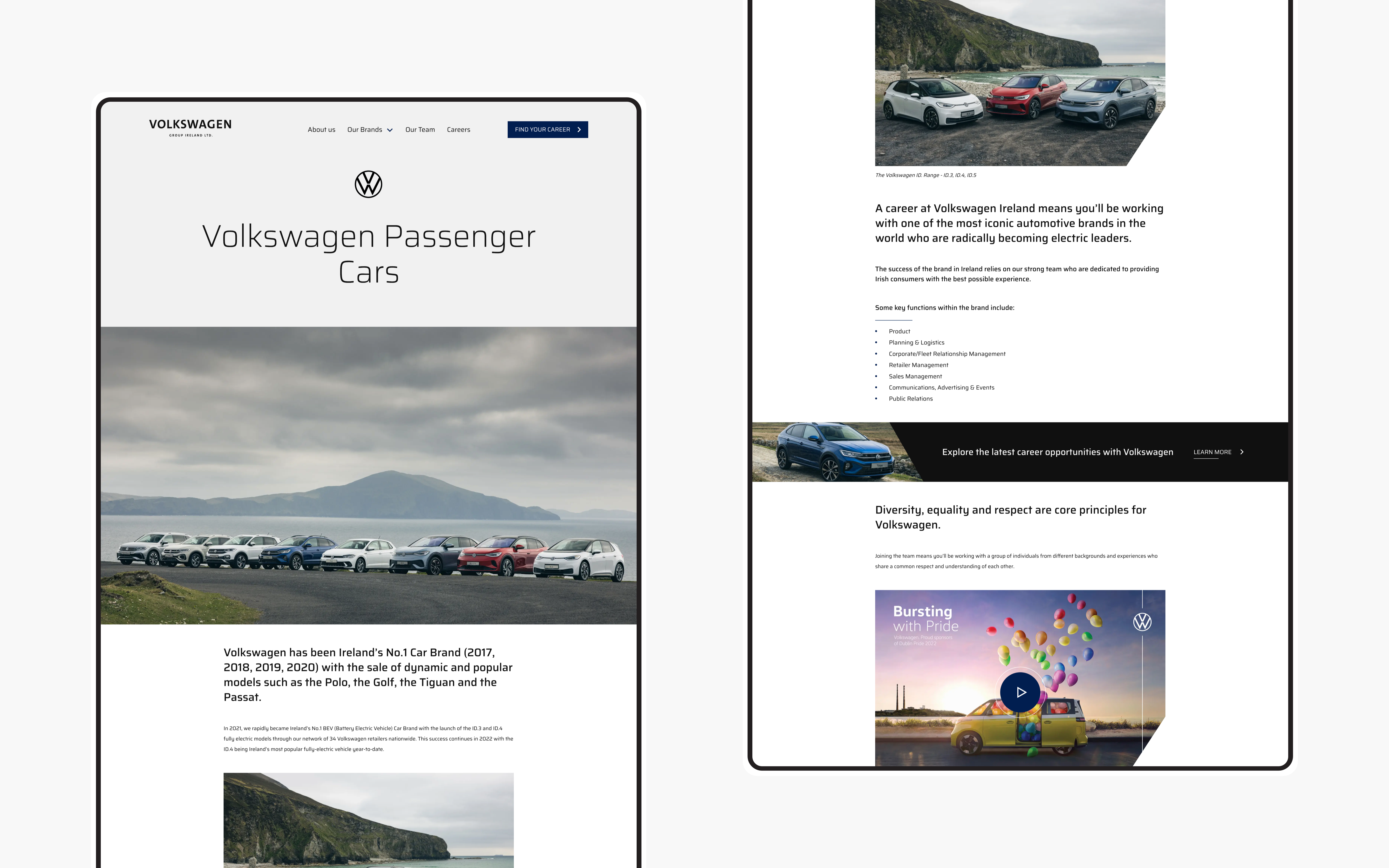
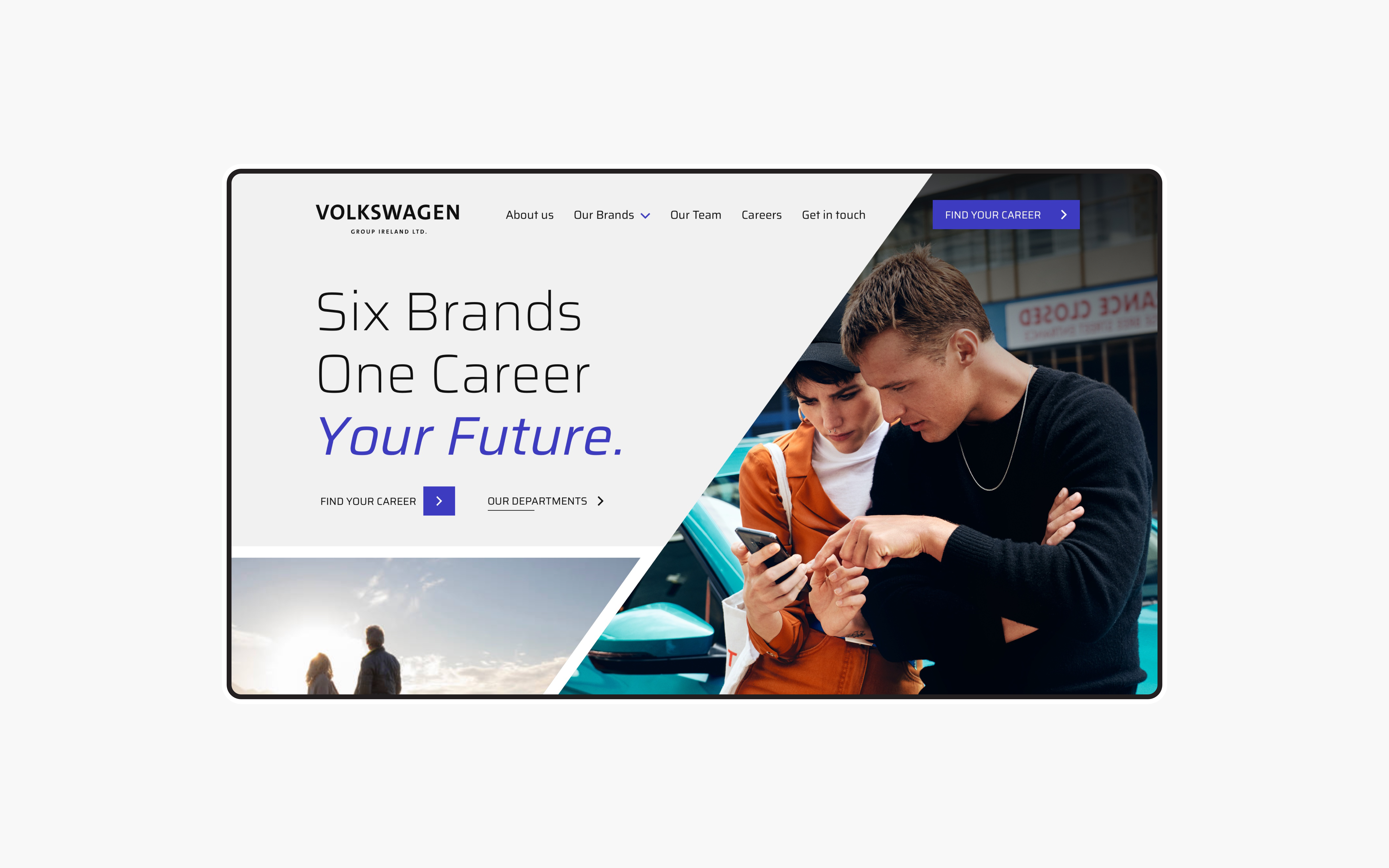
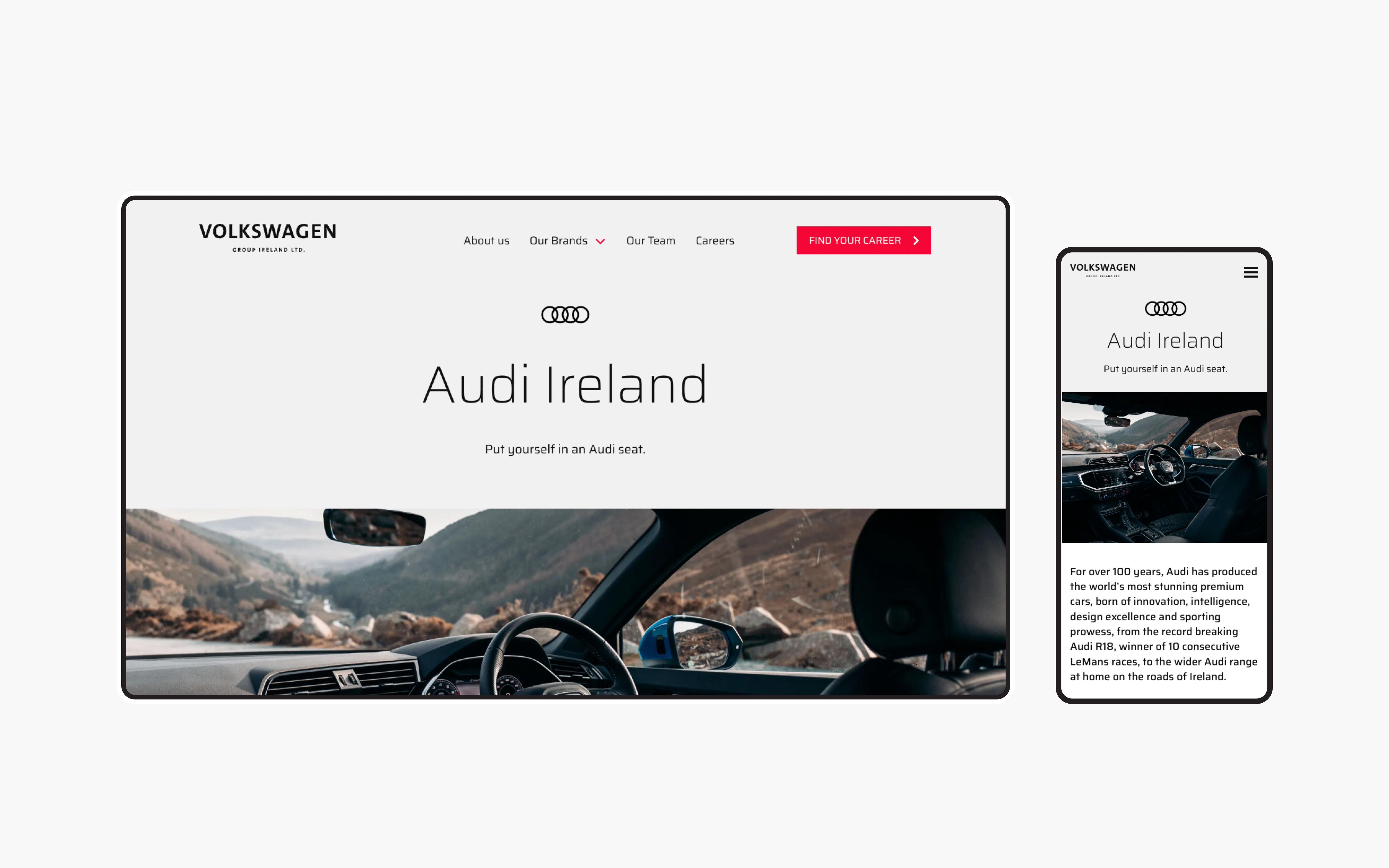
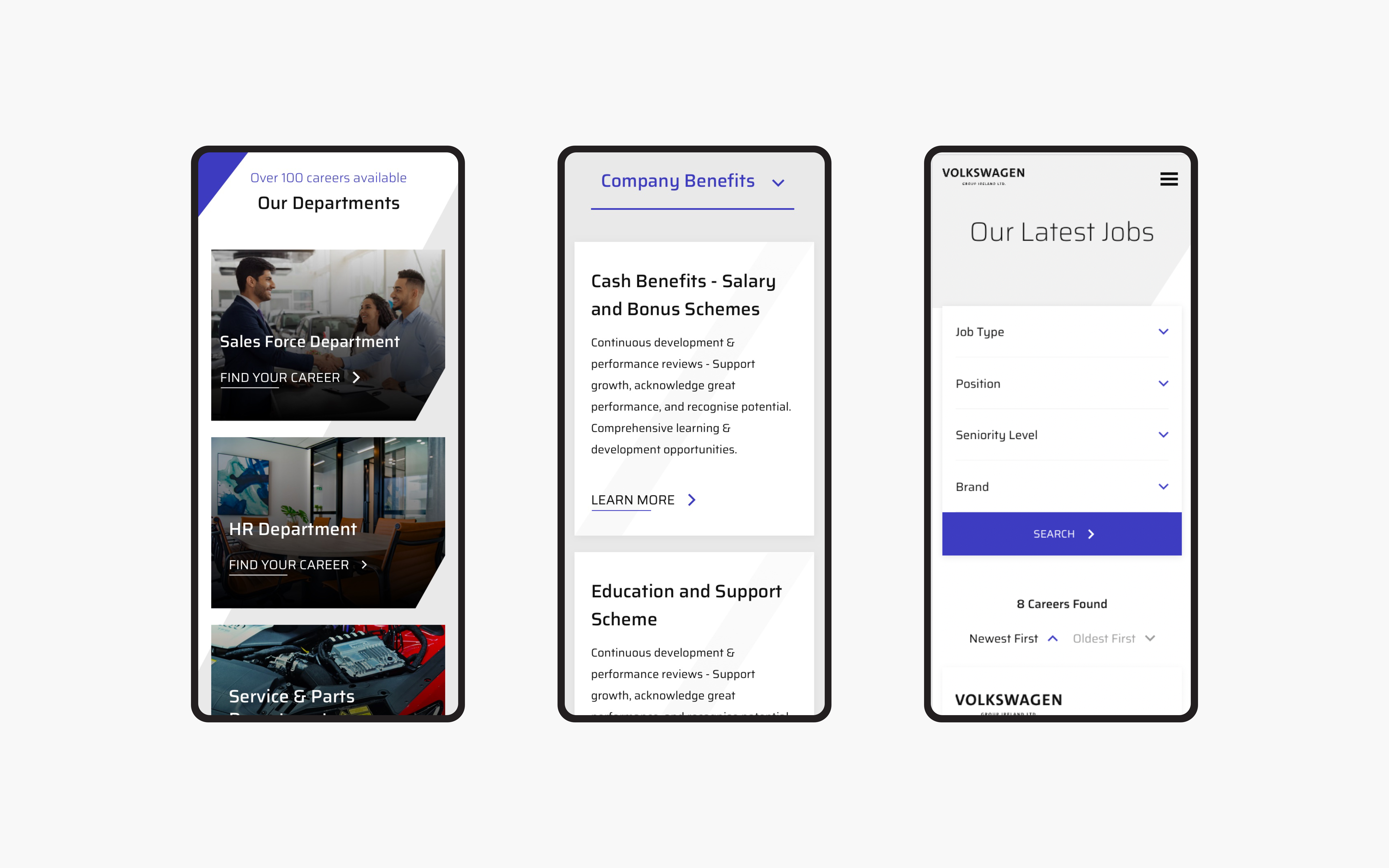
Volkswagen approached Kooba to redesign their existing careers site. Although the site was functional, the strategy was focused on improving the careers site in hopes of attracting stronger talent and increasing hiring engagement. Based on Volkswagen’s preferences and the user research conducted by Kooba, we decided on several objectives that would guide the process from start to finish: visuals, content and animation.
View the site
vwgcareers.ie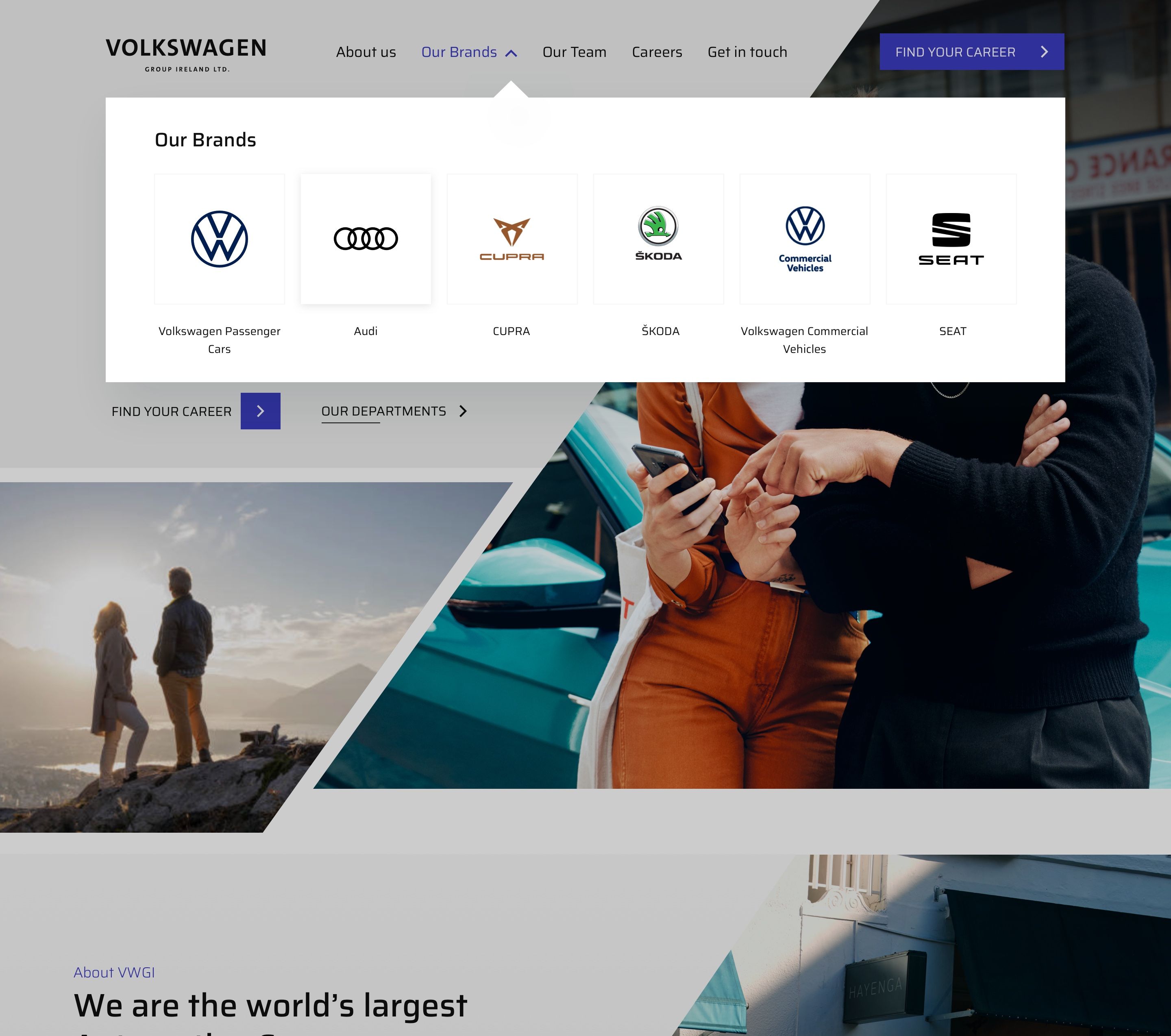
Stronger visuals at full speed
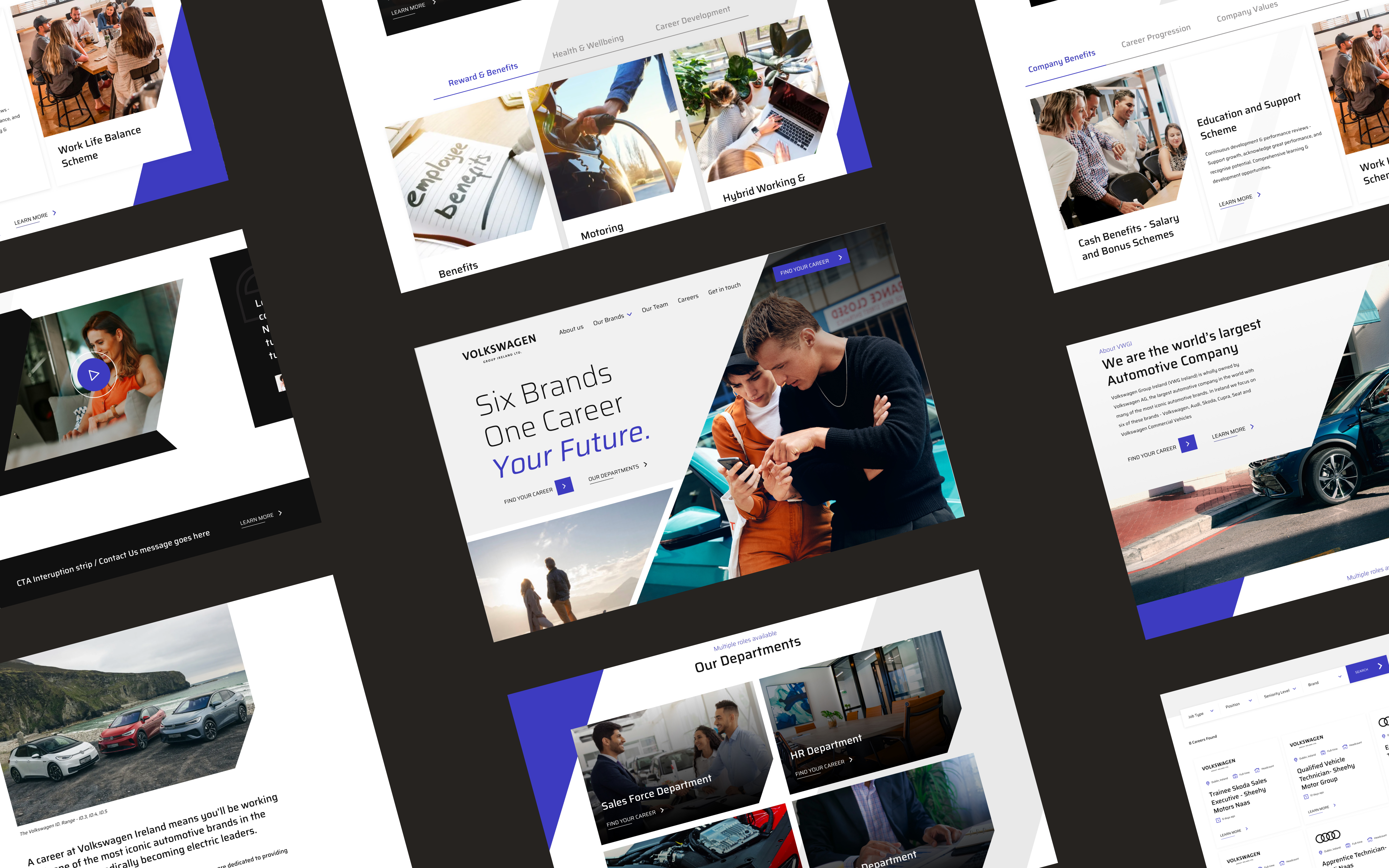
Volkswagen wanted stronger visual content across the site; in particular, there was a desire for imagery and video content highlighting people and the Volkswagen community to add a personal ethos to the site. From the start, the strategy revolved around spotlighting company culture and imagery throughout the pages. However, we proceeded with caution, as increased content can often compromise site speed. To support Volkswagen’s interest in an image oriented and video-heavy careers page, we built in a Vimeo integration for stronger performing videos. By using Vimeo, video chunks are downloaded on demand rather than reloaded with the rest of the site. As a result, the site is much faster than a site that hosts the amount of video content that Volkswagen wanted.
A career booster
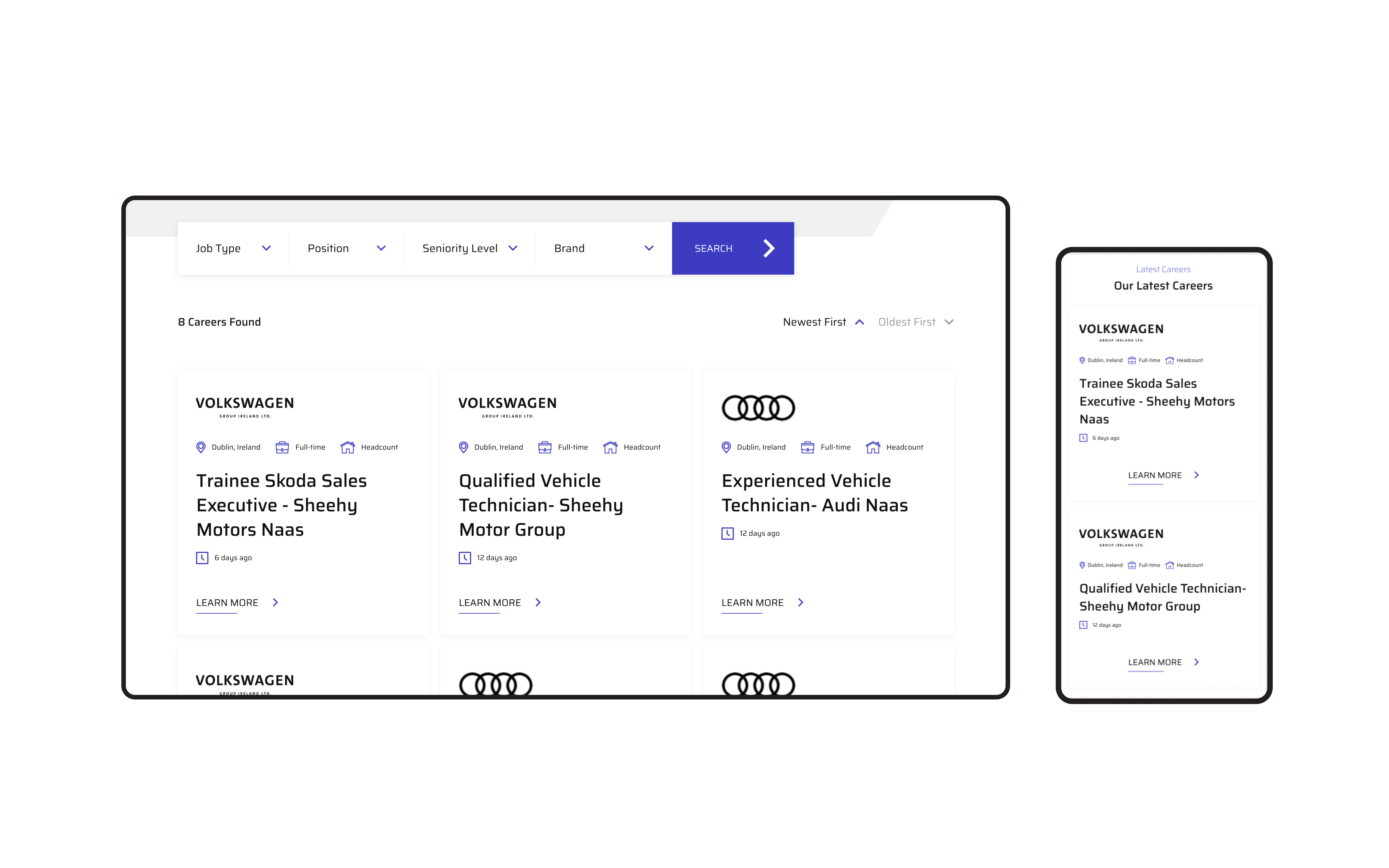
Another core part of the digital strategy was positioning the site as an information source. The vision included elements such as application resources, guides, FAQs and industry insights. We understood that the site needed to evoke a sense of career growth and excellence, something Volkswagen voiced as a priority for attracting the skilled, ambitious people they are looking for. As a result, the new site content is more creative and rich than before; the modules have been developed to keep the user engaged, and the plethora of information has created a distinction between external careers sites like LinkedIn and Volkswagen’s own site as a resource for prospective employees.
Engaging & moving
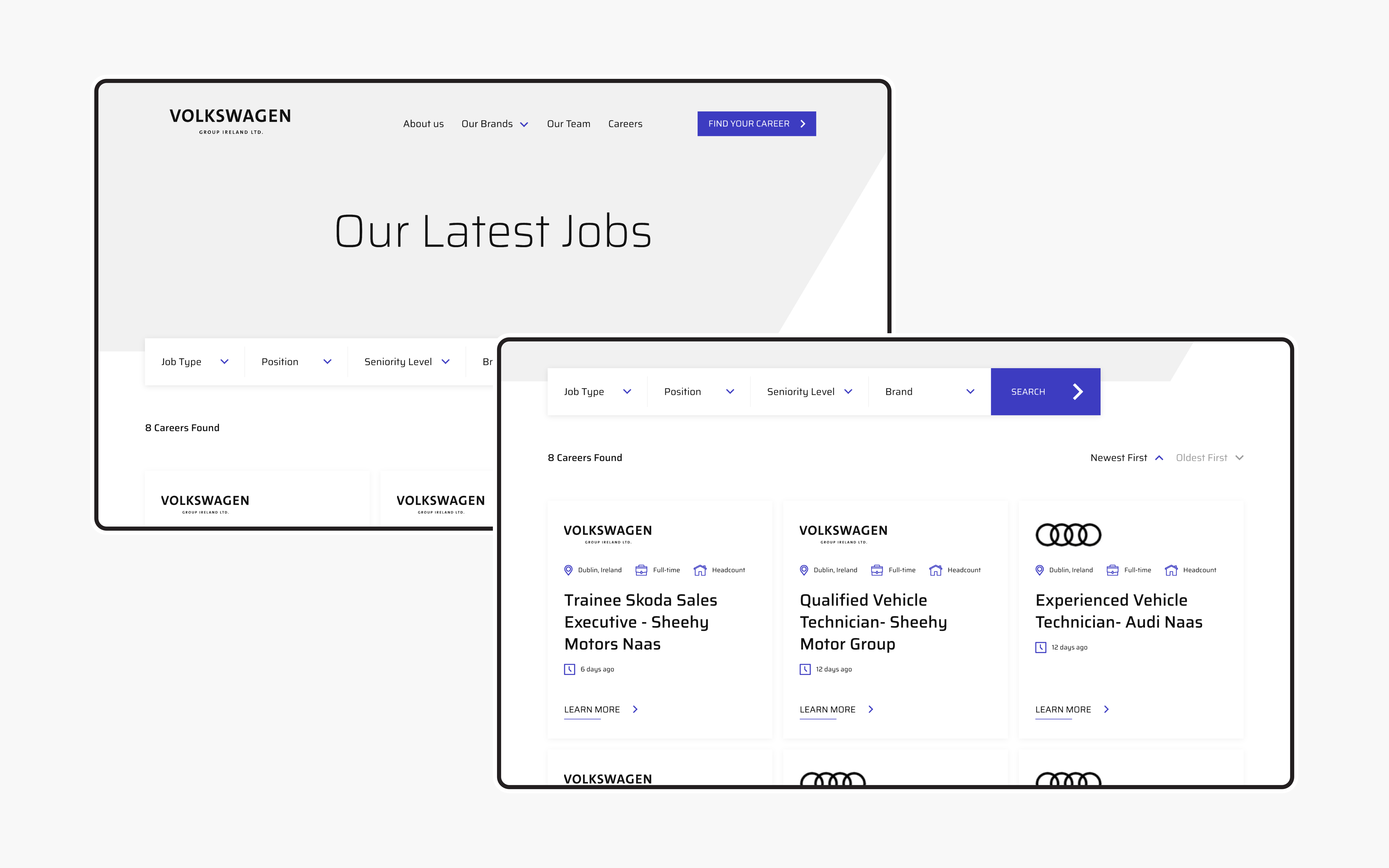
Among the several new innovations on the site, animation contributed heavily to increased functionality and visual engagement. Using animation not only added to the storytelling experience of the site, but also allowed an element of accessibility to the pages. Our developers used GSAP for animations throughout the site, an specific animation library that crafts high-performance animations that function efficiently regardless of the browser or internet speed; more site users can now engage with and eventually apply to Volkswagen.
What we did
- UI / UX design and development
- Information architecture
- Content strategy and development
- CMS integration
- SEO analysis and implementation
The result
Two clicks away from ‘apply’
Since the recent launch of the site, Volkswagen has seen several positive outcomes from the development. There are clear goals and consistent call-to-action buttons for the user to navigate throughout the site to add to a more seamless website and career search experience. The new content is more engaging than before, and the overall performance of the site has improved. The careers process is already daunting as is; the new Volkswagen site takes away the added stressors of slow-loading pages, unclear information and unmotivating content. What we’re left with is a digital presence that shows a clear road towards career growth with Volkswagen.
