At its heart any online presence, be it a site, product or landing page, is designed to help someone get something done. Taking the time to really understand who that someone is, and what that something is, is central to delivering a project that works for the audience, and as a consequence delivers on your business objectives.
That’s not all. With a clear understanding of the jobs that our audience want to get done, we are in a position to make tactical decisions around information architecture, site navigation, and creative approach with a clear understanding of the specific tasks we’re looking to support. That helps concentrate the mind - and certainly makes a refreshing change from just following the most persuasive person in the room!
With all that in mind, here’s 5 simple tips to put the process into action, get genuine understanding around user priorities, and ensure that understanding is put into practise:
1. Turn your perspective around
It is all too common to hear clients talk about how an online presence is about “communicating the great benefits of our product” or “showcasing our services”. But when we talk like that, we create a suggestion that a website exists to help our own organisation do something. We just have to decide what that something is, tell our agency - and we are on our way!
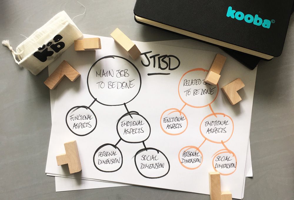
It is, of course, the other way around: the audience is those individuals using the site. And we can’t necessarily intuit exactly what it is that they want, or what ‘job’ they have in mind when they approach our site. So it is vital to make this first step: to understand that tasks, motivations, ‘jobs to be done’ and so on all stem from the end user, not from the client. Once we have made that particular adjustment, the real work can begin.
2. Ask, watch and listen
I was tempted to use ‘trust nobody’ for the heading above. Certainly if you are hearing many sentences along the lines of “we know users want to be able to sign up for free trials online” you are well advised to take them with as much salt as you feel appropriate. The way to understand what users want is - surprise surprise - to listen to them.
But it goes deeper than that. Many of us are not always able to clearly articulate what we want from a product or service, or indeed claim to want something that in fact we do not. Here we might recall Ford’s famous (and almost certainly apocryphal) observation that “if I’d asked people what they want, they would have said ‘faster horses’”. The nugget of truth within that line is not that customer input does not matter, but rather that sometimes you need to dig deeper to find it.
That’s where watching, observing and encouraging your users to talk aloud about what they are thinking can help where simply asking ‘what do you want?’ may not. Sit down with users and customers. Observe them using existing sites and landing pages - including those of competitors. Encourage them to speak aloud about their thought processes. Observe what matters and what they are attempting to do - and if possible film everything.
3. Talk to the right people
Garbage in, garbage out. It’s a cliche for a reason. It is vitally, vitally important to learn from those users who truly matter to your business. If you are sitting down and observing the wrong users - you will learn nothing.
This is where the development of personas can come in handy. Without getting into detail (that can wait for a later blog post) a persona is a tangible definition of a meaningful individual who would wish to use a website or online presence. By having such a definition, it becomes simpler to establish whether the individuals you are watching and listening to are truly those who will give you genuine insights.
This can’t be stressed enough. It is often tempting (either for the client or the agency) to compromise on accuracy when selecting users for this process. Doing so undermines the entire project. Take the time to define precisely who you want to observe, and don’t compromise when it comes to getting hold of them.
4. Keep the analysis open
Task analysis is not the same as user testing. The latter often starts by giving the user a specific task (even if an open-ended one) and seeing how they perform. But in this instance, we want the user to let us know what they are trying to achieve, and we want to see how what they are shown might support or change those objectives - and so on.
Given this is the case, it is preferable to start with conversation alone. Walk the user through a series of open questions around their ‘job’ (whether in a business and personal capacity) and what they look for from a company like yours. Don’t necessarily link everything back to the online site. Then watch them navigate your own and competitors sites as above, without prompting them to perform certain actions. Let them find their own way and voice what they are attempting to do.
By taking this approach you’ll probably discover that some tasks you felt were important don’t even occur to your users and customers, and you’ll be in a better position to meet user needs in the service of your own business objectives.
5. Ensure decision making refers back to task analysis
Now we come to the heart of the matter. User and task analysis means nothing unless it is reflected in the decisions you make around information architecture, navigation and creative.
First up - document your results. Failure to have some clear conclusions on paper is a recipe for the ‘stronger’ personalities in an organisation to run roughshod over the findings! Summarise your work clearly and most importantly ensure everyone is agreed on the key tasks customers and users are looking to complete.
When that is done - keep referring back to that document. The process of online design and development is one that involves decisions and trade-offs at every step. At the most simplistic level, with on-screen real estate limited (particularly on mobile) it can be difficult to decide what to prioritise and what to let go. In organisations with multiple product and service offerings, each with an internal team, it can be politically difficult too. This analysis can help make those decisions, and make them objectively.
It can also inform how information architecture works and, in conjunction with mouse and click-tracking analysis, help ensure that those tasks users do want to are optimised (and tested to ensure they are optimised as much as possible!) When the time comes for user acceptance testing of a final product, we have a list of tasks to give participants in order to establish how well creative and design have delivered on our objectives.
In short - we have an effective design that works with the user to help them get the job done. And it all started with a few simple questions!


