What makes a good brand?
Ultimately, a brand needs to communicate your value and status clearly and efficiently to your users, customers, and target market. This means building a visual identity that the entirety of your audience can access and interact with.
At Kooba we’ve often argued that good design is accessible design. That’s not just true about websites, but also brands. Here’s some of the principles that we follow in order to make our branding work as inclusive (and effective!) as possible.
Colour
Colour is perhaps the most obvious and quantifiable factor in building an accessible brand. By measuring the contrast between the colours of a foreground and background, we can understand the legibility of a brand or website for those with impaired vision. As a rule of thumb, designers aim for a contrast of at least 4.5:1 when selecting a colour palette (you can check your own palette here). For brand designers, every possible combination of brand colours needs to be legible and clear when combined, and this means building a brand palette that accounts for the potential “mixing and matching” of assets and colours.
Of course, most of this advice applies to any brand, regardless of accessibility concerns. Imagine a user viewing your logo from a distance, or catching a momentary glance of one of your advertisements. Clear, distinctive and high-contrast colours can make all the difference in these scenarios. If your visual brand is more accessible to disabled users, that almost always makes it more accessible to your entire audience. IKEA have an incredibly distinctive visual brand and logo, which is also (surprise surprise!) highly accessible. As always, good design is accessible design.
Colour also offers an opportunity to communicate information in a fast and direct way. By using consistent colour codes across a brand, users can understand content without needing to read detailed text. Take, for example, the way that TitanHQ’s site distinguishes different products with unique colour identities. It’s a small detail, but it makes an otherwise overwhelming amount of information immediately useful and legible. It also allows anyone familiar with the brand to navigate quickly even without seeing the text underneath each colour. This creative use of colour can help make a brand both more accessible and more effective, and is something that Kooba embrace whenever possible.
Shape
As with colour, the shape of your visual assets can always benefit from simplicity and consistency. Accessible brands prioritise shapes that remain clear and understandable at every scale, with overly complex elements kept to a relative minimum. An obvious example here is the logo (think of IKEA again), but equally important is the overall use of shapes, textures and contours across a brand identity. A coherent approach to these elements will provide a consistent and familiar impression on your users in every context. This includes your website, advertisements, social media and even your sales material.
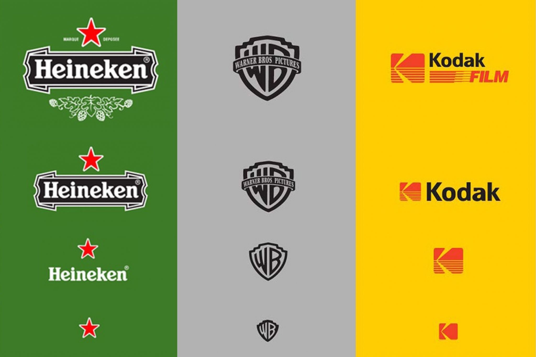
Again, building brand elements that remain distinctive and clear in every context is simply best practice, even without considering the accessibility upsides. Consider the use of responsive logos, which aim to provide an appropriate amount of visual information to users at every scale of display. These ensure your brand always makes an immediate impression on every user, but also avoid the accessibility concerns of tiny details and illegible text.

Three examples of responsive logos.
The importance of inclusion
Your visual brand is more than a superficial coat of paint. It directly controls how your audience and users interact with and understand your business. Thinking in terms of accessibility provides a useful guideline for building this direct, effective, and profitable communication. Focus on including your entire audience, and you’re halfway towards a powerful brand identity.


