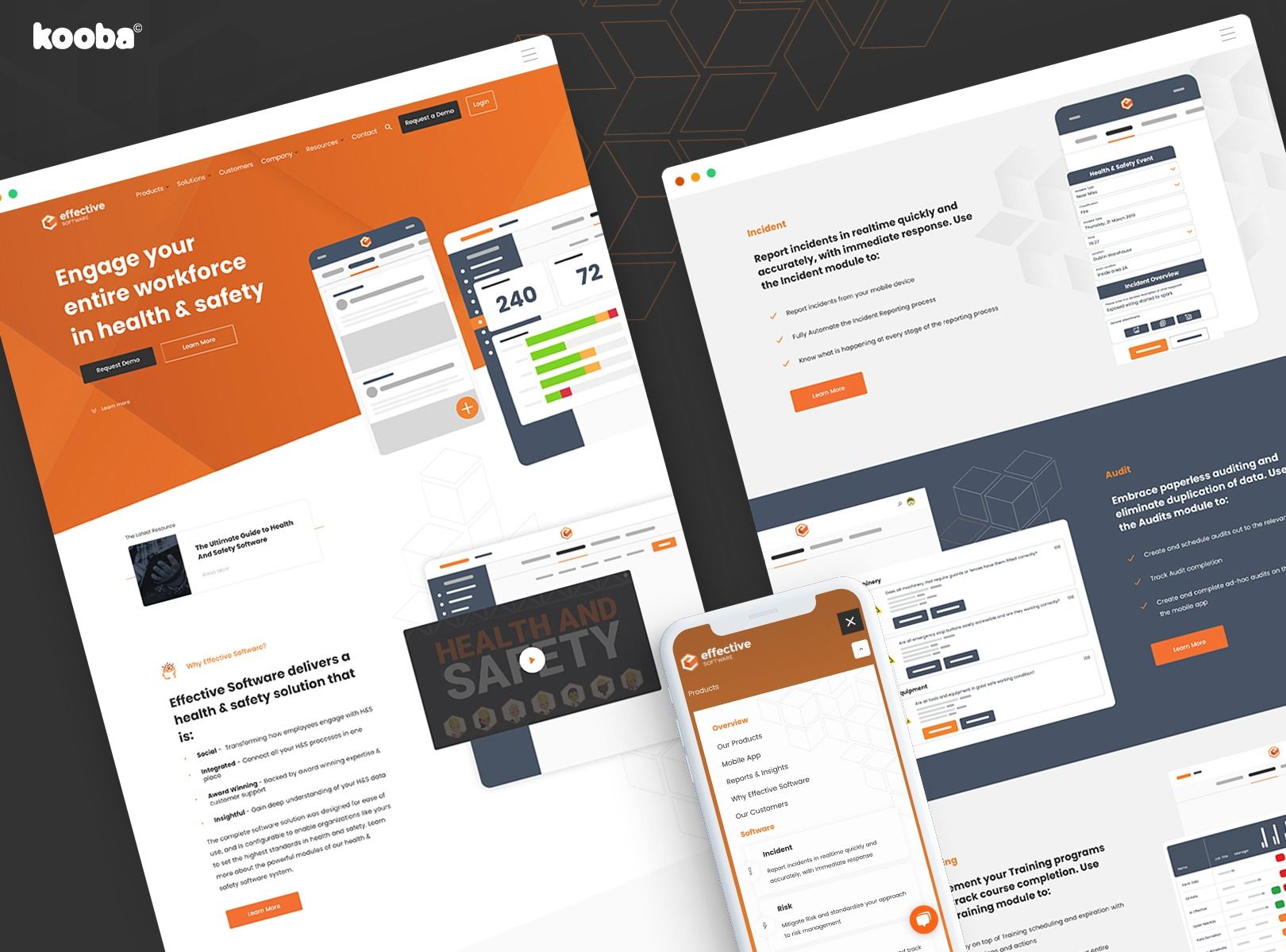
Earlier this month we were delighted to launch a new online presence for Dublin-based Effective Software.
In a sense this project was everything Kooba is about. Much more than a great looking website (although that is certainly a big part of it), the engagement looked at the challenge of driving business and new leads from every angle.
We’re delighted with the result, and more importantly, so is the client! “Kooba’s approach was simple, with clear deadlines set and hit throughout the project” according to Head Of Marketing David Rowland. “We’re delighted with the site and looking forward to work with such a creative, co-operative and friendly team on future projects”
Read on for more detail...
The company
Effective Software helps organisations across the globe transform the way they approach health and safety. To that end the company provides a full suite of products and mobile apps that together allow for reporting of incidents and the management of assets and processes to be performed quickly and easily.
That’s an essential aspect of construction projects in the modern world - and the company is growing fast as a result. Kooba were brought on board to help ensure the Effective site, and every other aspect of the online experience, helps drive that growth.
Business objectives
For Effective, the bottom line was pretty straightforward. They wanted visitors to request a demo, and when doing so share their contact details. That’s how it often works in B2B software business. Contact details mean leads, which in turn mean sales - particularly as once any prospect has seen the company demo they tend to be ready to buy.
And as always, there was a desire to ensure Effective were putting their best foot forward online. The company wanted a website that reassured and impressed visitors and delivered the best possible user experience. Looking great always matters online.
The effective website
We started with the big questions. In particular, what was the best way to communicate the benefits of the Effective offering?
The answer involved thinking clearly about the relevant tasks and ‘jobs’ that Effective can help any organisation with. In response to this we developed clear categorisations under both product and solutions headings. The former focused on the aspects of health and safety that a potential client would consider (incident reporting, auditing, risk management etc). The latter on specific industries (manufacturing, utilities, and so on)
Taking this approach meant that it was easy for audiences to find the Effective Software that was right for them (we know, we tested it). And within this structure, content was created and delivered in a ‘progressive’ manner, meaning users were not overwhelmed with information but could explore and learn at a natural pace.
We also worked hard to ensure that the navigation supported this process of discovery, adding context to the main drop down menu so visitors could find what they were looking for. We included a ‘sticky’ nav in sub sections for products and solutions: this enabled visitors to find all content relating to a particular aspect of the offering without bouncing up and down the site.
A ‘natural search’ feature in the resources section helped new users find their way to helpful, relevant content in what is a huge range of great resources in a range of media. It can be easy to get lost on websites: half the job is ensuring users are able to intuitively find what they are looking for.
Lastly, it goes without saying that the site is fully responsive and delivers a clean, contemporary and idiomatic SaaS style throughout the experience. Getting the ‘design idiom’ right for any given industry is particularly important - it can be hard to define what success looks like ahead of time, but get it wrong and you’ll know about it.
Lead generation and landing pages
As we noted above, lead generation is almost always important - and it certainly was for Effective Software. The demo landing pages we built for this project are models of focused clarity. At the top, headline, form and social proof appear above the desktop fold. Below, additional information is provided for those who need a little more persuasion!
Conversion is everything. In cases where a client is spending money on paid media, it is the single largest influence on cost per lead. With this in mind, we built a dedicated page for visitors from external advertising and links, with additional detail included that help get those users ‘over the line’
We also make the option of viewing the demo as prominent as possible throughout the site - not just on the home page. Because traffic + conversion = leads. And businesses like Effective Software love leads!


