


As an agency obsessed with accessibility, Kooba were delighted to work with Vially, an innovative company helping to build inclusive experiences for their clients. Our work encompassed a full website redesign, alongside a complete rebranding. One element of this campaign we particularly enjoyed was designing the new Vially logo, which we believe perfectly captured and developed this exciting partner’s brand.
Exploring Every Option
The process of designing a logo, like everything Kooba does, involves the collaboration of our client at every stage. Following an initial workshop with Vially, Kooba’s design team focused on several key takeaways. Vially wanted a logo that told a story, representing a journey towards accessibility. The logo needed to show movement and progression, thus highlighting Vially’s ability to advance the accessibility of their clients’ services. Vially had chosen their name to communicate this, with “via” deriving from the Latin for route or path. With this in mind, three logos were drafted, each showing dynamic change in a different way. These three options were presented to Vially in a later exploratory meeting.
The First Step
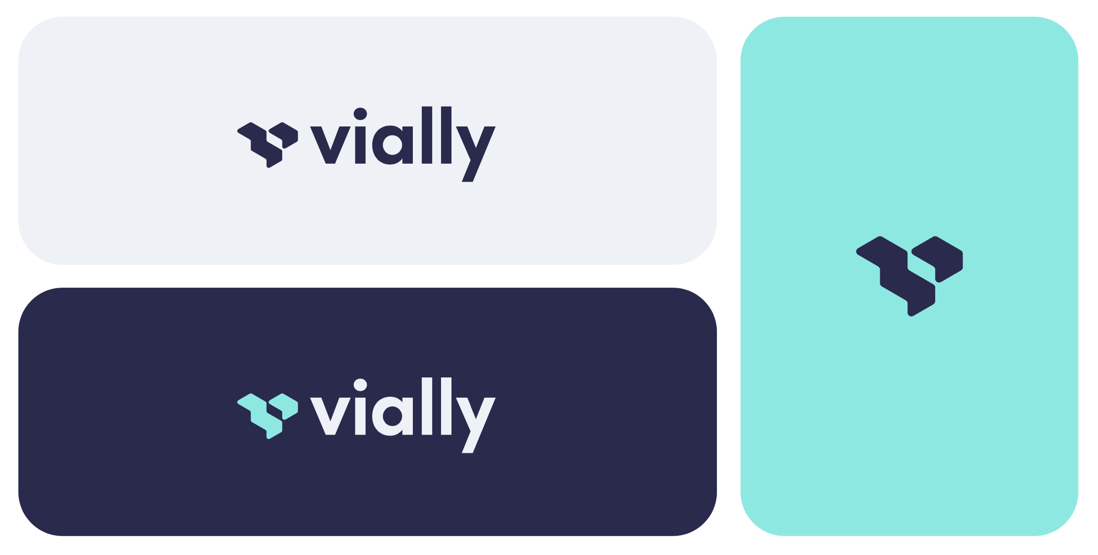
Ultimately Vially settled on a simple but powerful logo which aligned perfectly with their brand narrative and values. The logo centres on the image of a step, clearly showing a positive progression, and creating a visual tie with the concept of a path or road. This shape doubles as a “V”, cementing the connection between Vially’s name and their wider brand identity.
Kooba also wanted to pay a tribute to an element featured in Vially’s old logo; the six dots of the braille writing system. The step element therefore featured six sides, a subtle but meaningful nod to Vially’s accessibility credentials.
Alongside the graphical logo, a font was chosen for the company name. Kooba decided on Sofia Pro as a primary brand font, which is a modern sans serif typeface with a geometric touch. This kept the logo clean, sharp and professional, and retained the focus on Vially’s overall visual messaging.
Keeping it Simple
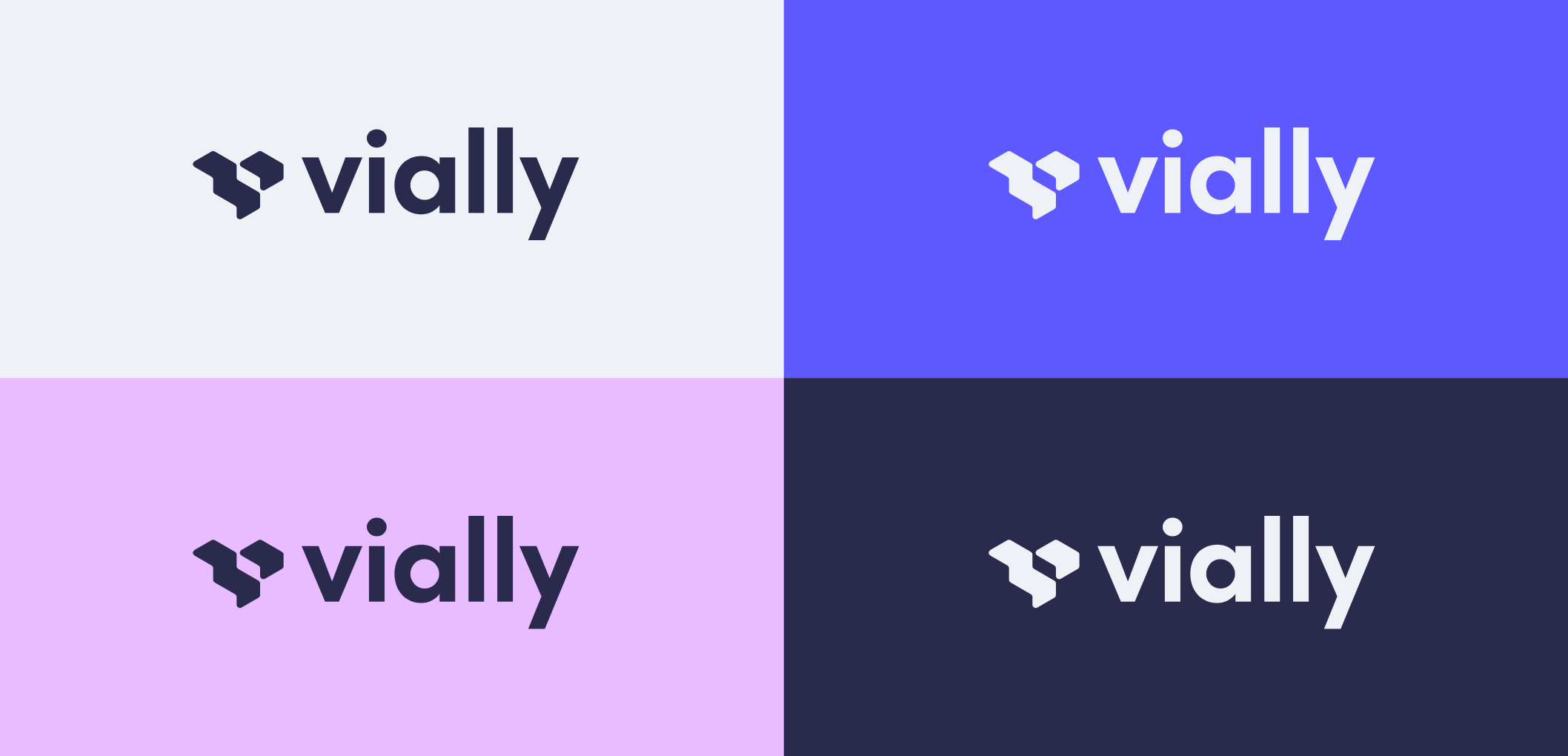
For a company specialising in accessibility, it was crucial that Vially’s brand and logo be completely inclusive to every possible end user. This was reflected in a deliberately minimal logo design, creating a visual simplicity and avoiding any excessive cluttering. Of course, this also adds to the power of the logo’s message, helping communicate Vially’s mission to every viewer more effectively. As we often point out at Kooba, accessible design and good design are one and the same.
Building a Brand
A logo cannot create a brand by itself. Crucial to the success of the Vially project was the integration of the logo’s elements into the wider design of the brand. The shapes of the logo were used to build background textures for Vially.io and different social media templates. Likewise, the brand palette was tested with the logo’s design, and the high contrast colour scheme helped elevate an already striking and accessible logo.
A lot of business comes down to telling a story. Sales, marketing, design and branding can be reduced to communicating a clear and compelling narrative to customers. Vially’s logo illustrates this perfectly, with every element of its design referencing and contributing towards the company’s values and mission. If you’d like to find out more about this exciting project you can read our case study, or better yet check out the final website at Vially.io.